Scrubs & Clogs
Scrubs & Clogs
Scrubs & Clogs
Info
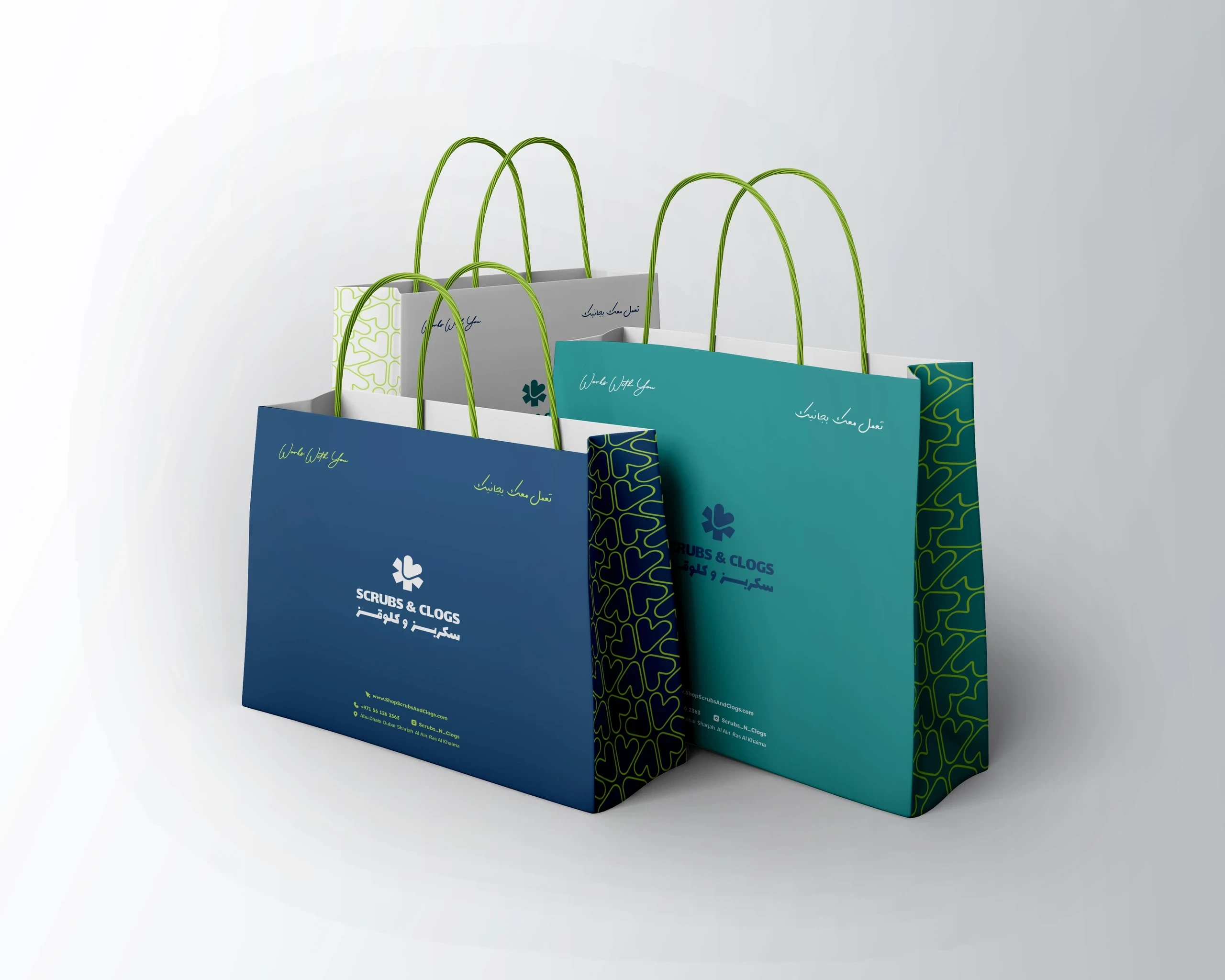
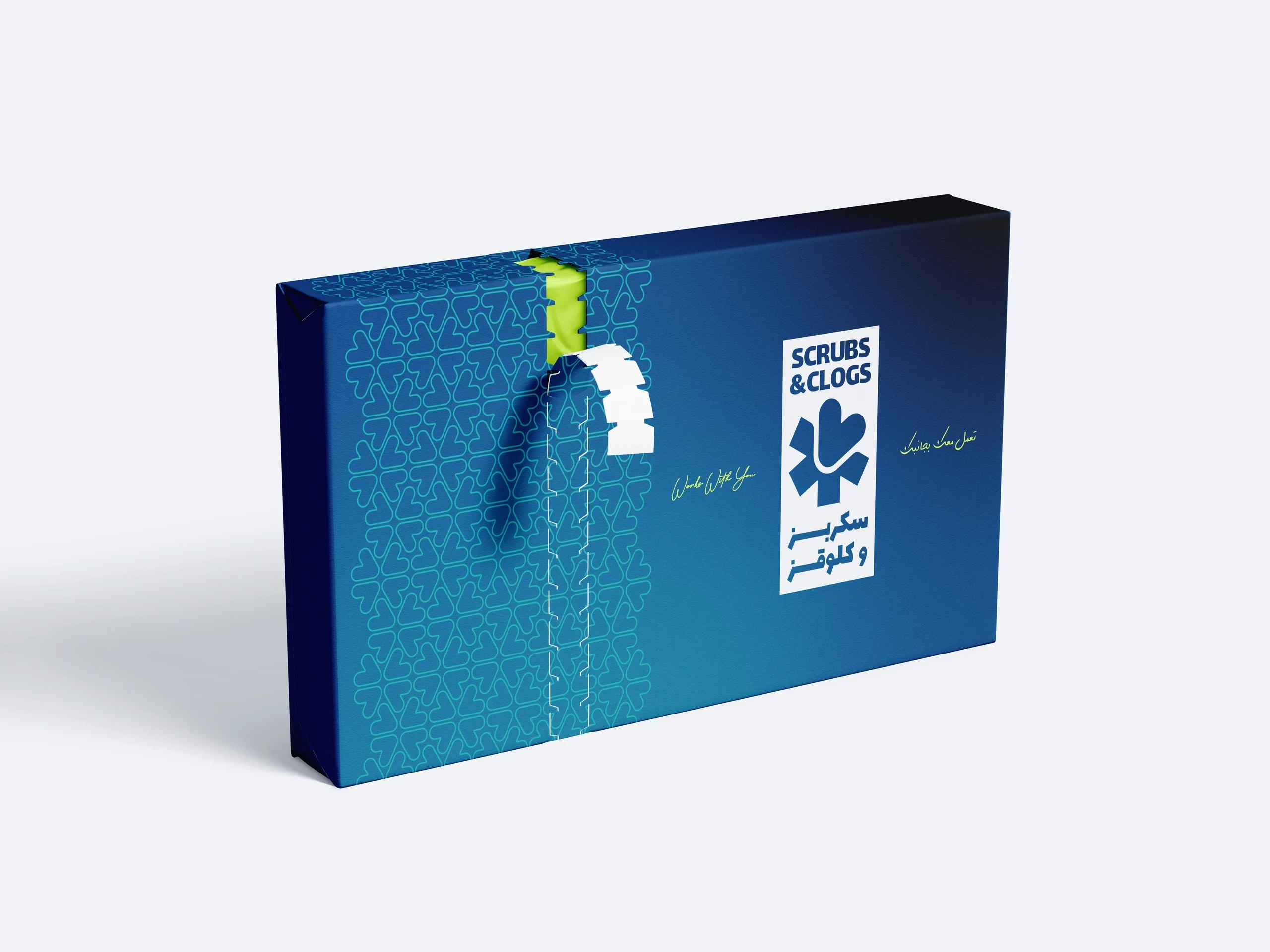
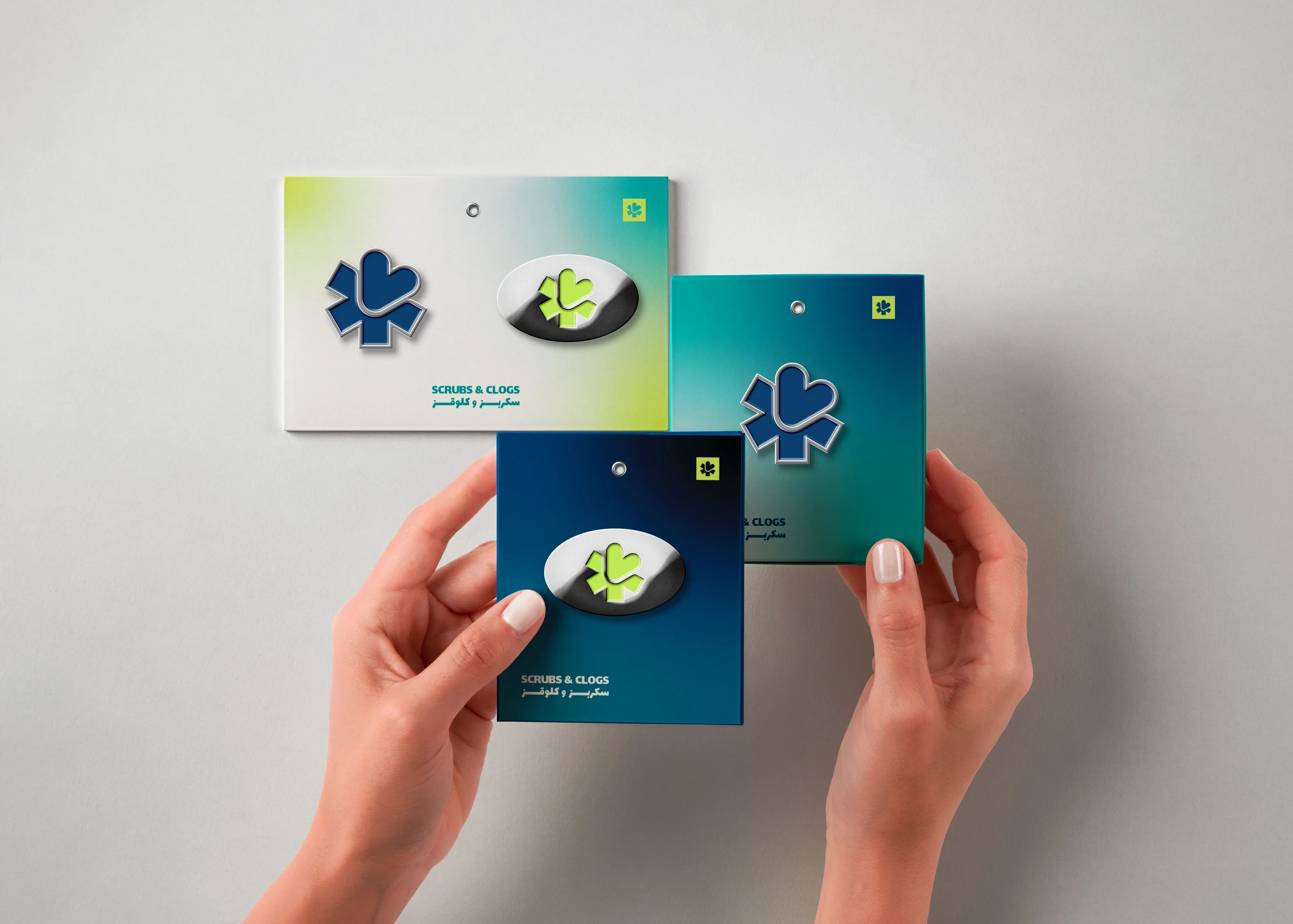
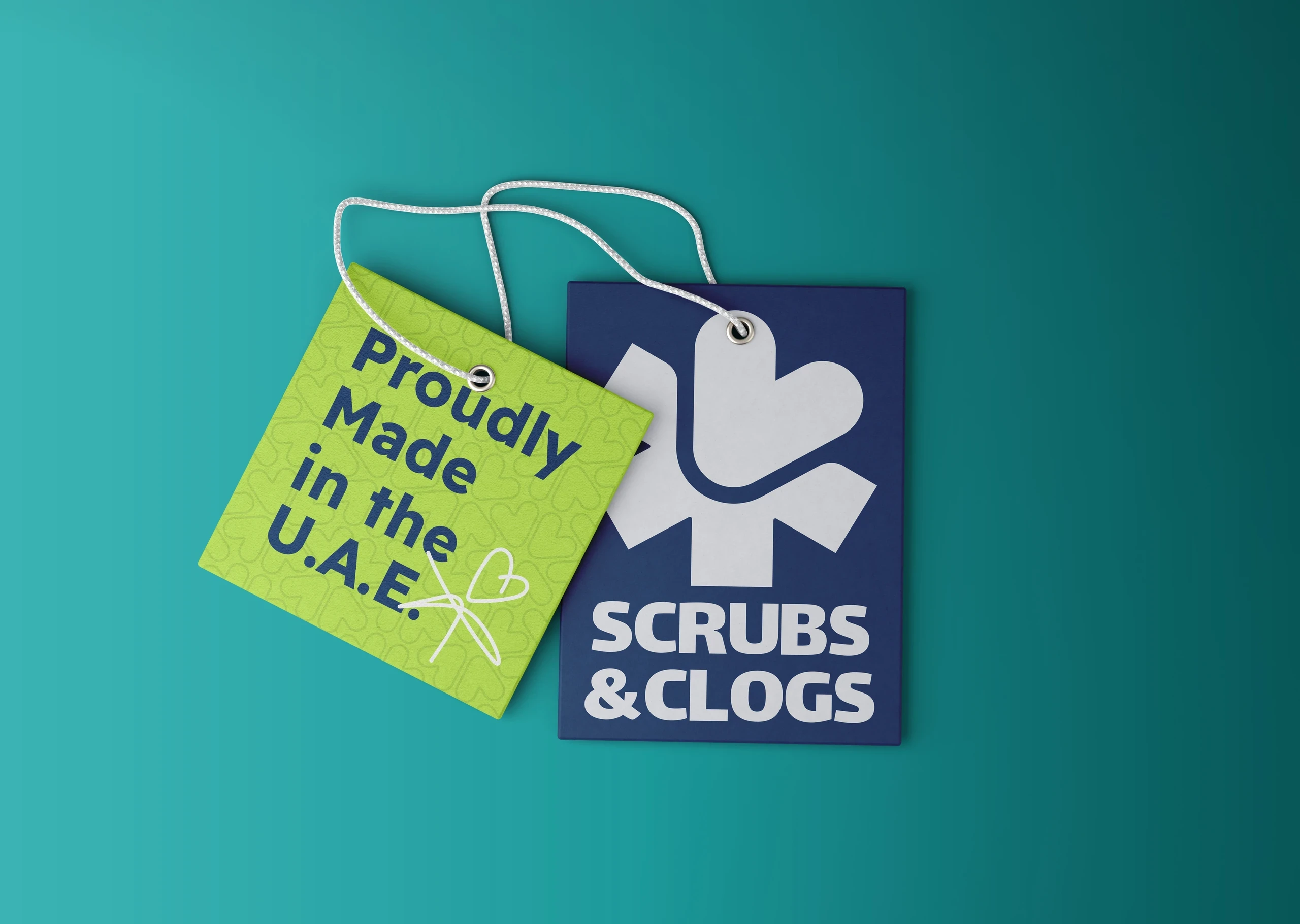
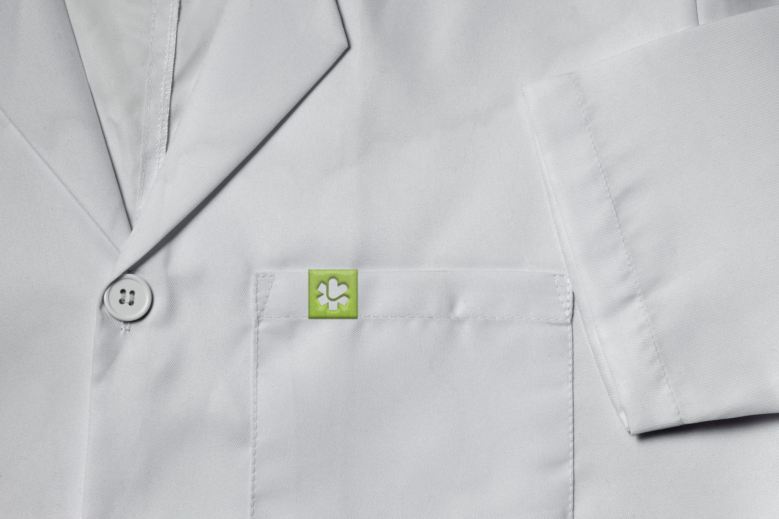
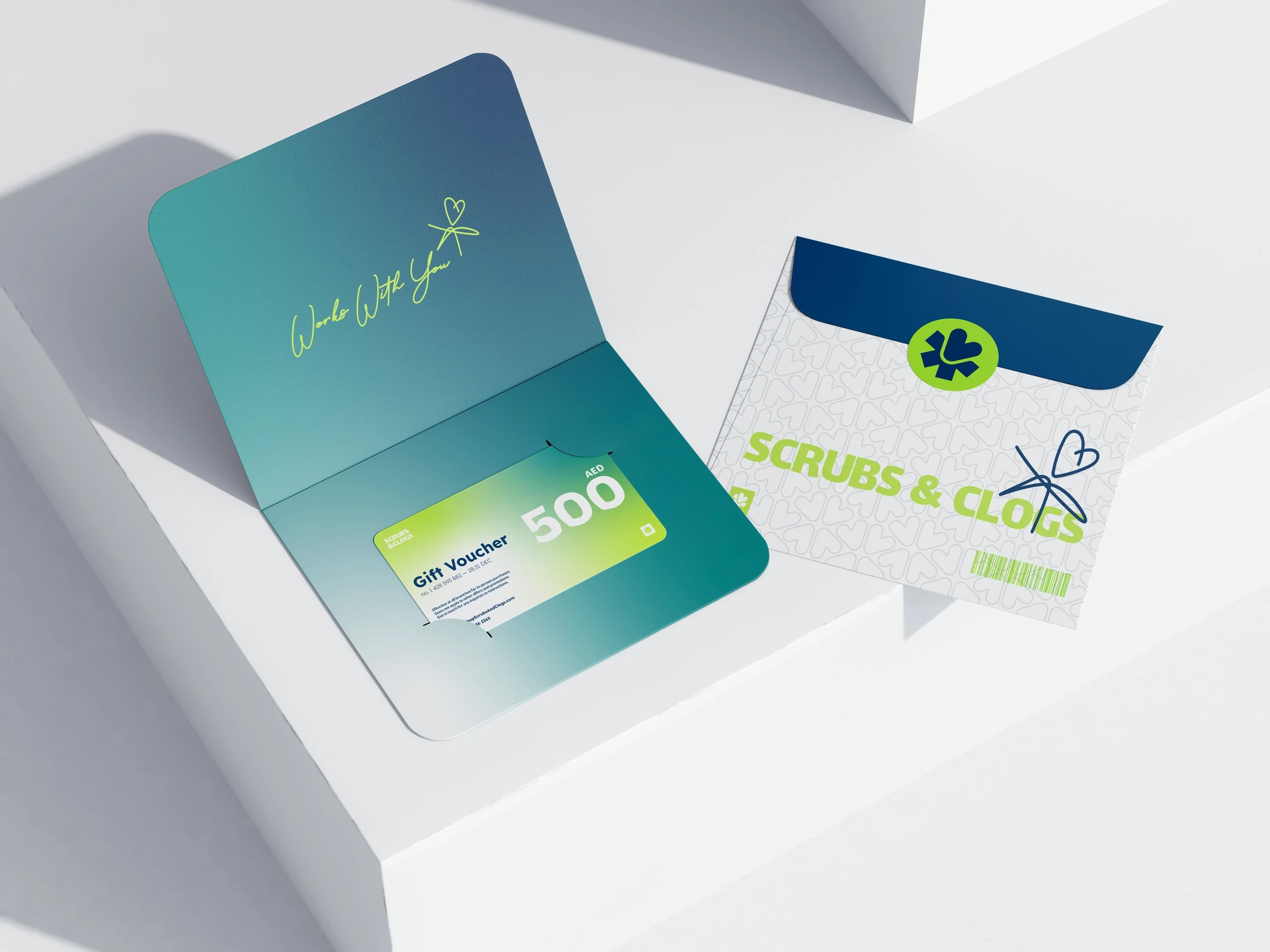
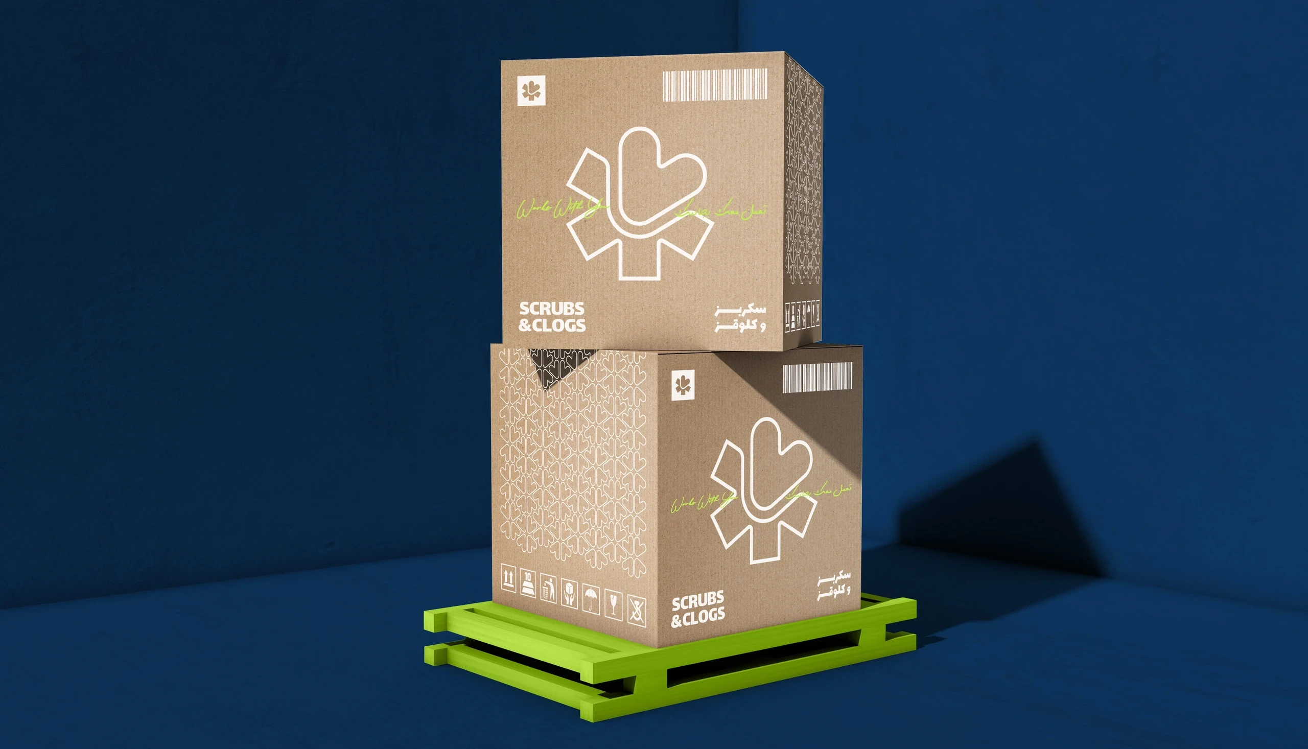
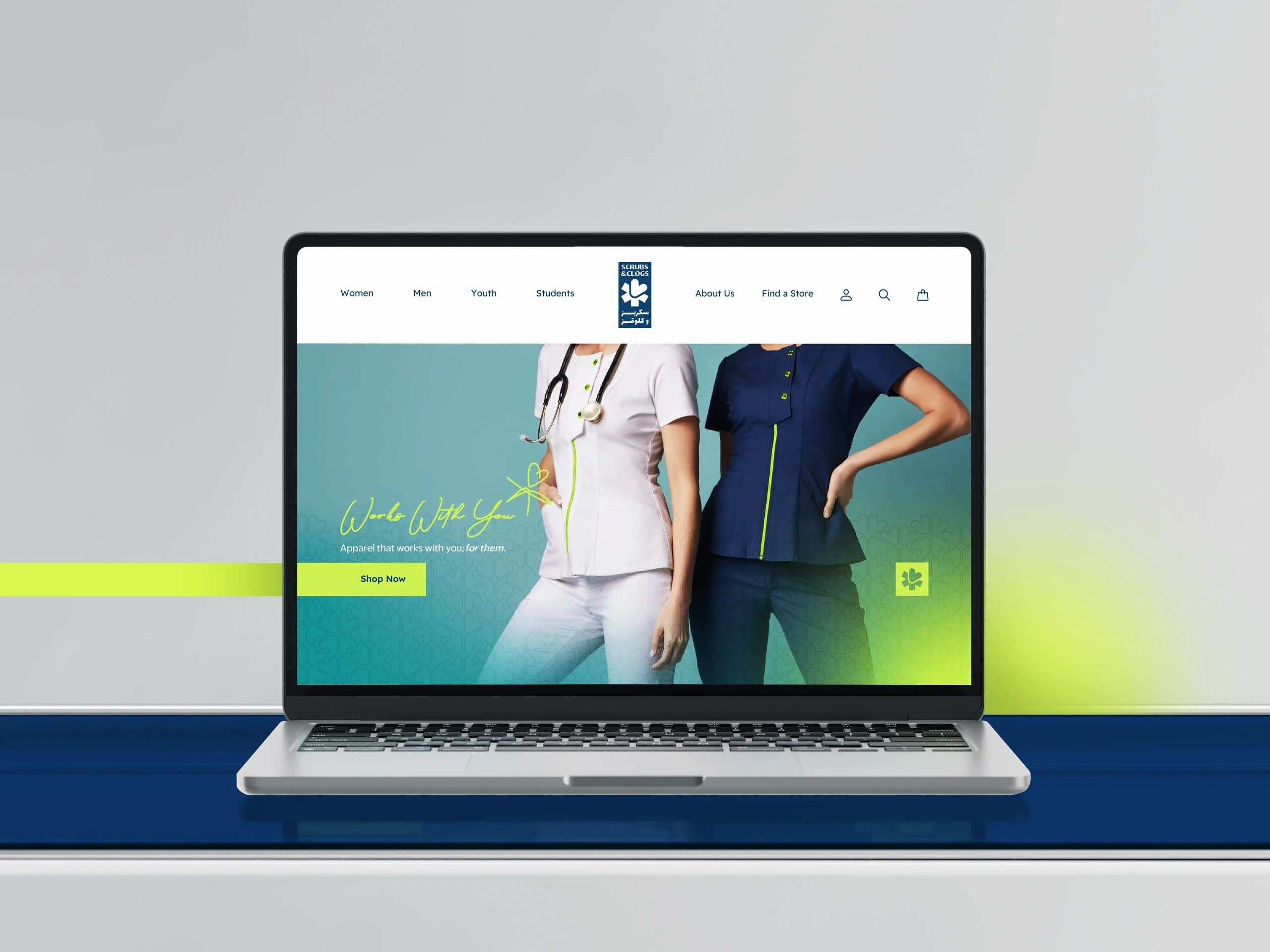
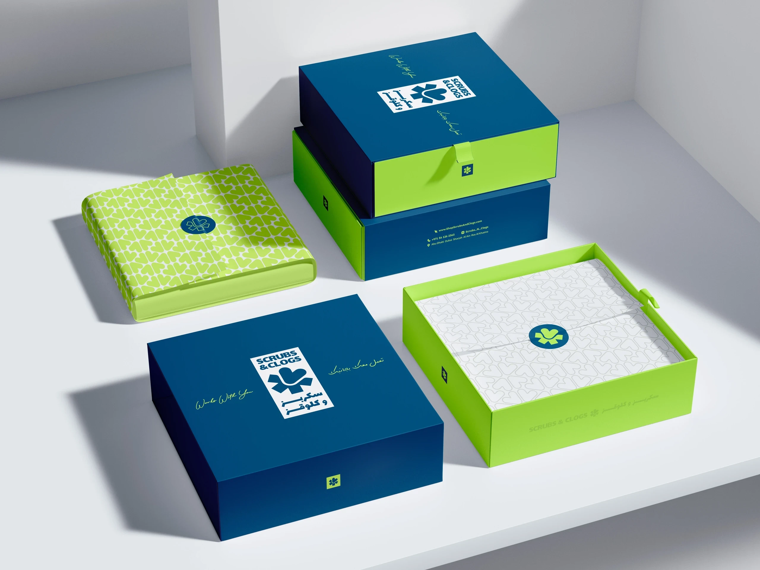
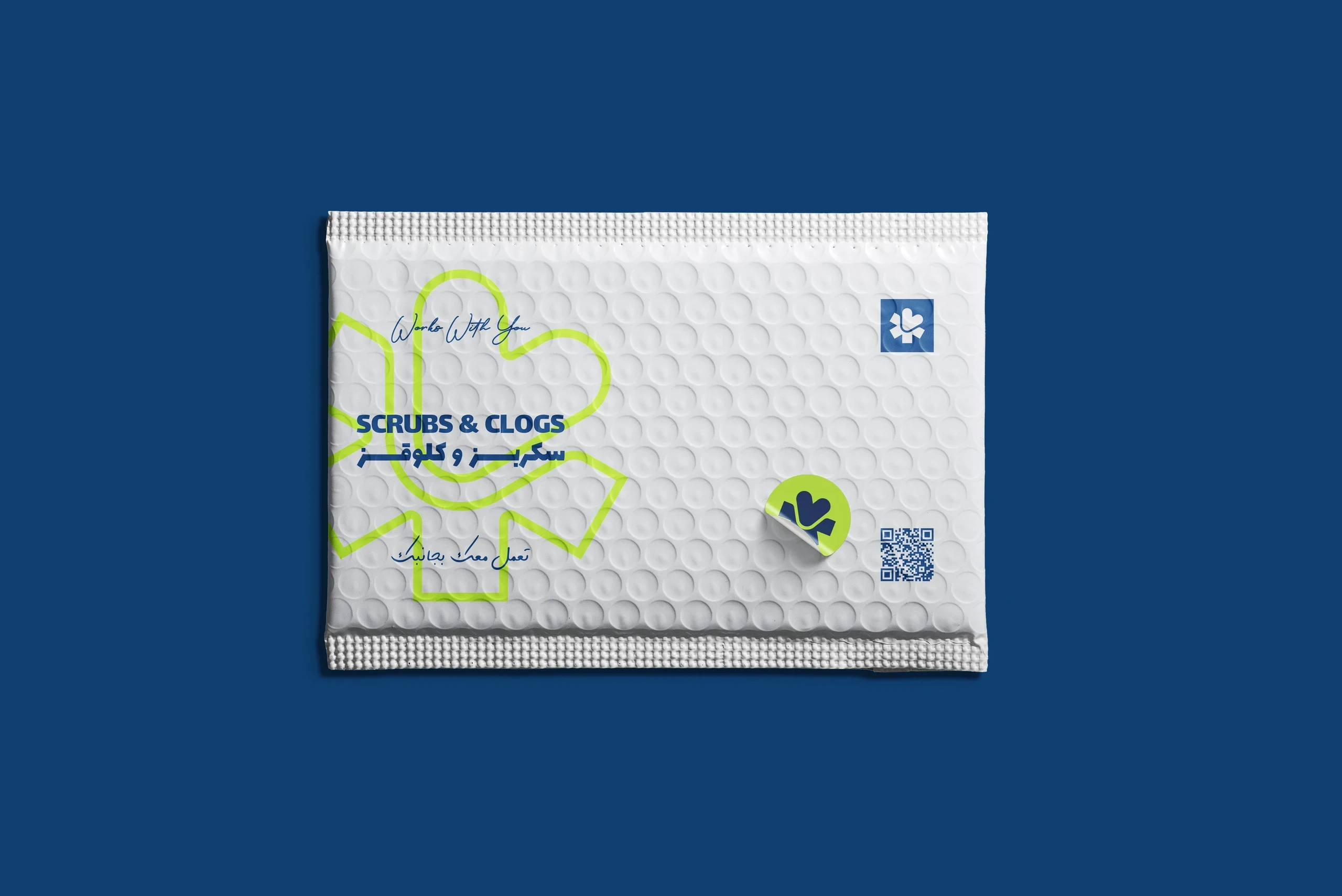
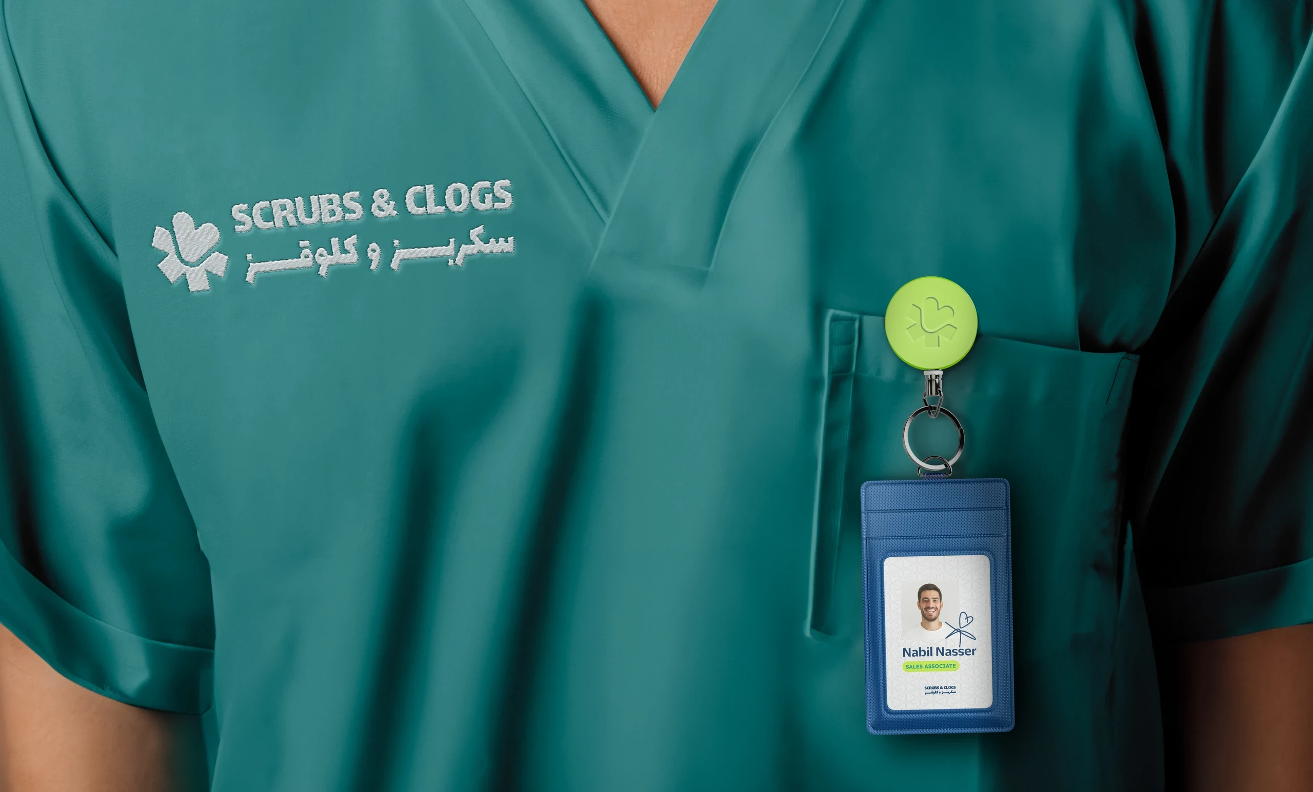
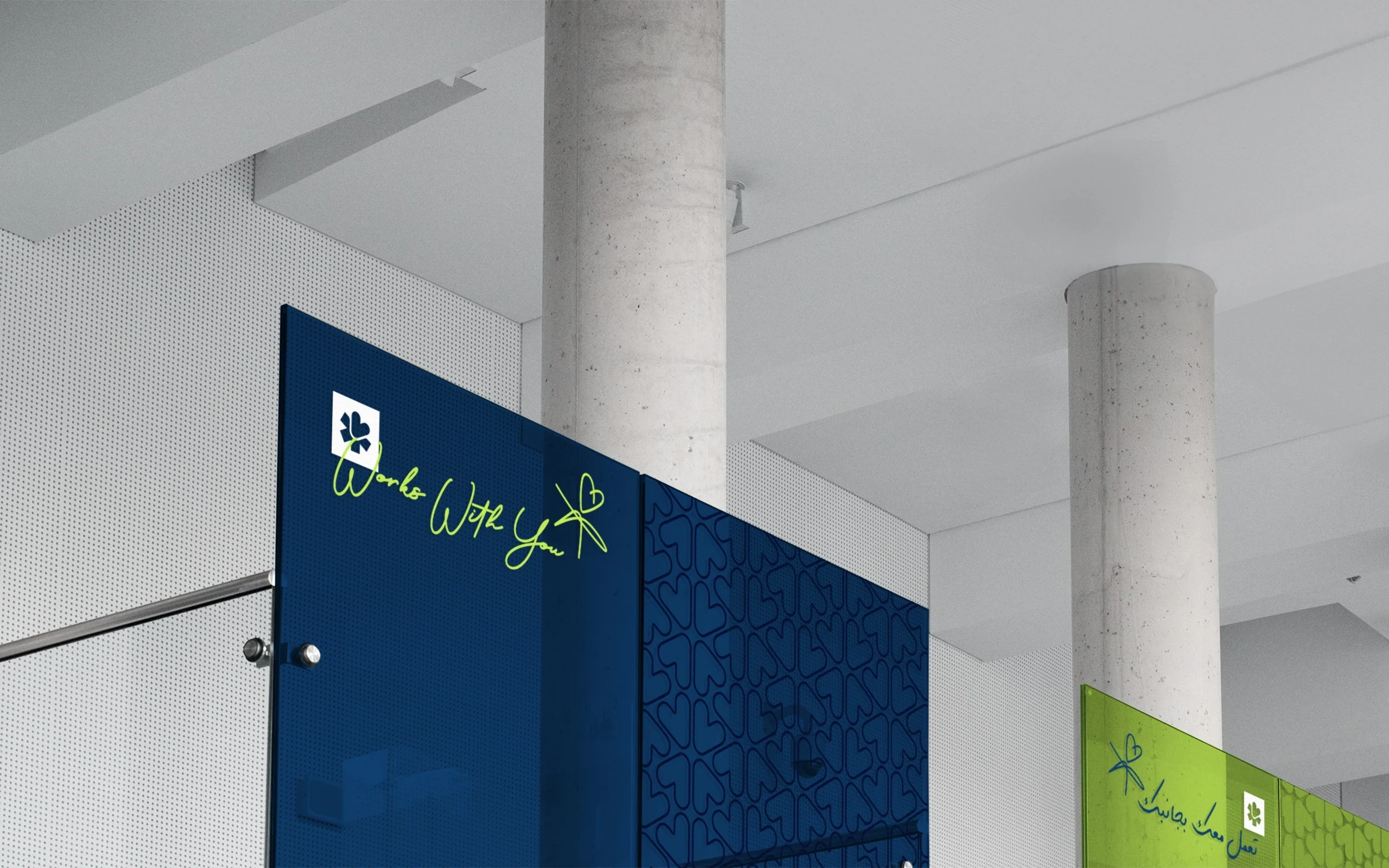
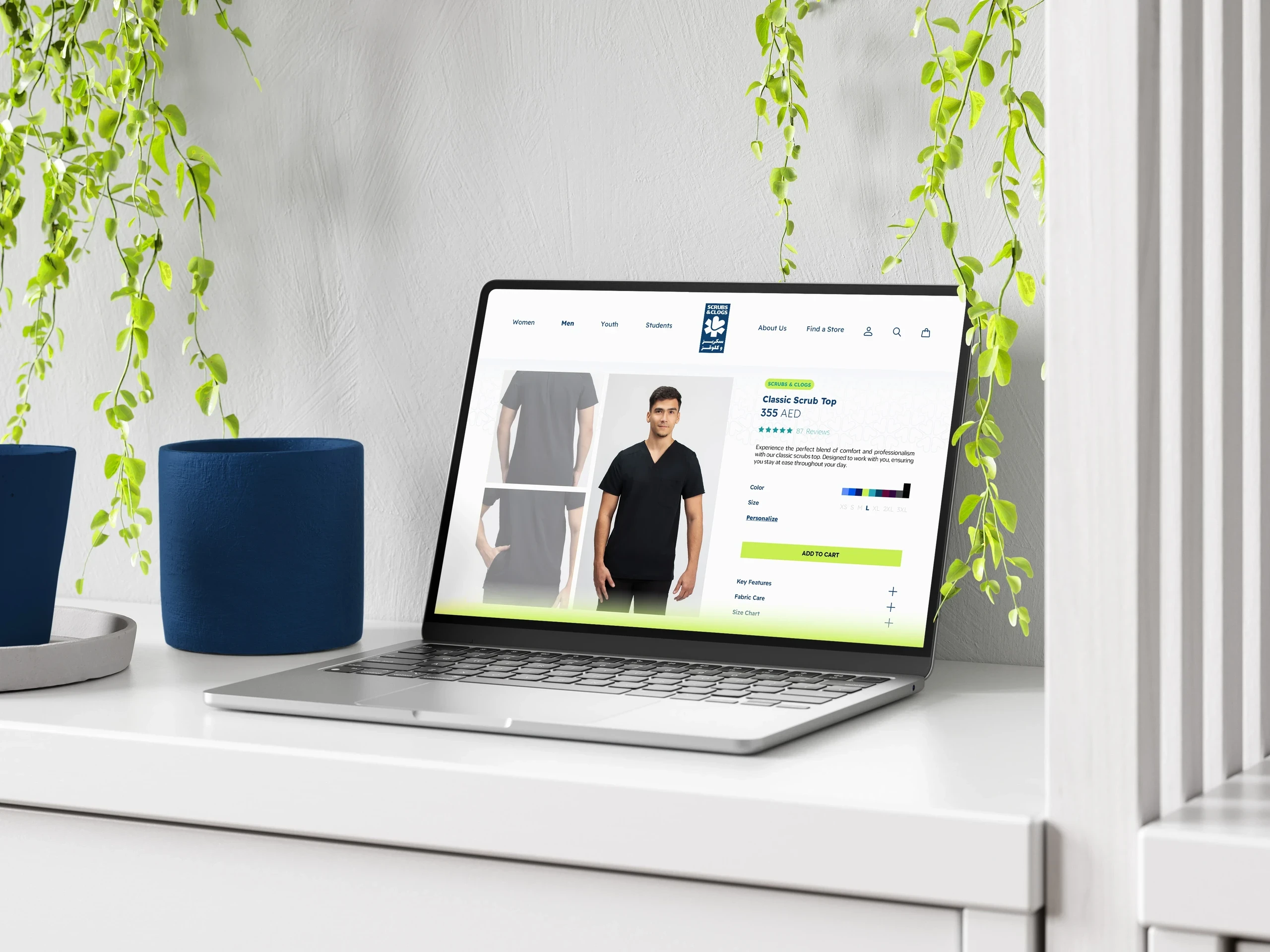
Scrubs & Clogs is a healthcare rebrand that combines professionalism with warmth. The refreshed identity reimagines the medical star symbol with a heart-inspired form, creating a visual system that feels supportive, modern, and approachable.
Year
2024
Client
Scrubs & Clogs
Services
Brand Identity, Packaging Design
Live Brand
The project aimed to retain the credibility of the original brand while making it feel more human and globally adaptable. The redesigned symbol transforms the familiar Star of Life into a softer, more dynamic mark that emphasizes care, empathy, and support. A palette of teal, deep blue, and bright green balances trustworthiness with energy, while handwritten-inspired details add personality and relatability. The verbal identity reinforces this direction through relationship-focused messaging such as "Works With You." The result is a healthcare brand that feels dependable without becoming clinical or impersonal.
The project aimed to retain the credibility of the original brand while making it feel more human and globally adaptable. The redesigned symbol transforms the familiar Star of Life into a softer, more dynamic mark that emphasizes care, empathy, and support. A palette of teal, deep blue, and bright green balances trustworthiness with energy, while handwritten-inspired details add personality and relatability. The verbal identity reinforces this direction through relationship-focused messaging such as "Works With You." The result is a healthcare brand that feels dependable without becoming clinical or impersonal.
The project aimed to retain the credibility of the original brand while making it feel more human and globally adaptable. The redesigned symbol transforms the familiar Star of Life into a softer, more dynamic mark that emphasizes care, empathy, and support. A palette of teal, deep blue, and bright green balances trustworthiness with energy, while handwritten-inspired details add personality and relatability. The verbal identity reinforces this direction through relationship-focused messaging such as "Works With You." The result is a healthcare brand that feels dependable without becoming clinical or impersonal.