Ocu
Ocu
Ocu
Info
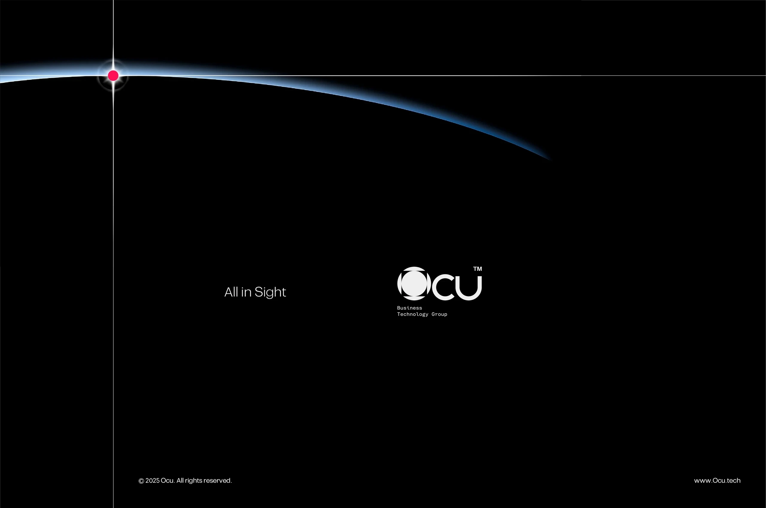
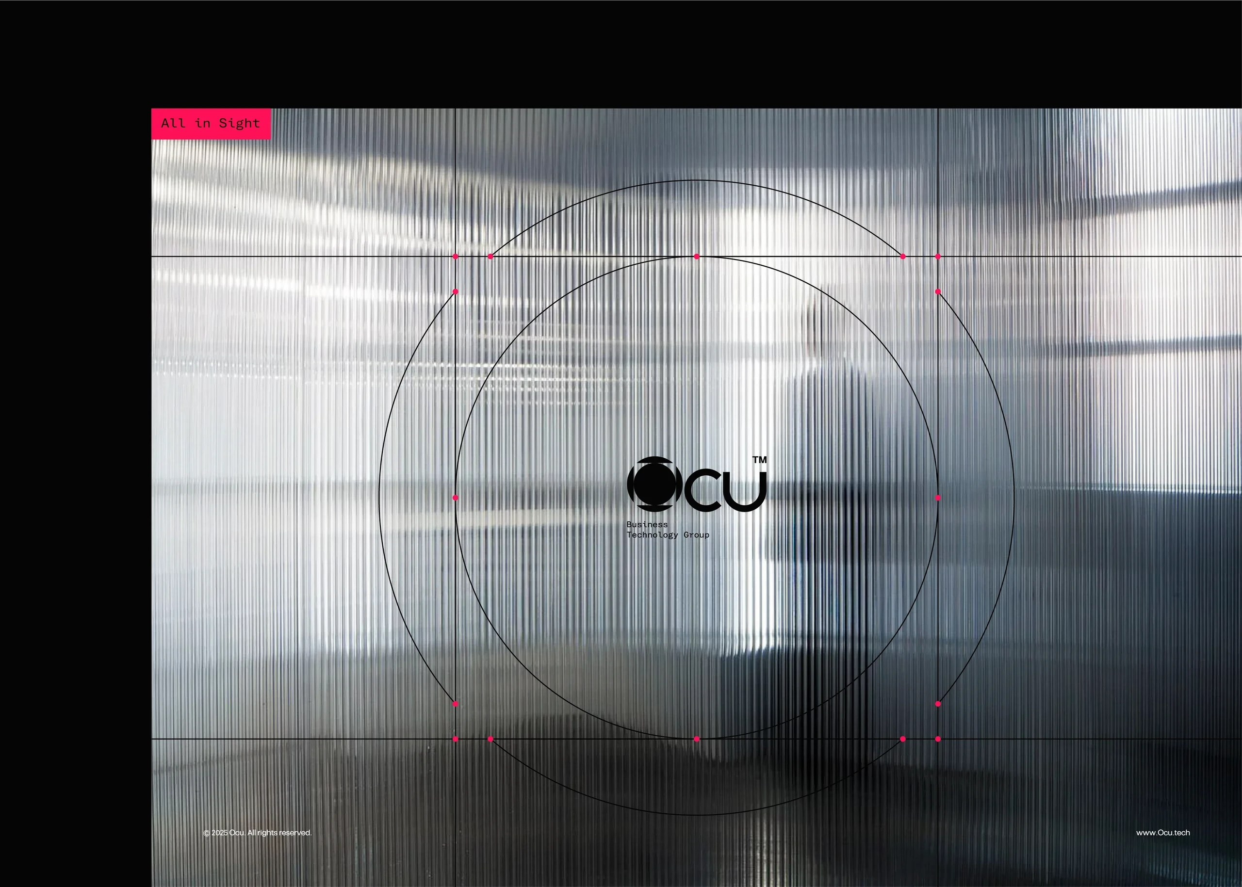
Ocu is a strategic technology brand built around the concepts of focus, intelligence, and control. Inspired by optics, targeting systems, and line-of-sight frameworks, the identity translates analytical thinking into a precise and disciplined visual language.
Year
2026
Client
Ocu
Services
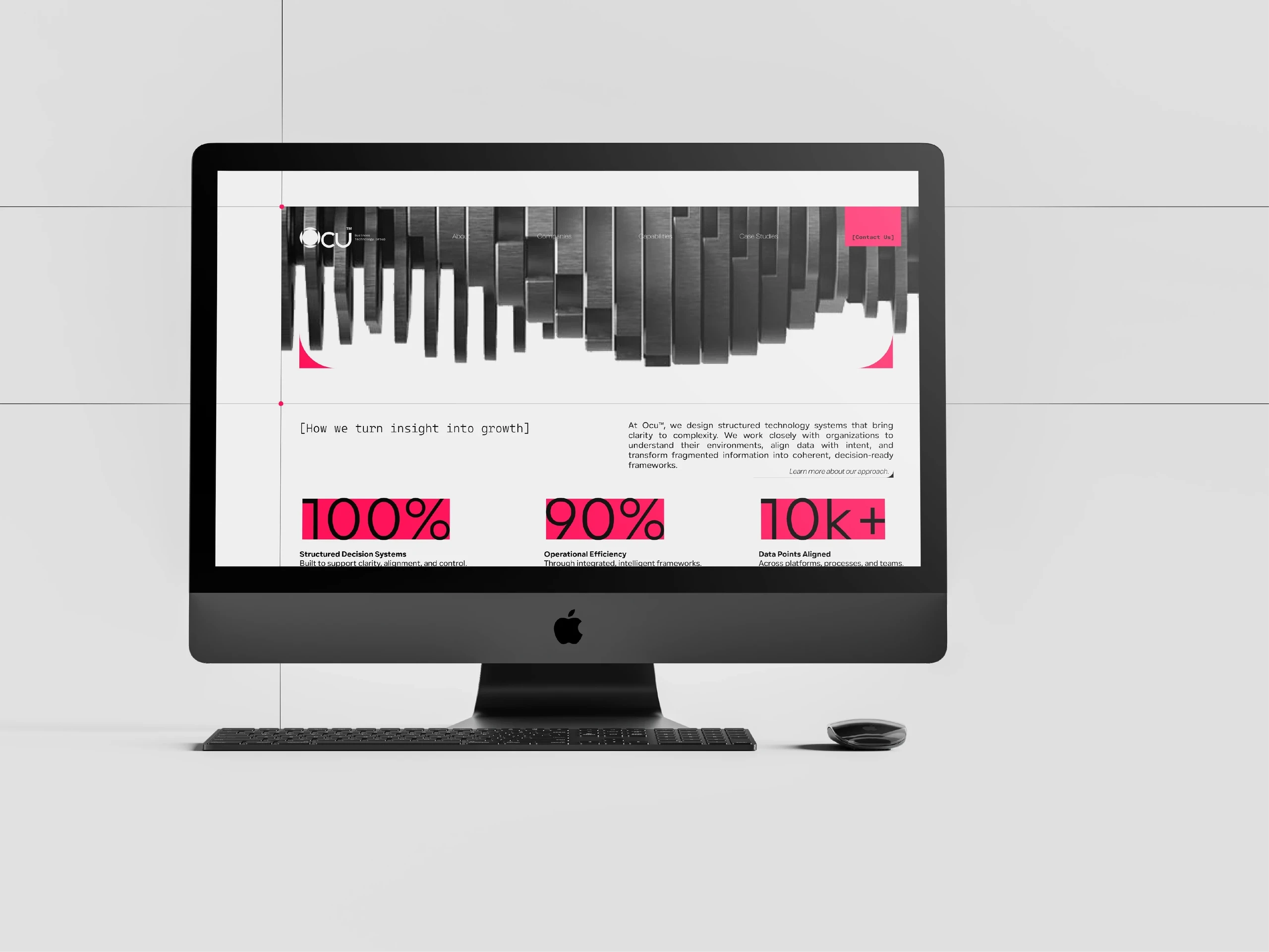
Brand Identity, Website Design
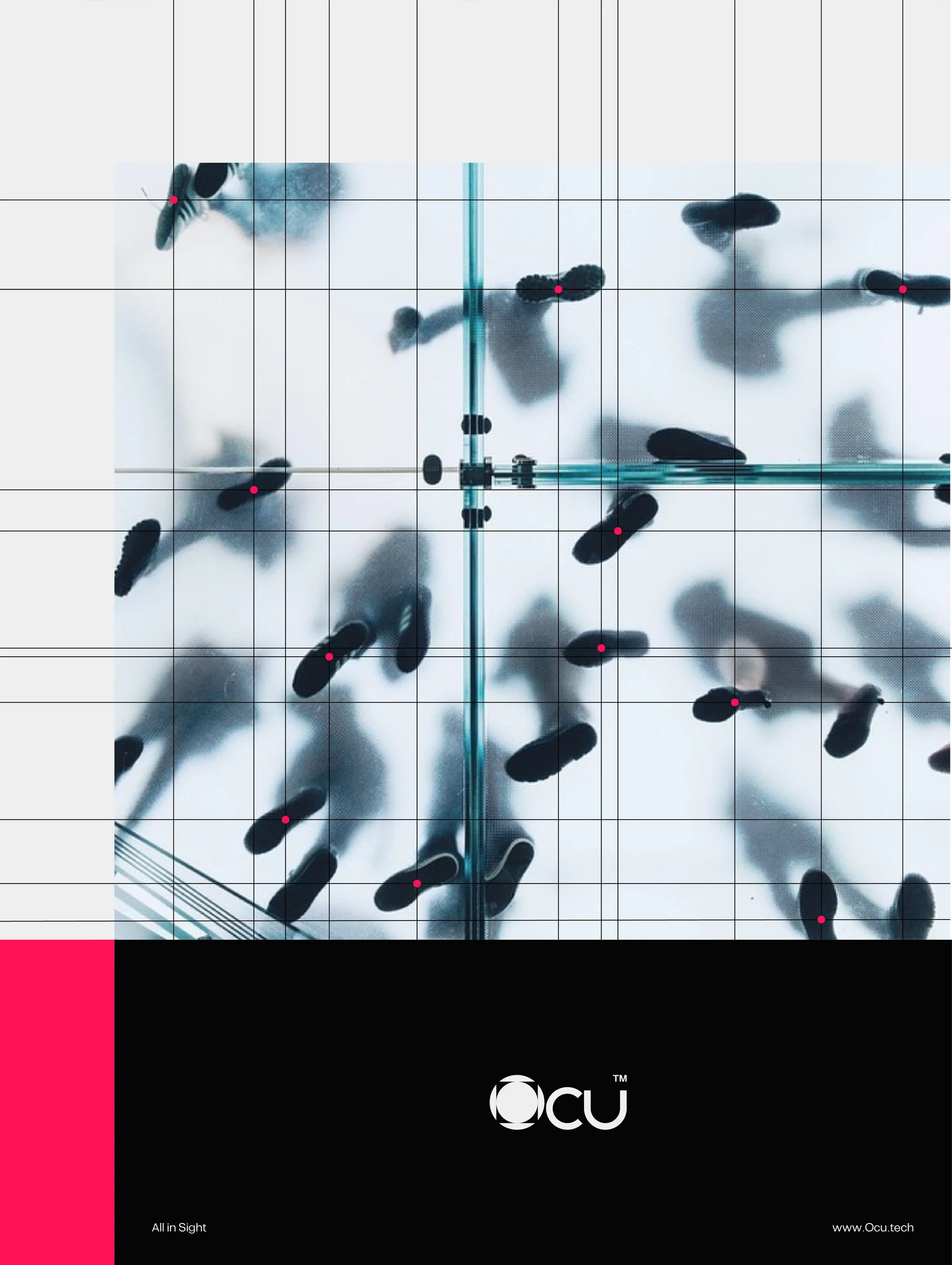
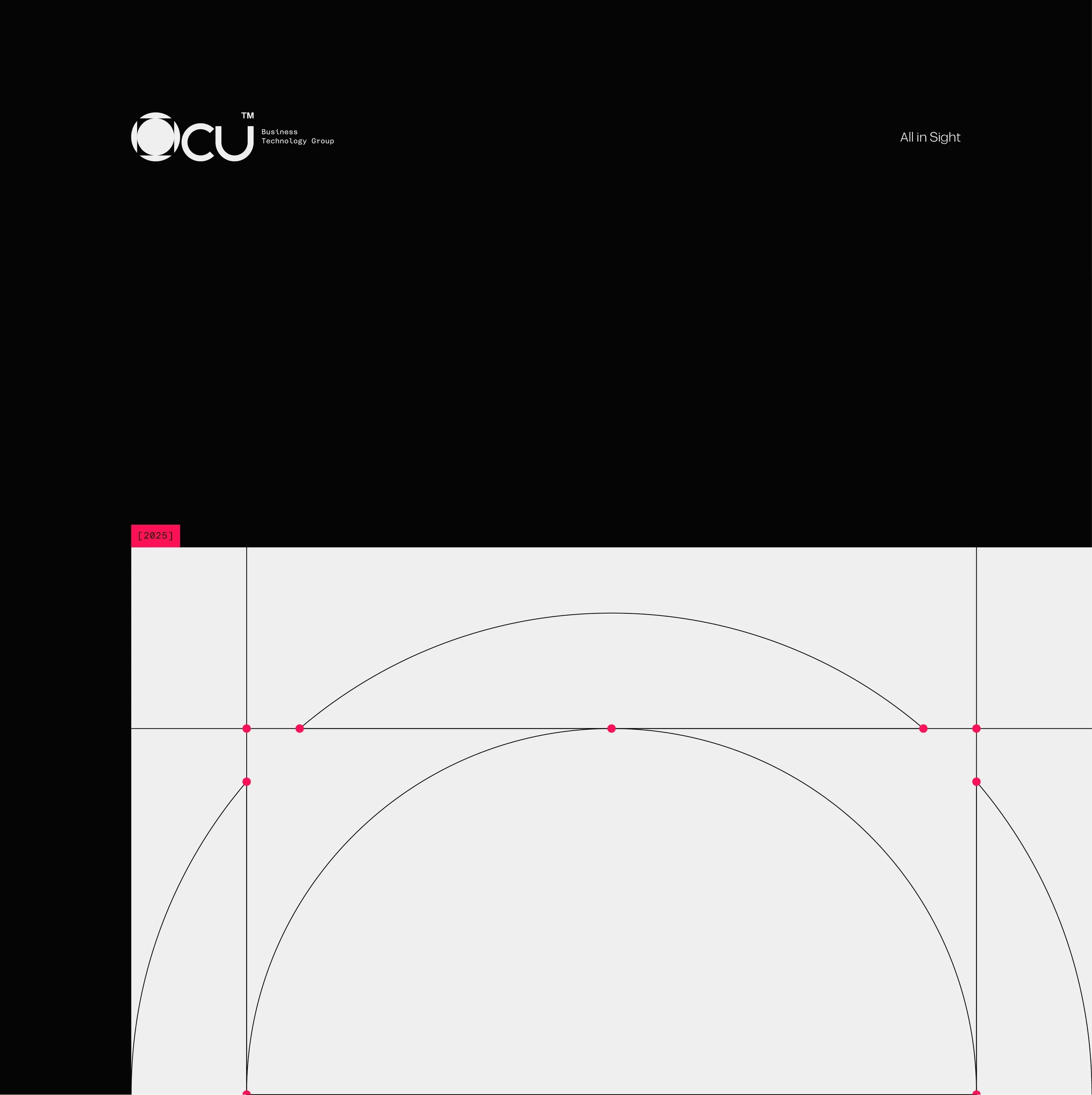
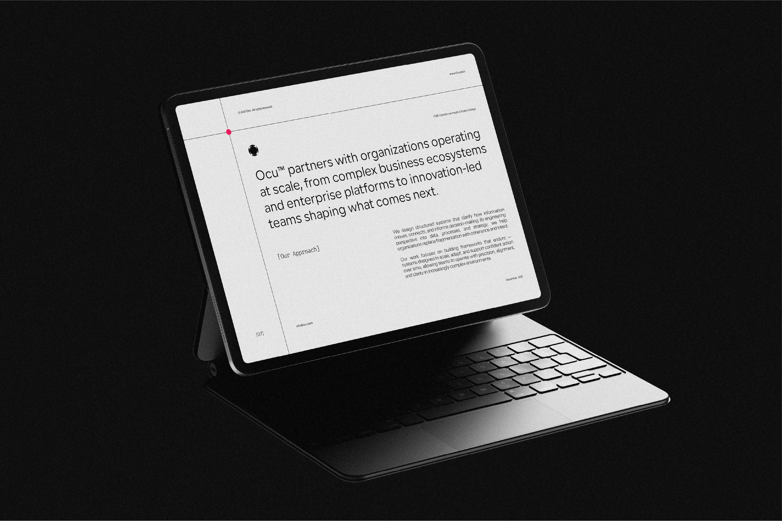
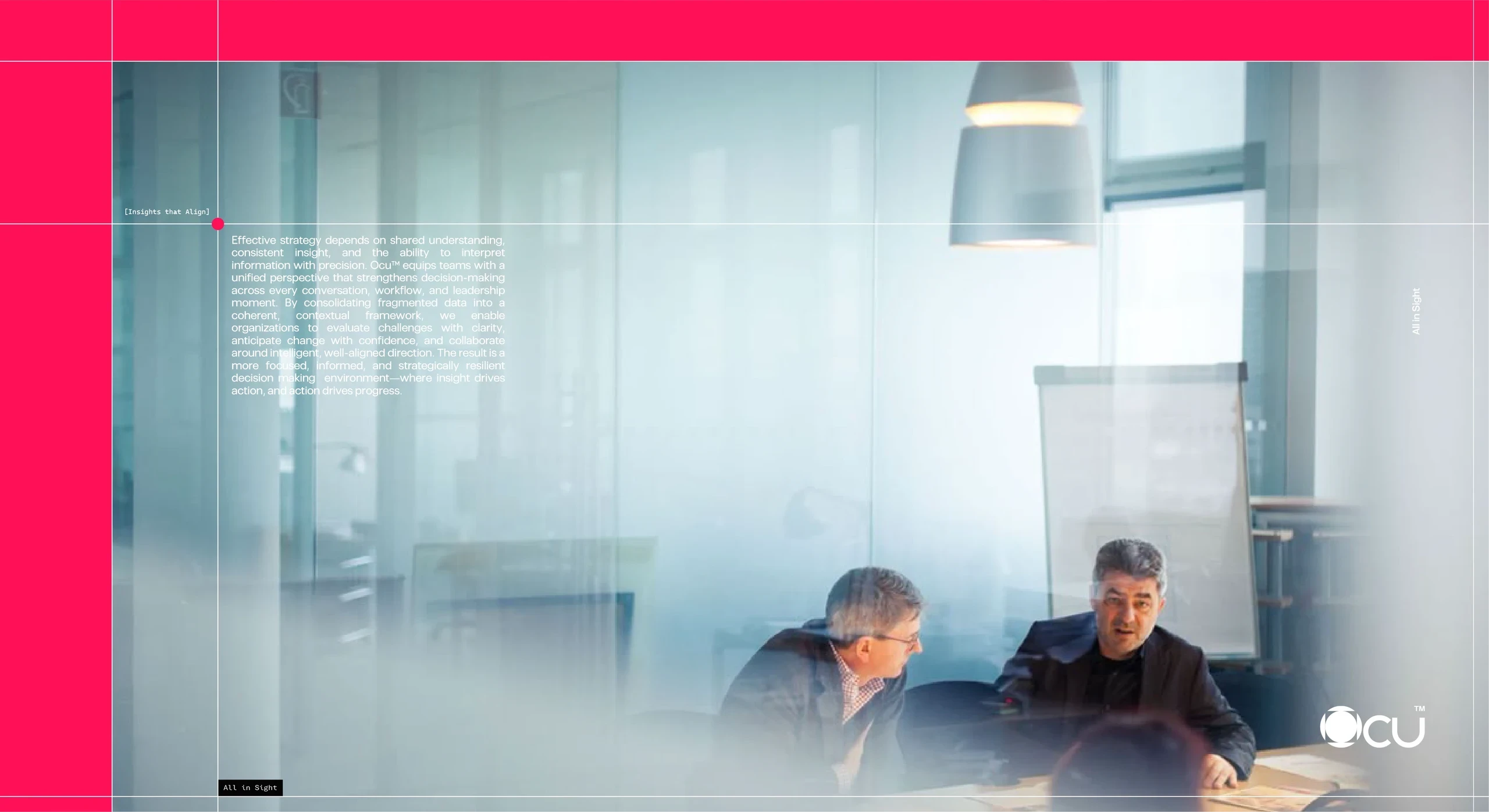
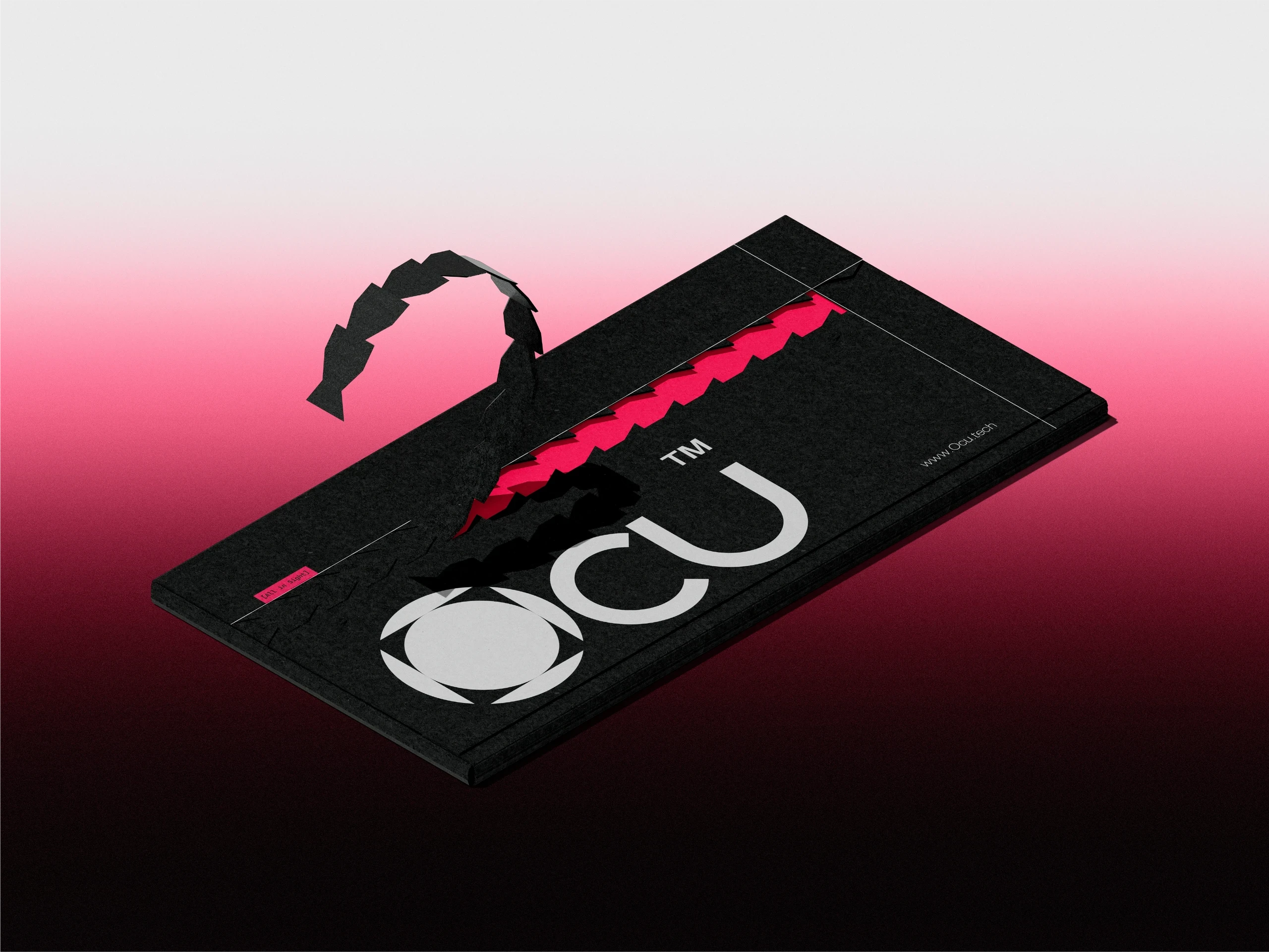
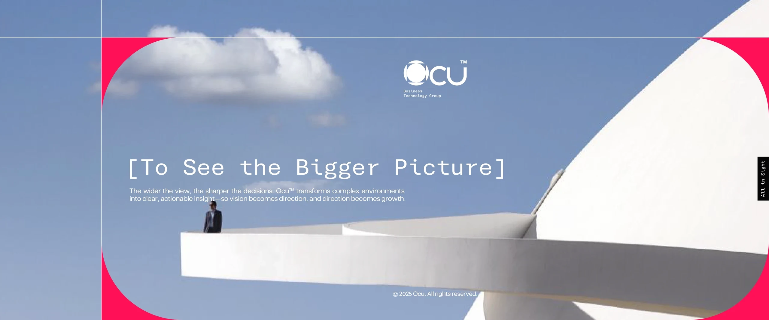
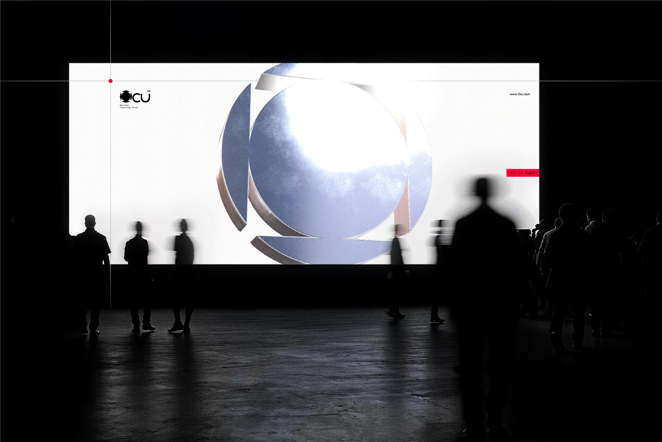
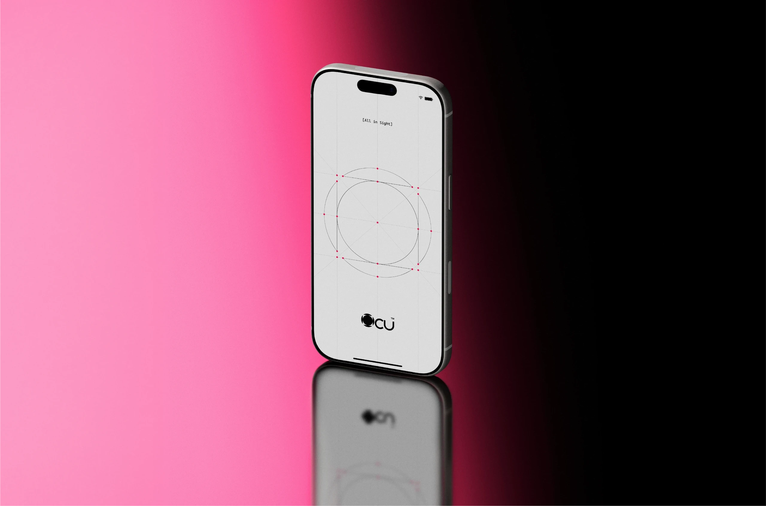
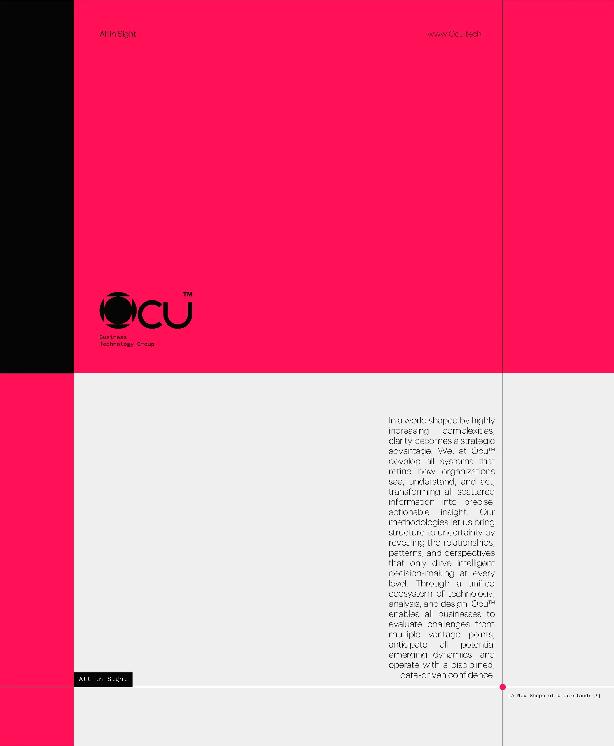
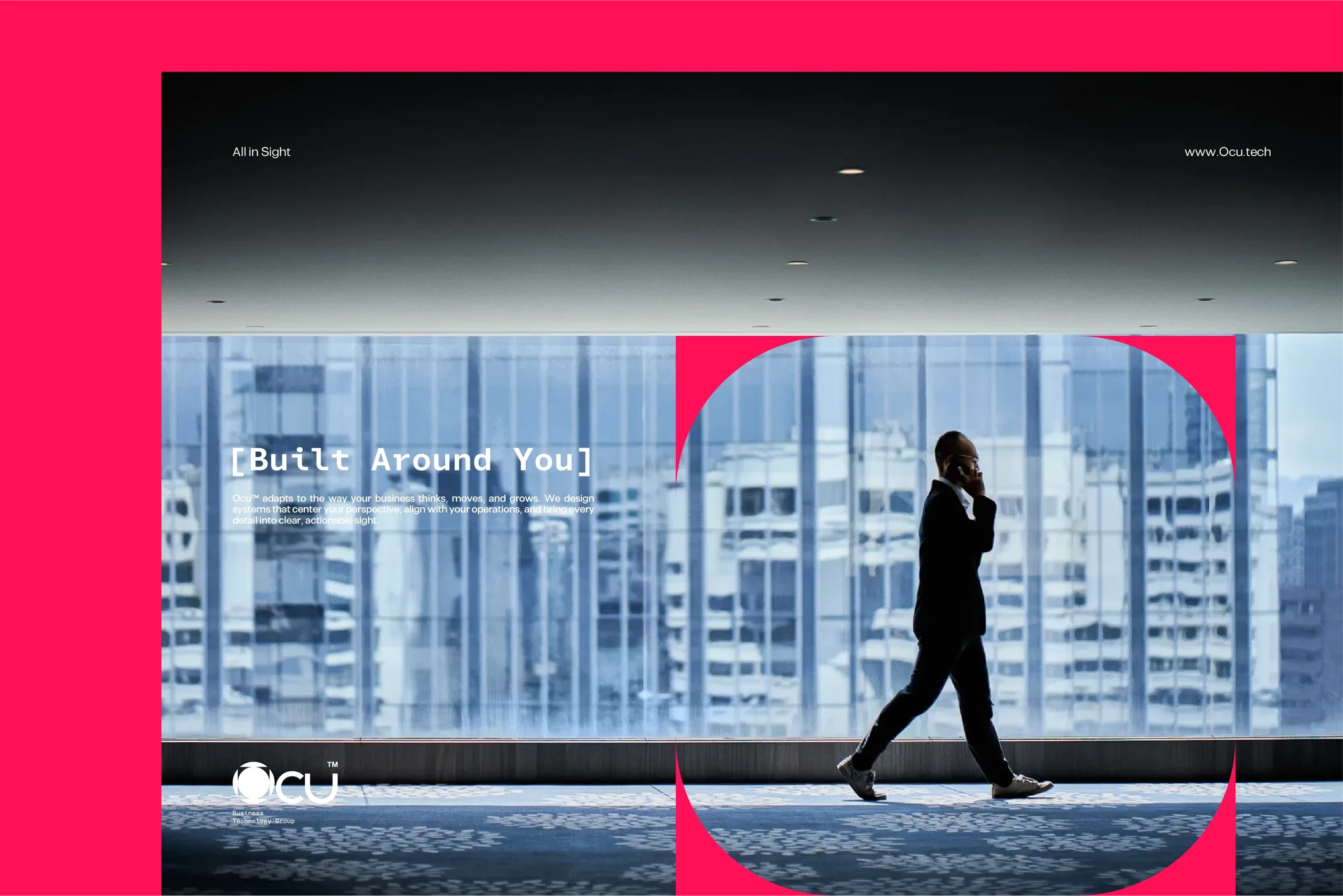
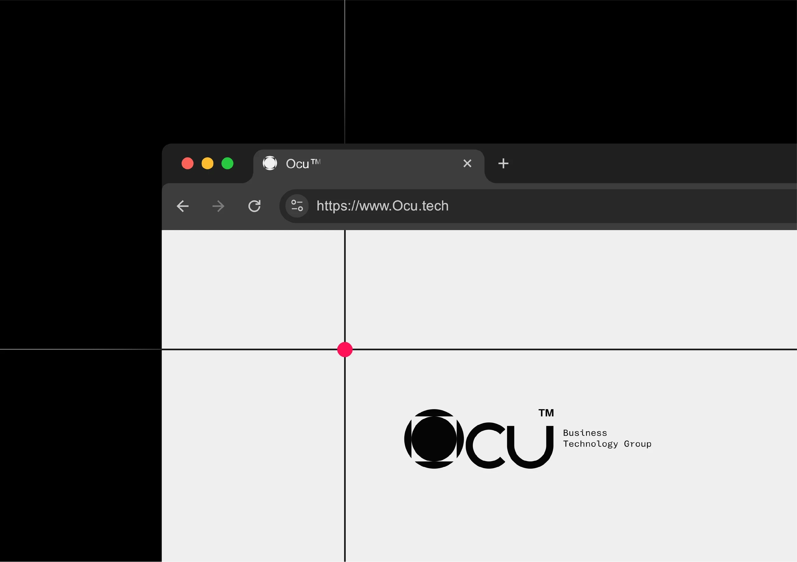
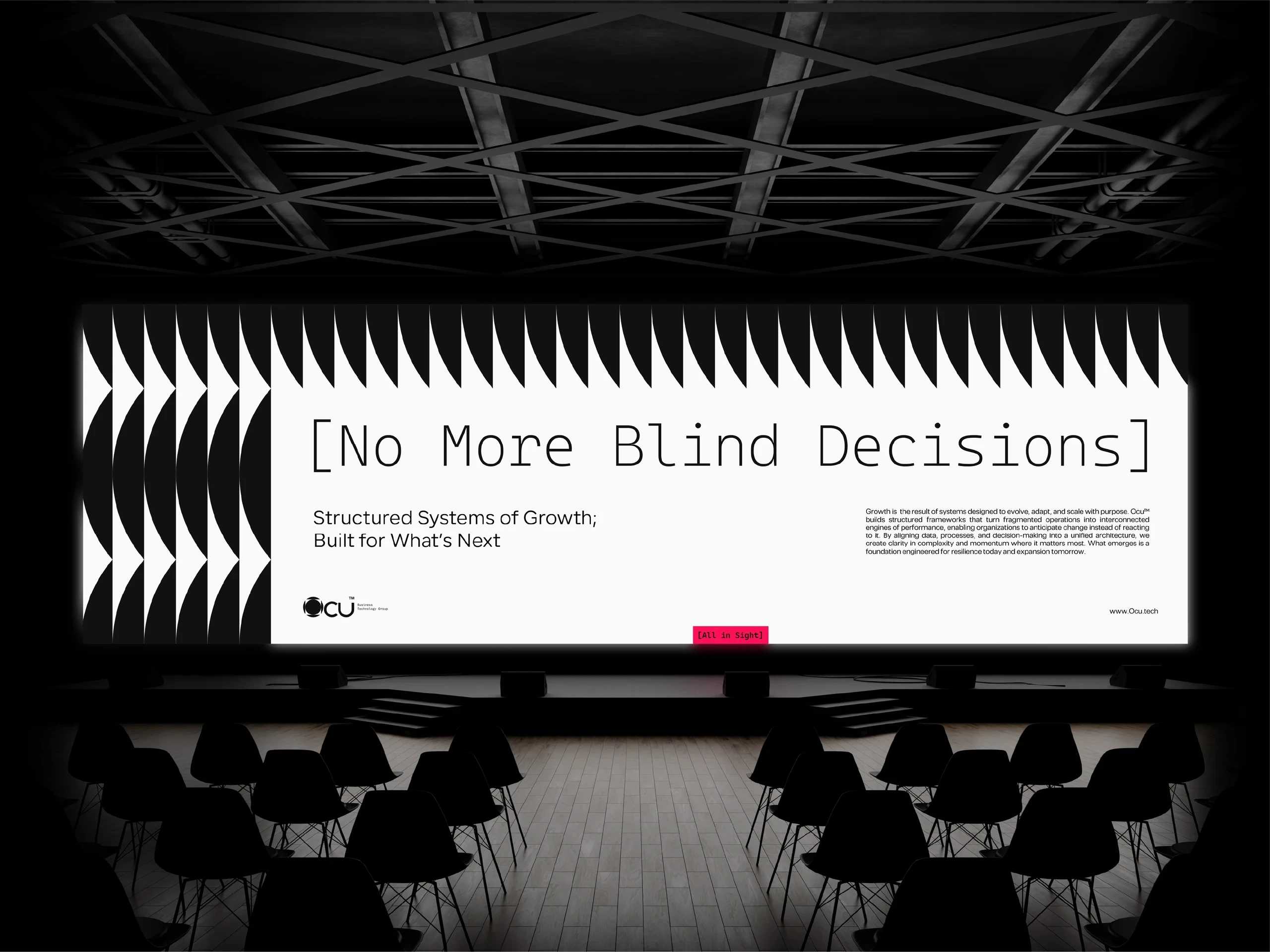
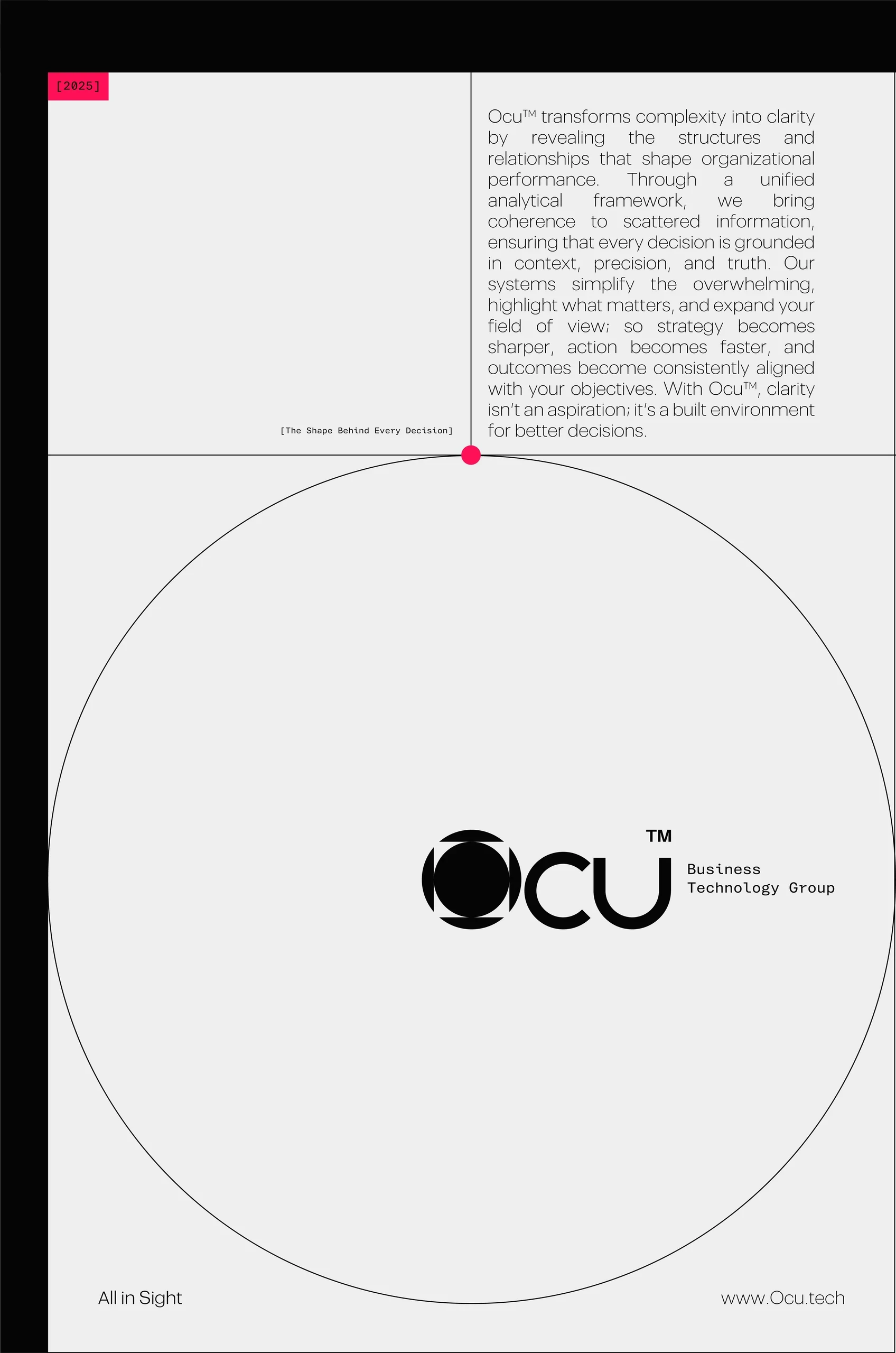
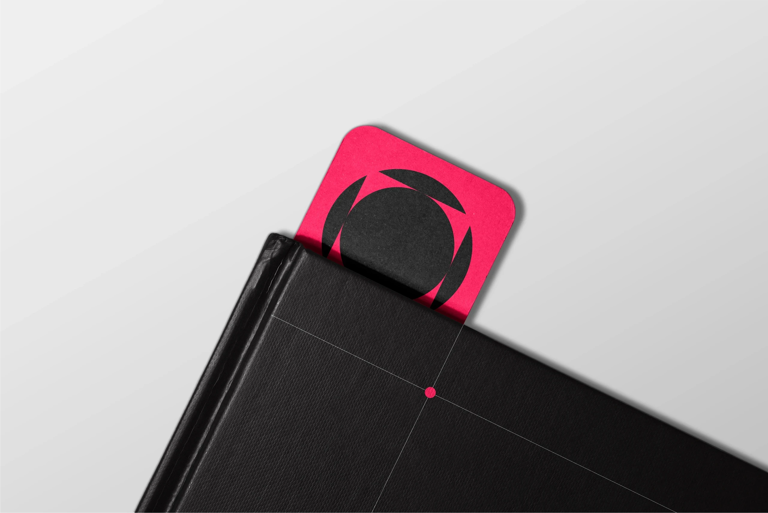
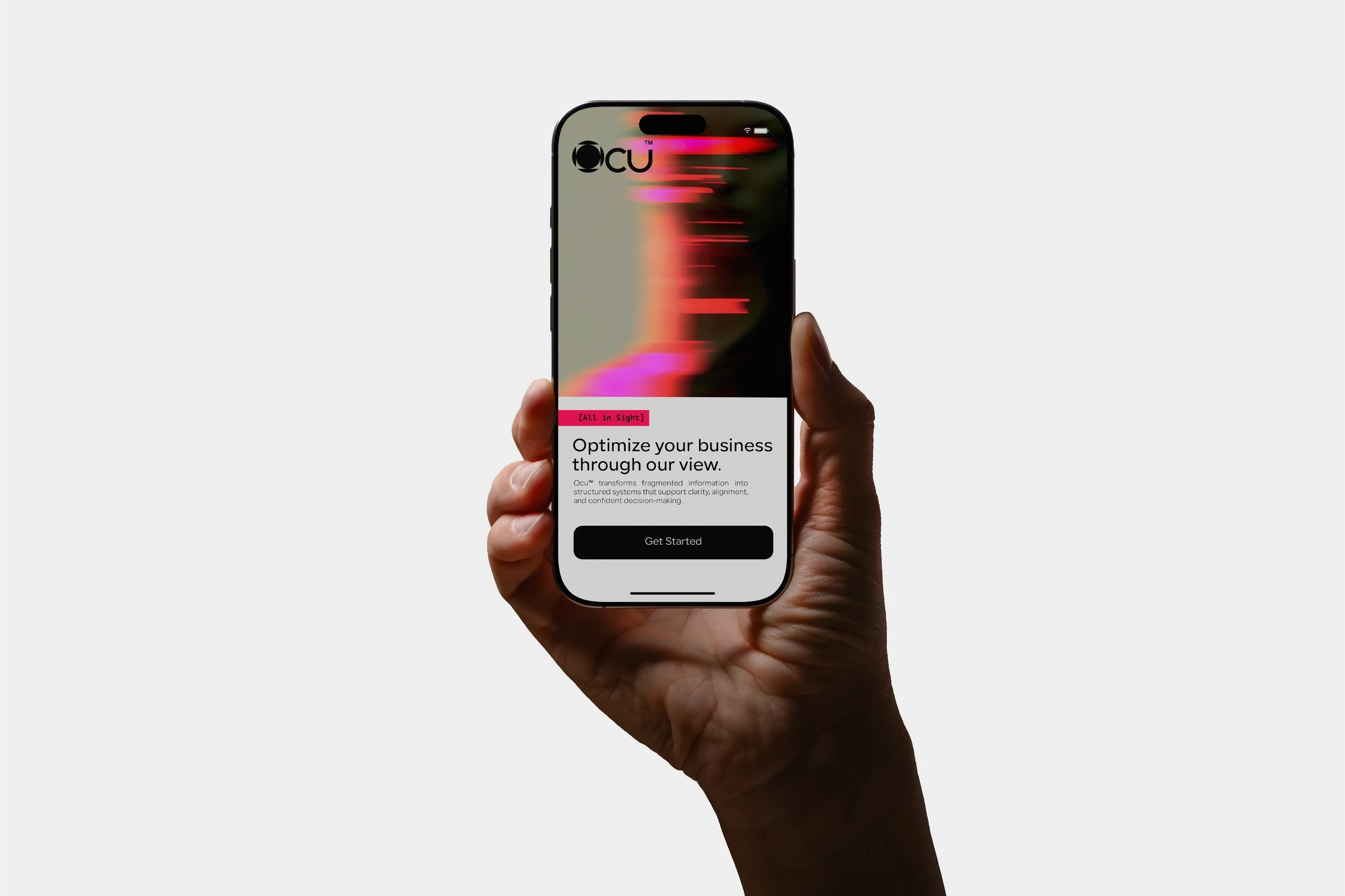
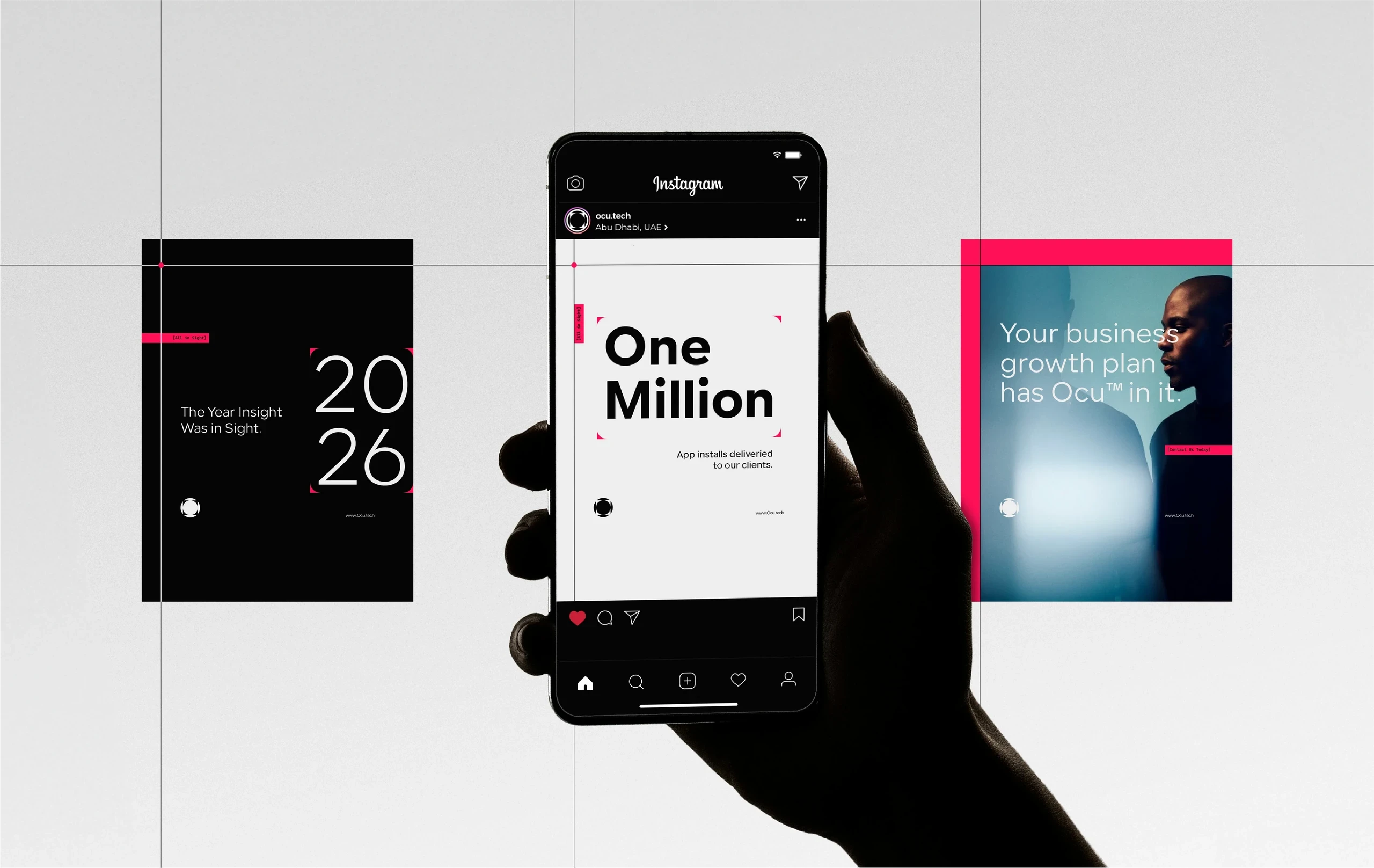
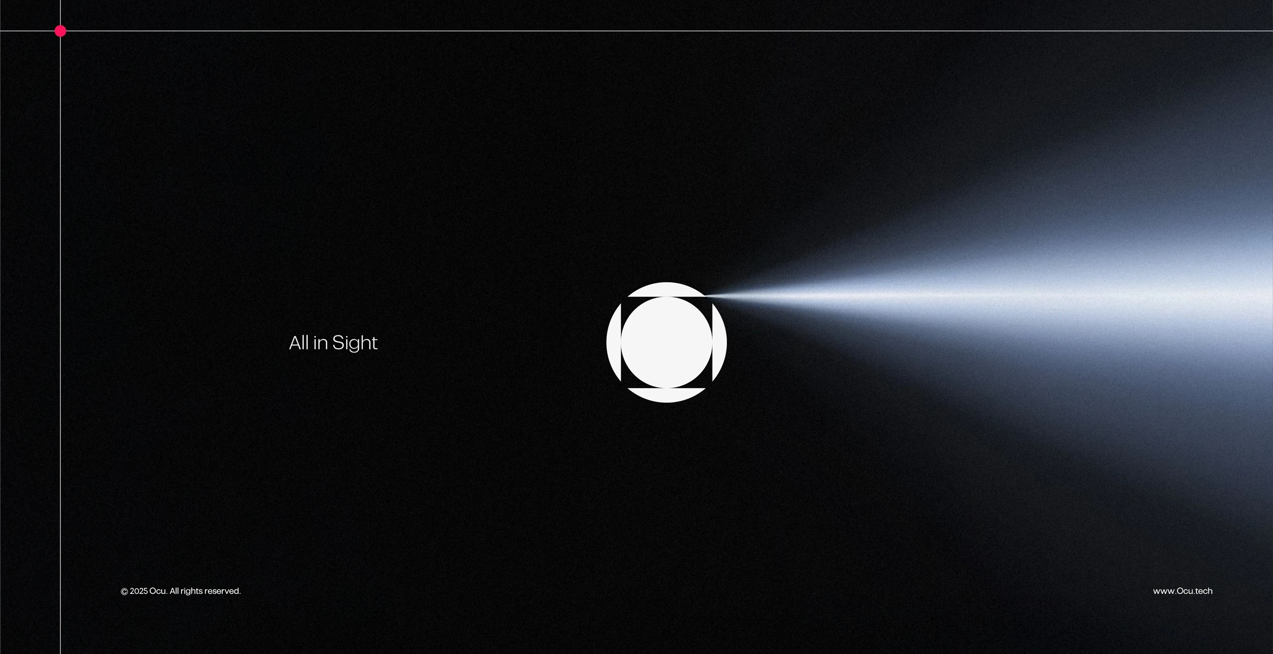
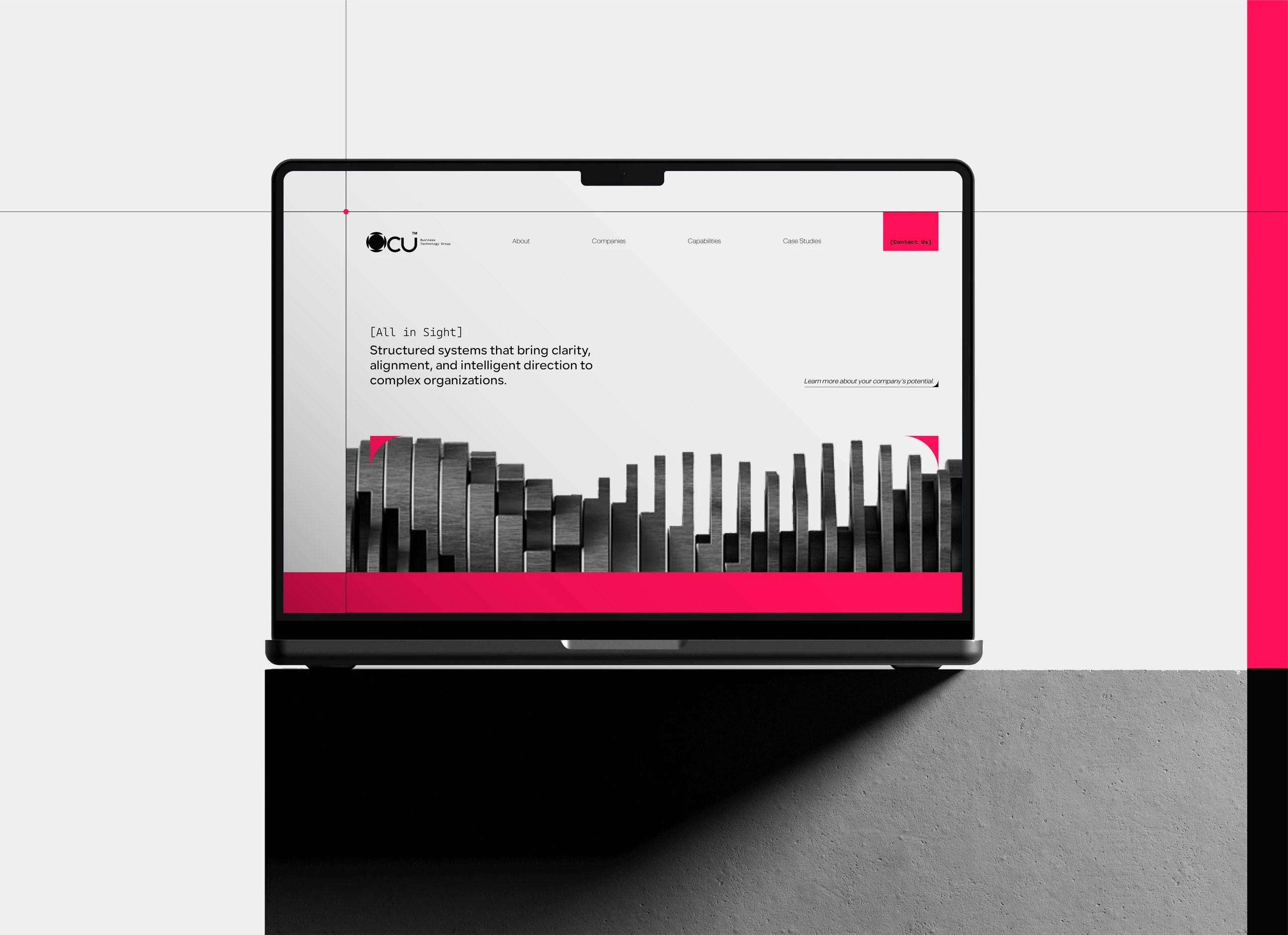
The brand system draws from cone-of-vision diagrams, framing devices, and perspective geometry to create a visual identity that communicates clarity and intentionality. The "O" mark functions as a structural symbol of observation and focus, while unequal margins and spatial hierarchy create controlled tension throughout layouts. Typography uses bracketed framing and restrained monochrome tones to reinforce professionalism and decision-making. A single signal-pink accent is used sparingly to direct attention toward critical information. Rather than relying on decoration, the system uses composition, alignment, and visual focus as the primary branding tools, resulting in an identity that feels analytical, confident, and forward-looking.
The brand system draws from cone-of-vision diagrams, framing devices, and perspective geometry to create a visual identity that communicates clarity and intentionality. The "O" mark functions as a structural symbol of observation and focus, while unequal margins and spatial hierarchy create controlled tension throughout layouts. Typography uses bracketed framing and restrained monochrome tones to reinforce professionalism and decision-making. A single signal-pink accent is used sparingly to direct attention toward critical information. Rather than relying on decoration, the system uses composition, alignment, and visual focus as the primary branding tools, resulting in an identity that feels analytical, confident, and forward-looking.
The brand system draws from cone-of-vision diagrams, framing devices, and perspective geometry to create a visual identity that communicates clarity and intentionality. The "O" mark functions as a structural symbol of observation and focus, while unequal margins and spatial hierarchy create controlled tension throughout layouts. Typography uses bracketed framing and restrained monochrome tones to reinforce professionalism and decision-making. A single signal-pink accent is used sparingly to direct attention toward critical information. Rather than relying on decoration, the system uses composition, alignment, and visual focus as the primary branding tools, resulting in an identity that feels analytical, confident, and forward-looking.