Koub
Koub
Koub
Info
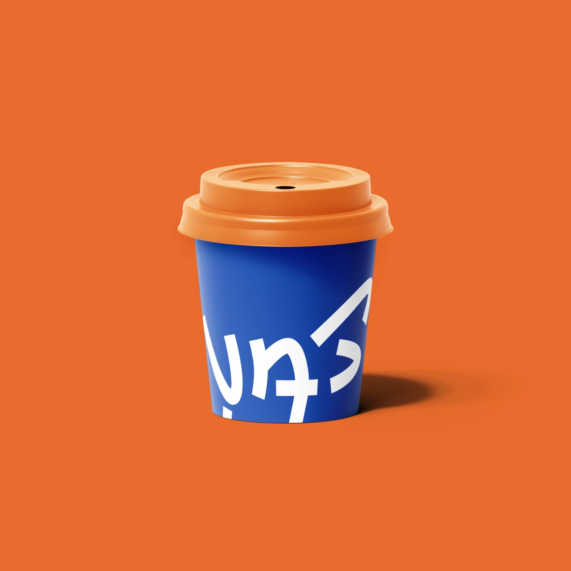
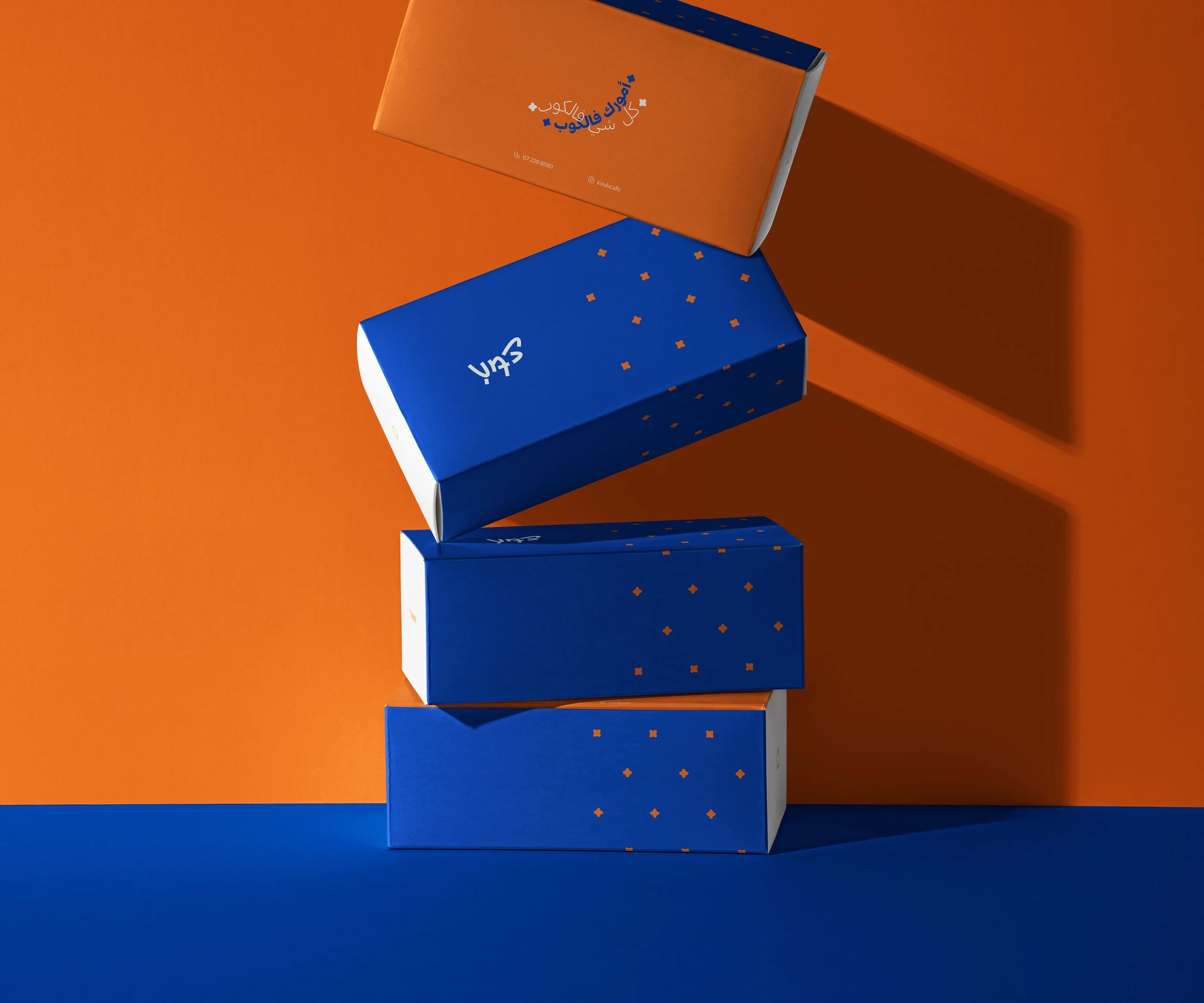
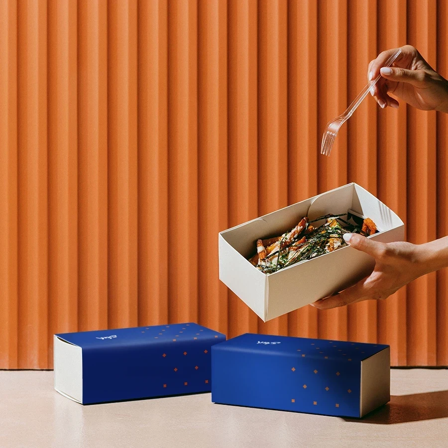
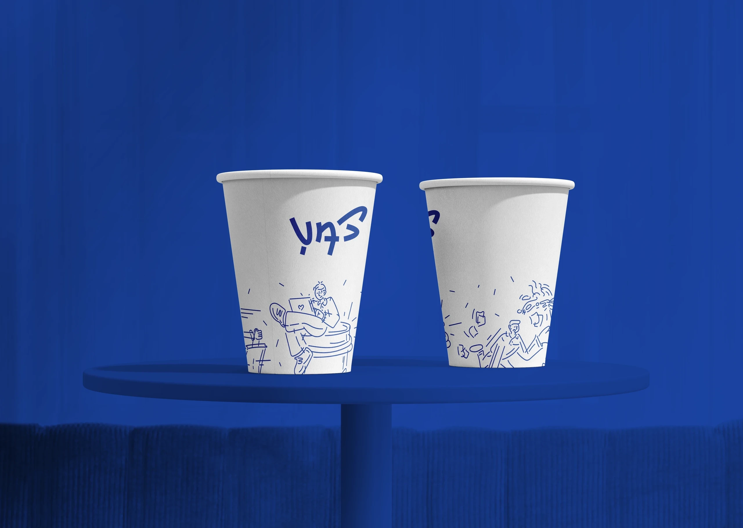
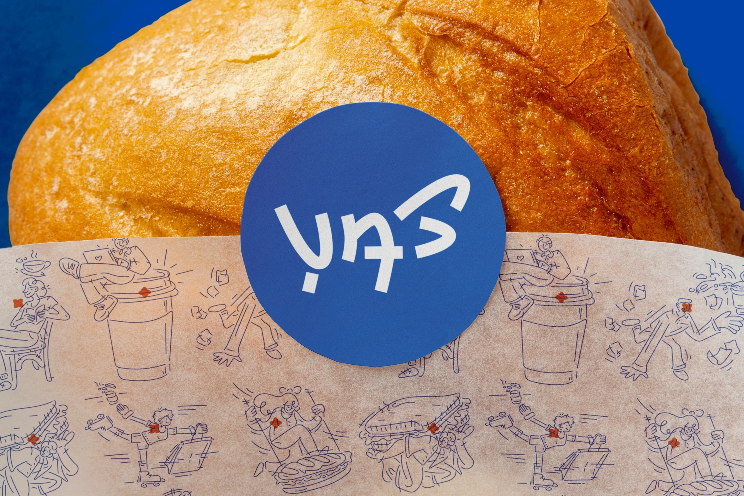
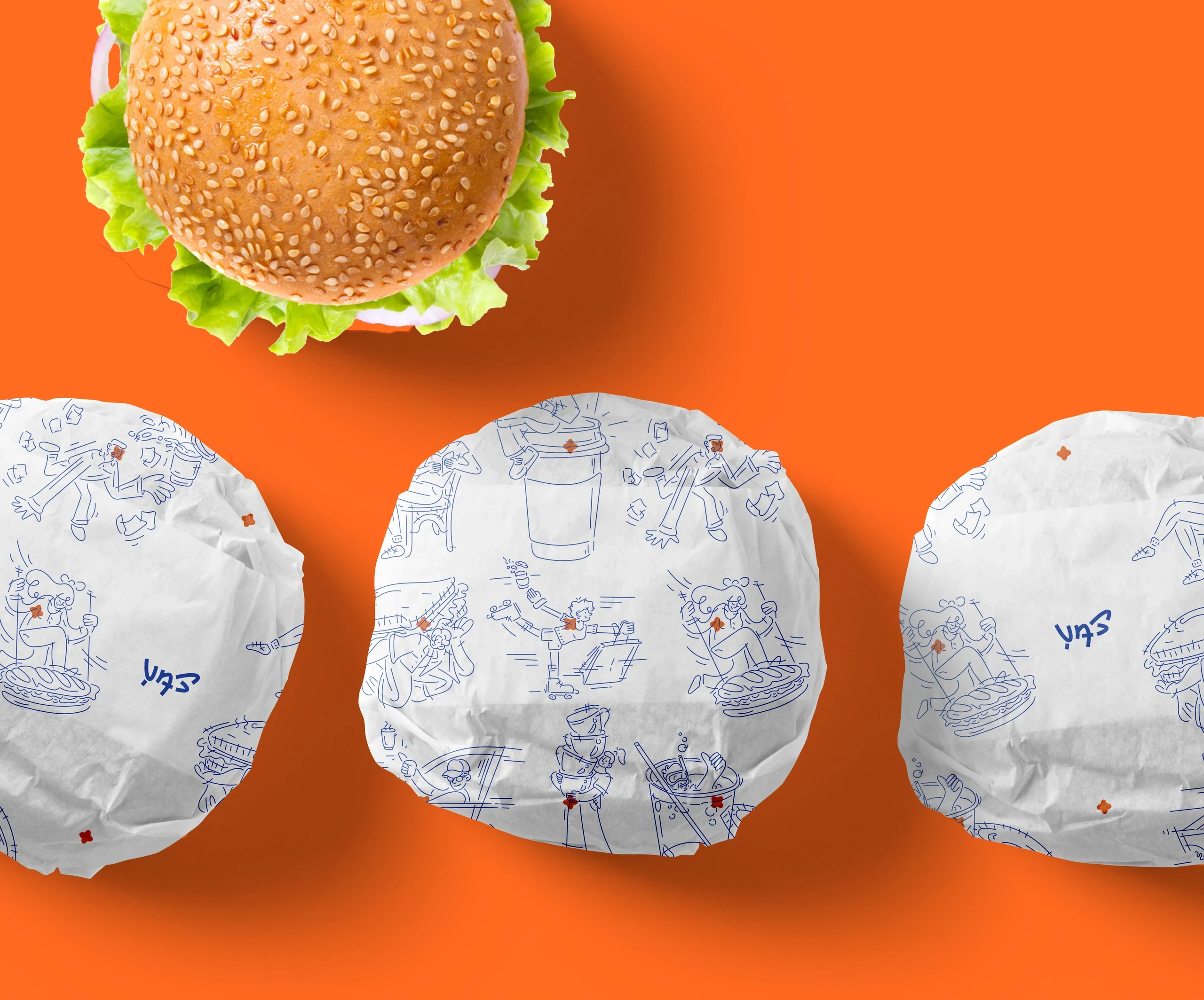
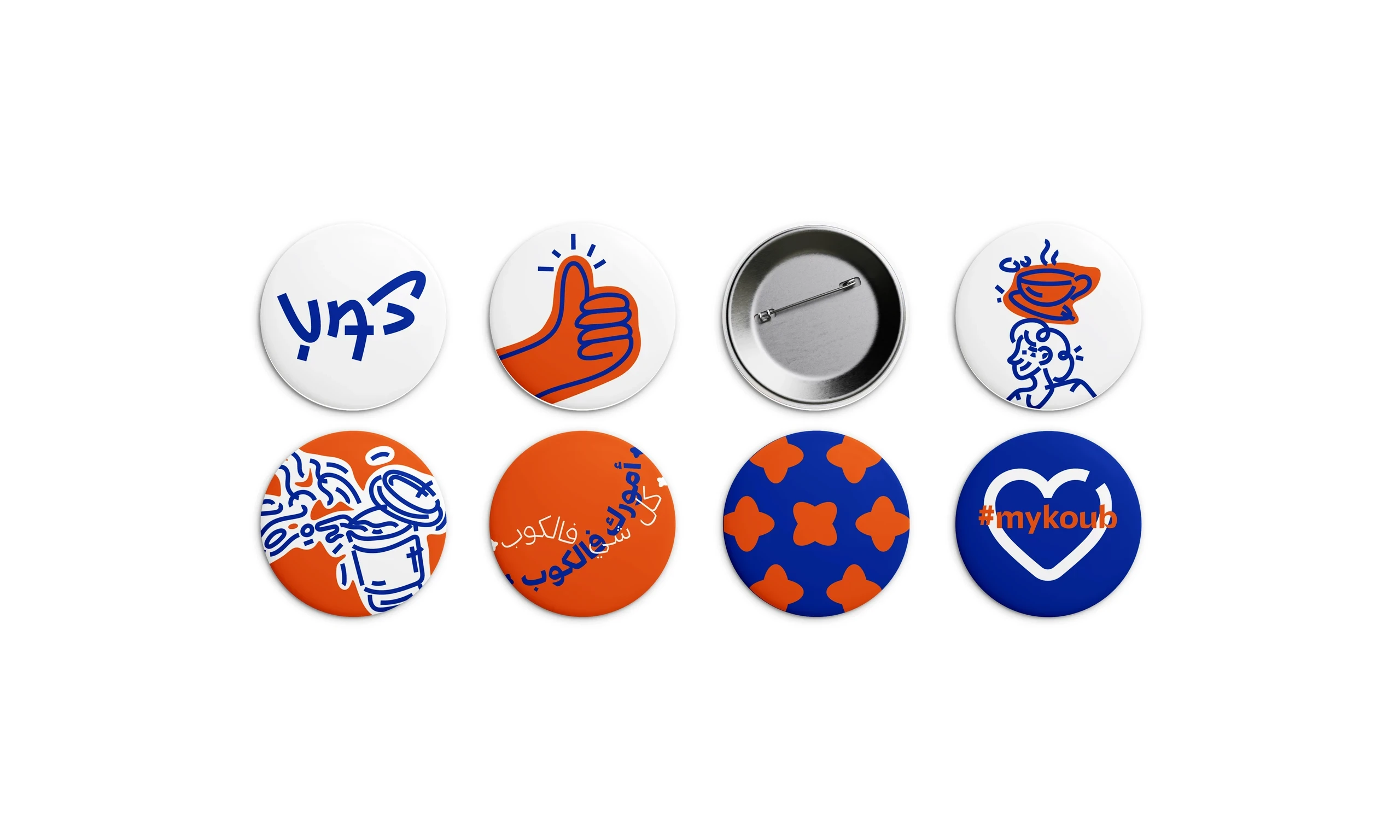
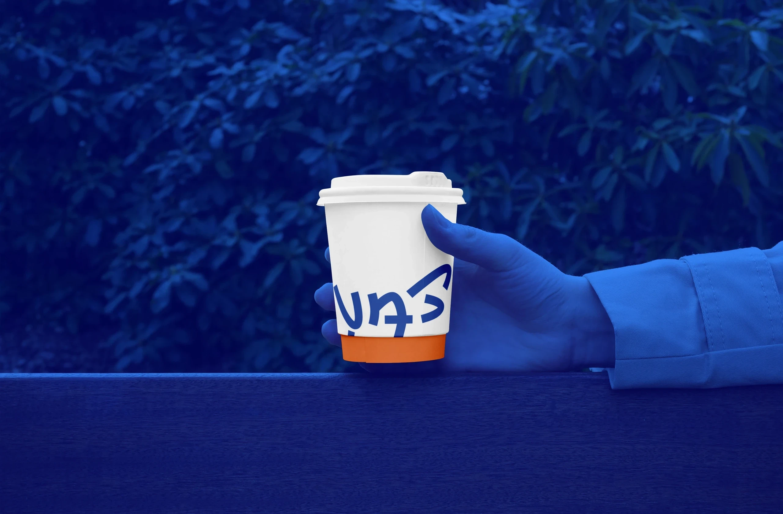
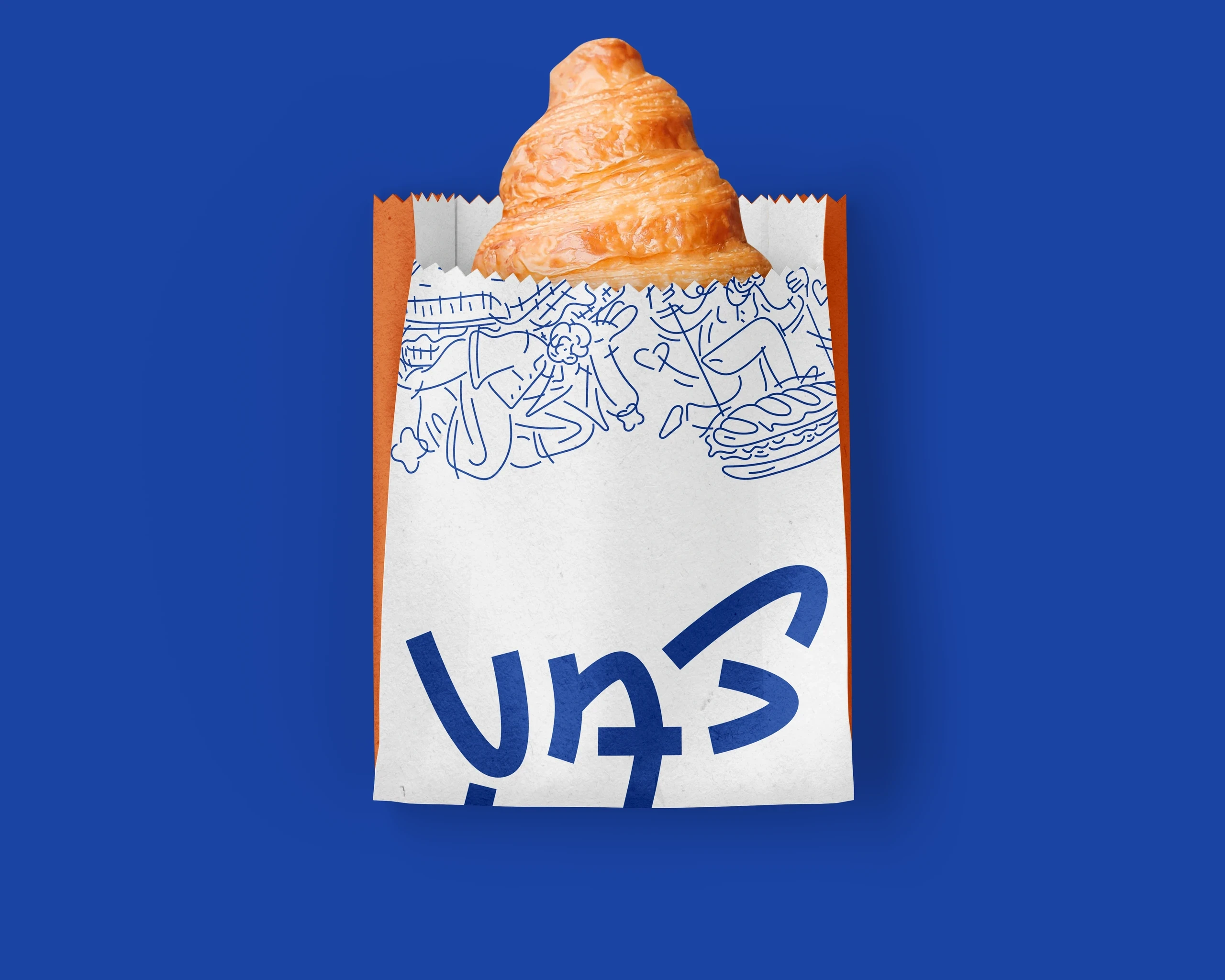
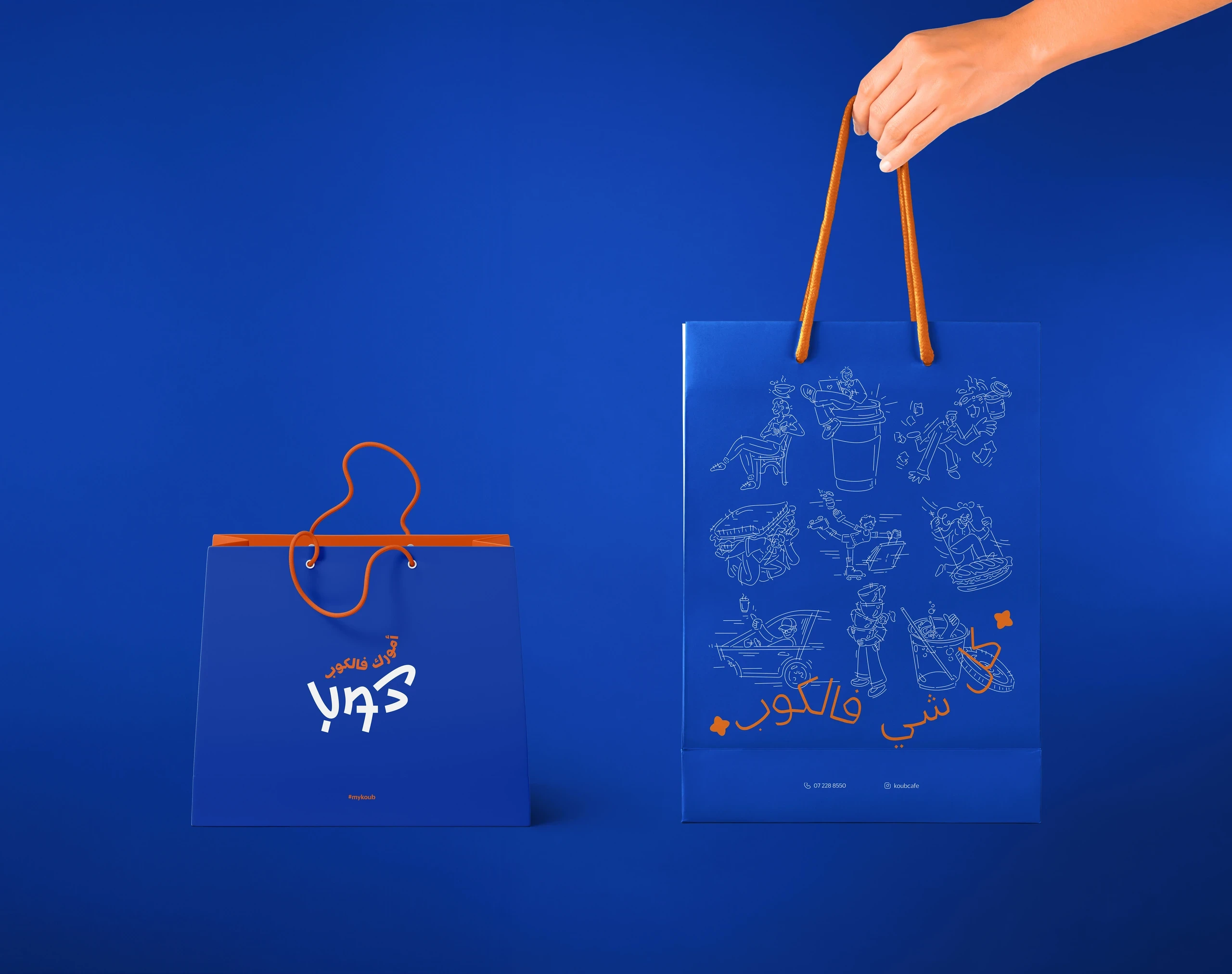
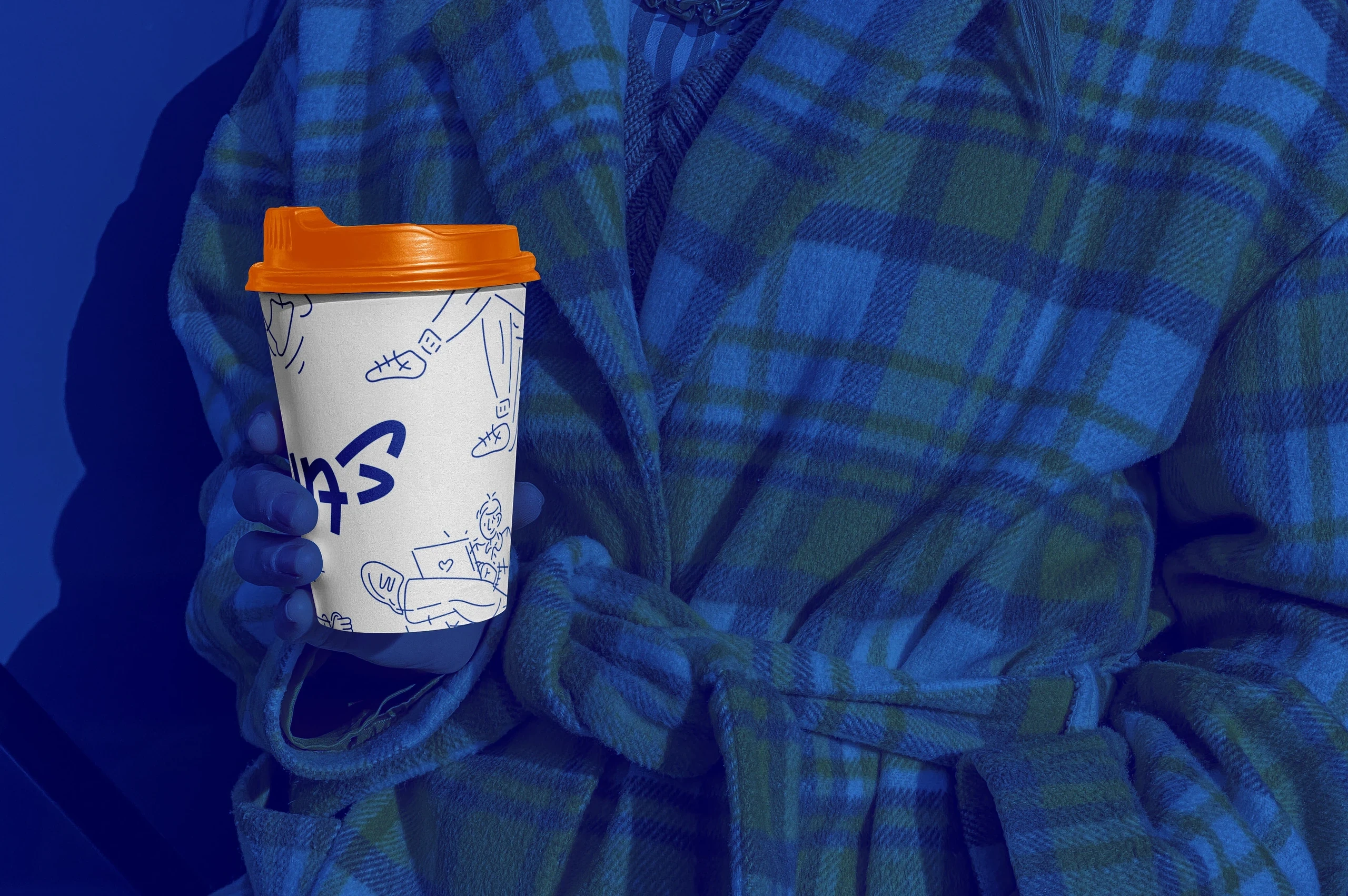
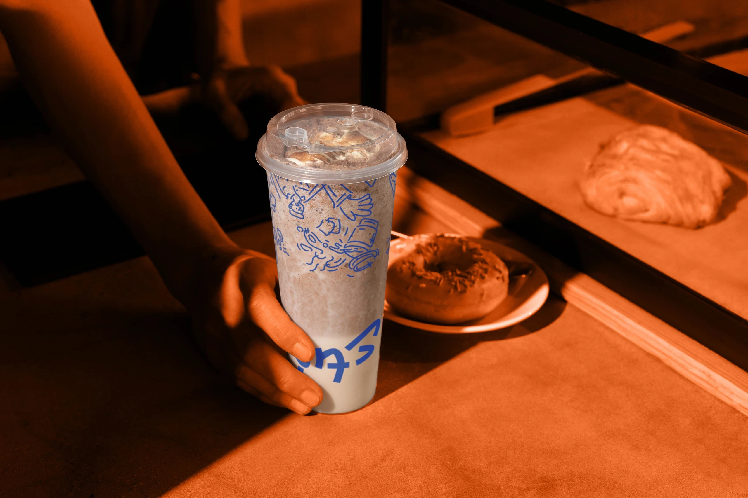
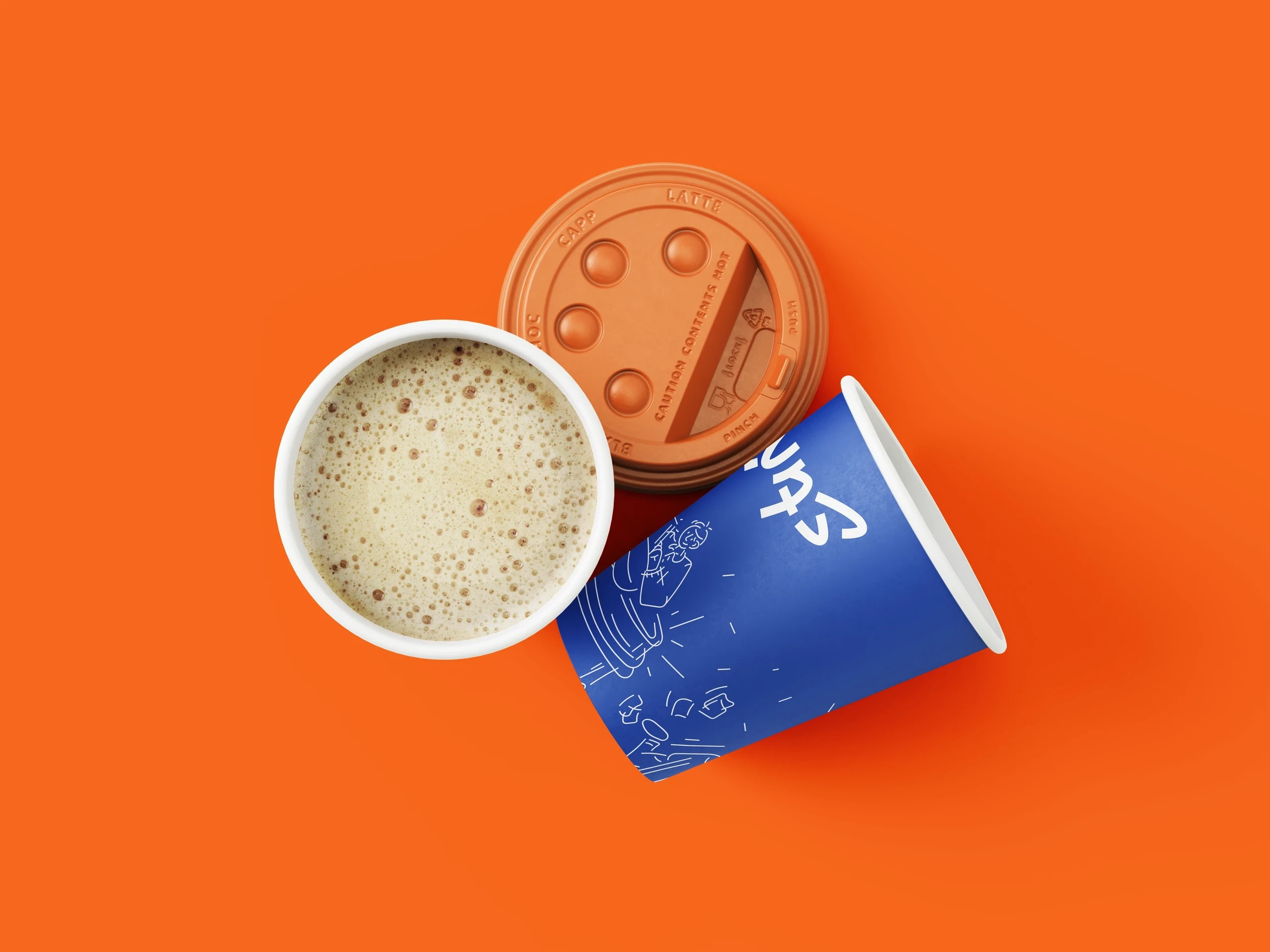
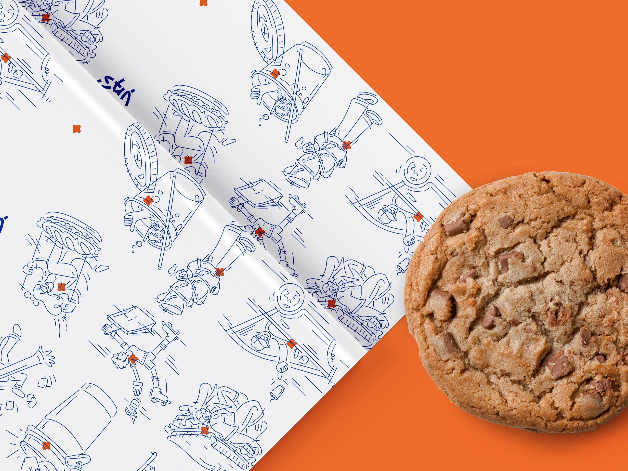
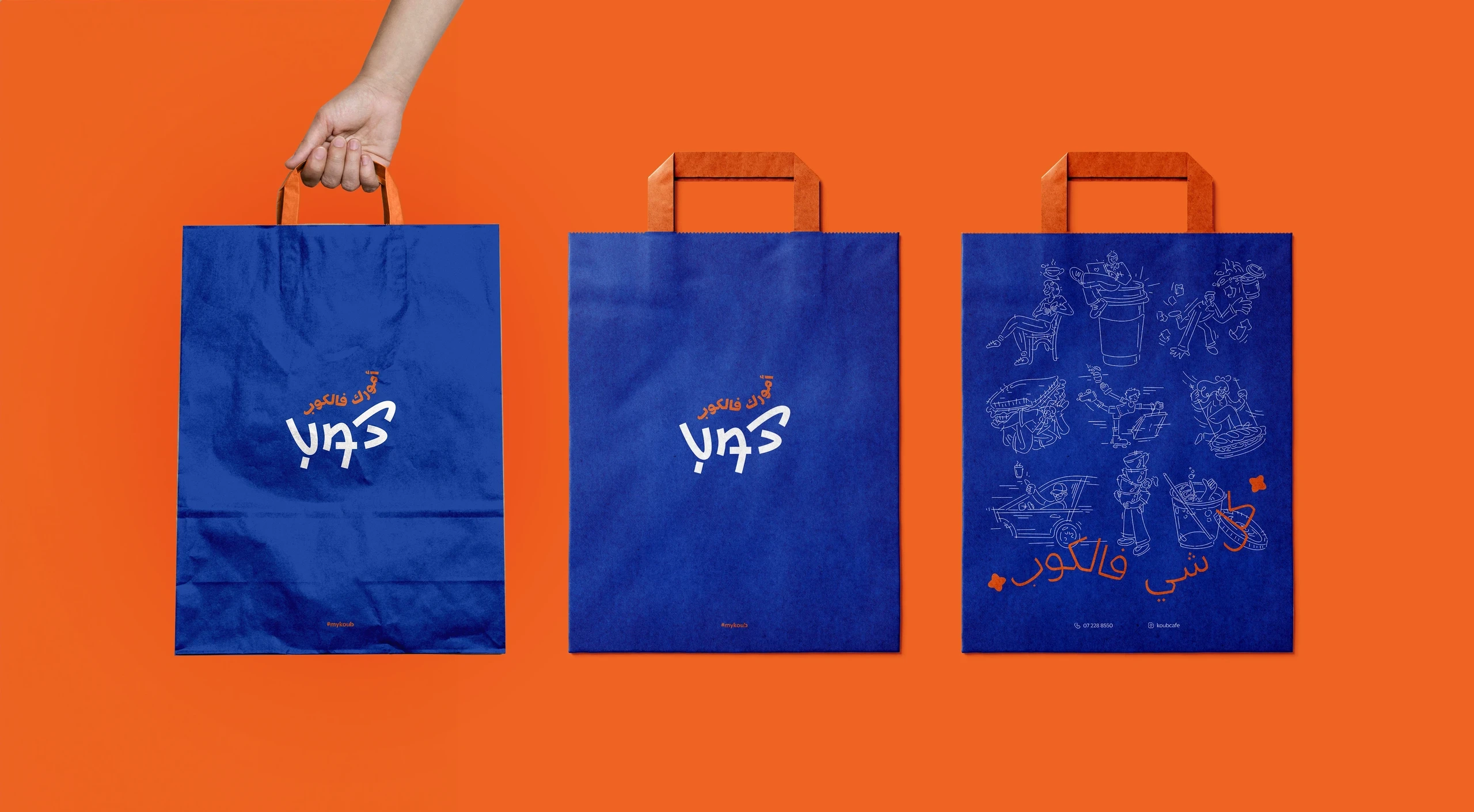
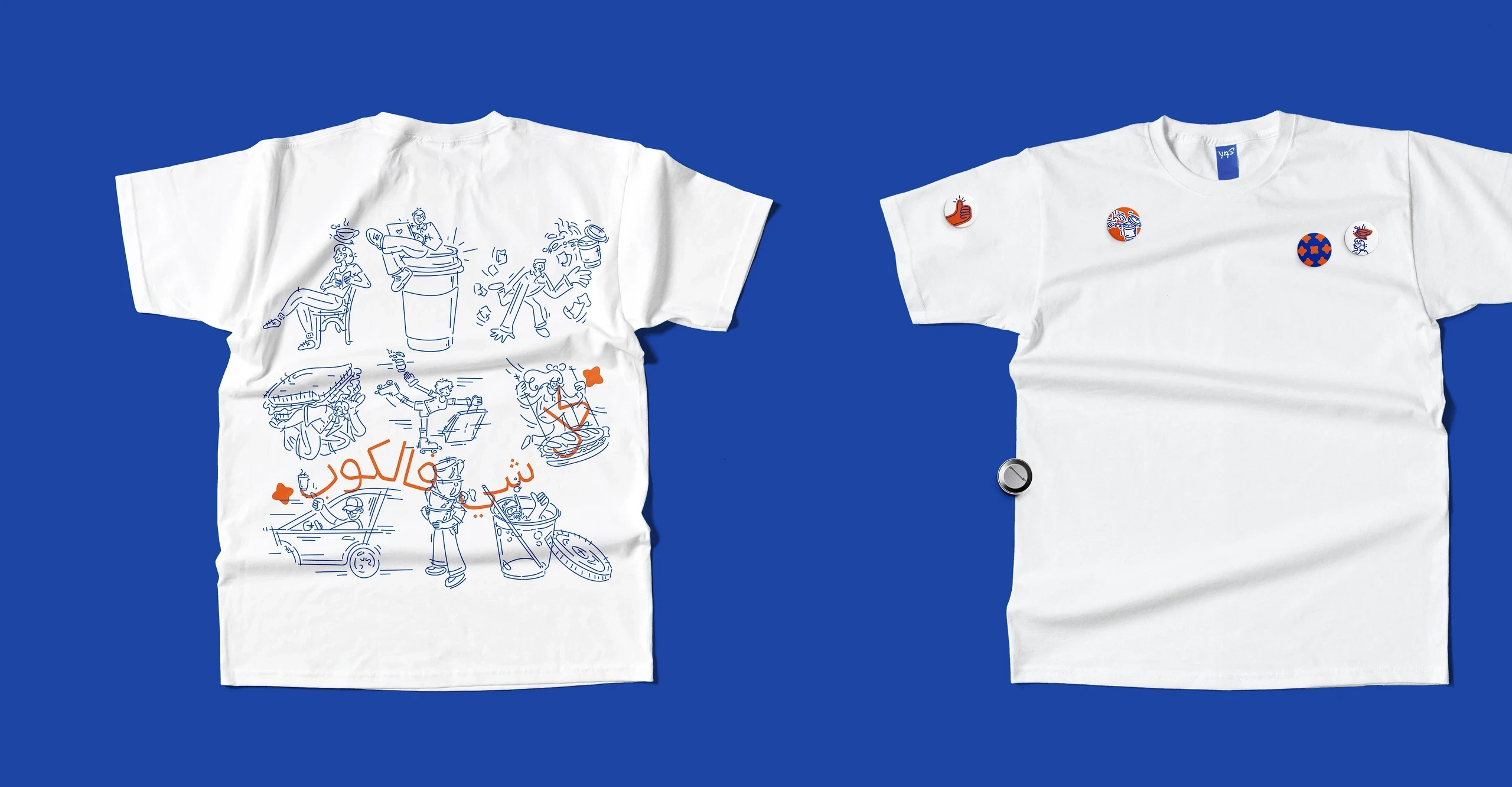
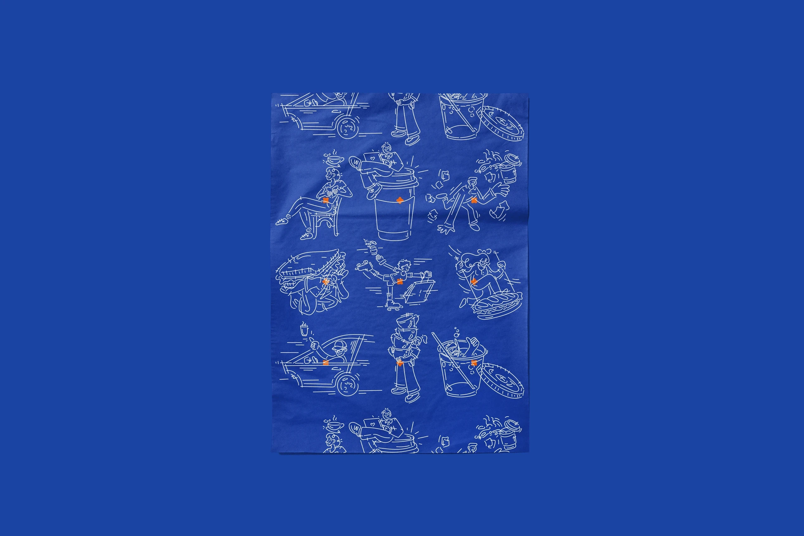
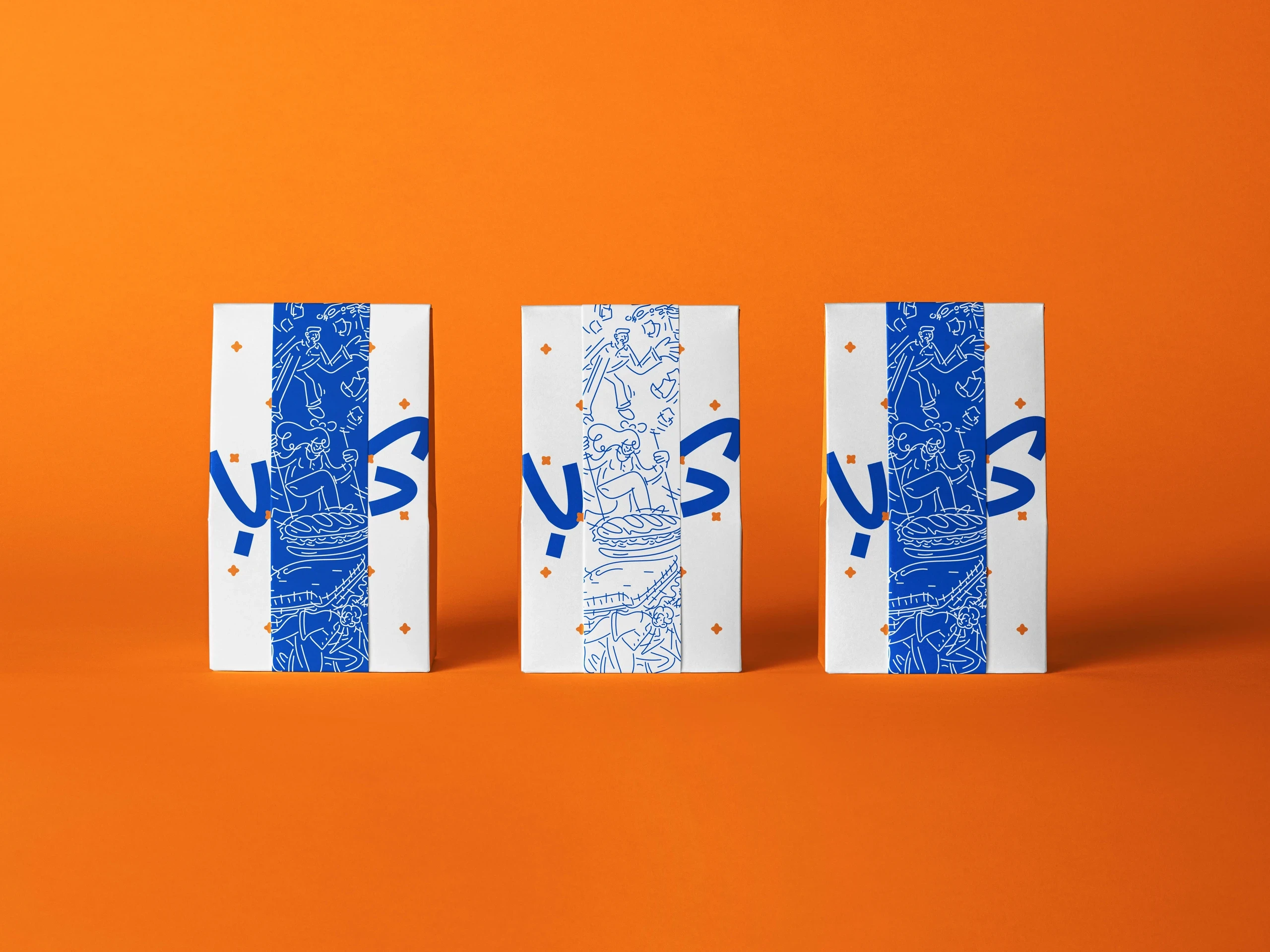
Koub is an eclectic brand identity that merges Arabic script and Japanese katakana into a bold, culturally hybrid visual system. Vibrant color blocking, playful illustration, and layered typography create a brand that feels energetic, contemporary, and highly distinctive.
Year
2023
Client
Koub
Services
Brand Identity, Illustration
The project explores how different writing systems can coexist within a cohesive identity without becoming ornamental. The logo combines Arabic and katakana influences into a custom mark that feels graphic and immediately recognizable. A palette of saturated blue, orange, and white avoids gradients in favor of strong, solid color fields that maximize impact. Hand-drawn illustrations and character-like graphics introduce warmth and personality, while carefully controlled proportions and layering maintain clarity across applications. The result is a visual identity that feels playful and approachable while still demonstrating strong structure and brand consistency.
The project explores how different writing systems can coexist within a cohesive identity without becoming ornamental. The logo combines Arabic and katakana influences into a custom mark that feels graphic and immediately recognizable. A palette of saturated blue, orange, and white avoids gradients in favor of strong, solid color fields that maximize impact. Hand-drawn illustrations and character-like graphics introduce warmth and personality, while carefully controlled proportions and layering maintain clarity across applications. The result is a visual identity that feels playful and approachable while still demonstrating strong structure and brand consistency.
The project explores how different writing systems can coexist within a cohesive identity without becoming ornamental. The logo combines Arabic and katakana influences into a custom mark that feels graphic and immediately recognizable. A palette of saturated blue, orange, and white avoids gradients in favor of strong, solid color fields that maximize impact. Hand-drawn illustrations and character-like graphics introduce warmth and personality, while carefully controlled proportions and layering maintain clarity across applications. The result is a visual identity that feels playful and approachable while still demonstrating strong structure and brand consistency.