Cupital
Cupital
Cupital
Info
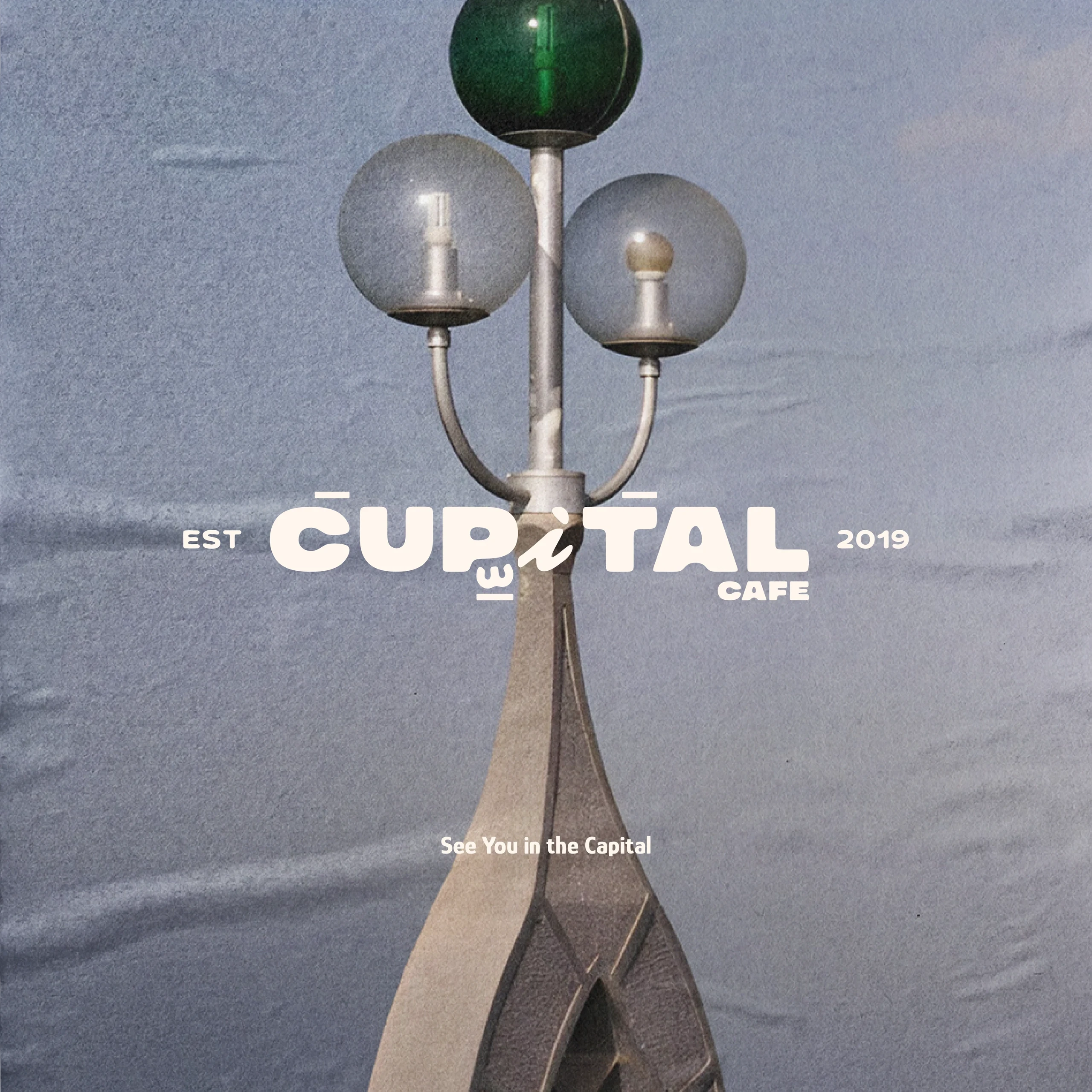
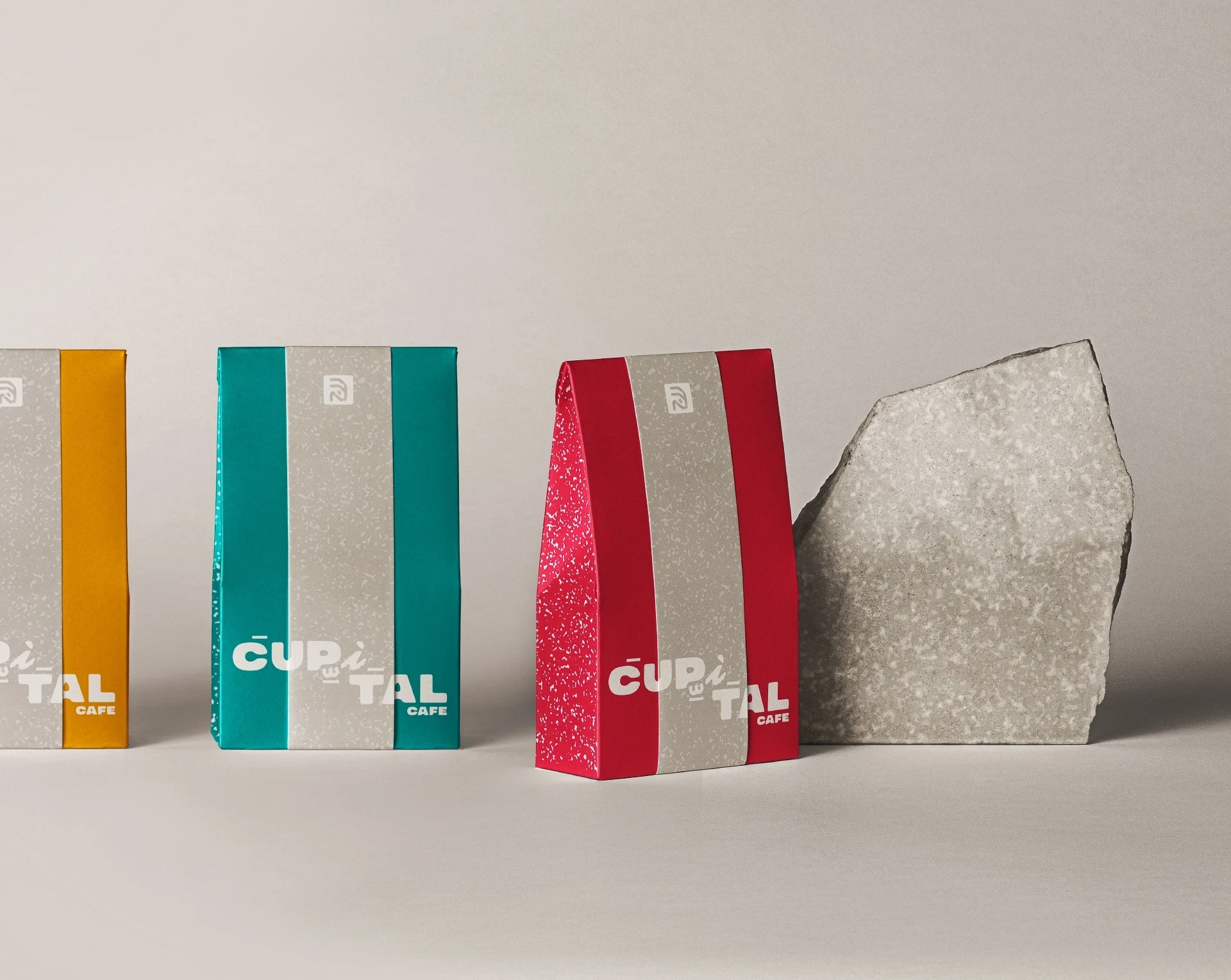
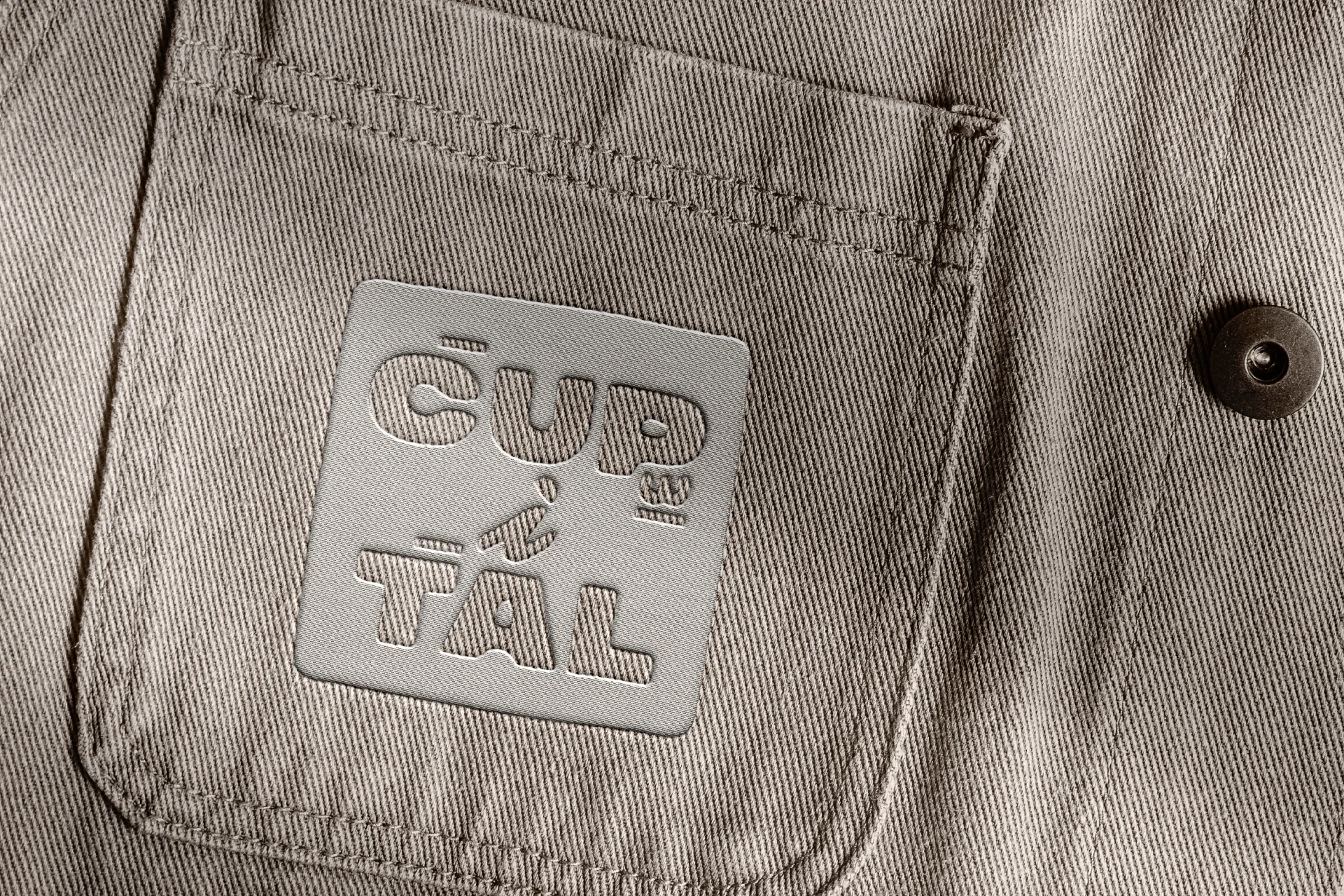
Cupital Cafe is a rebrand that celebrates Abu Dhabi's heritage through a contemporary coffee experience. Arabic and English typography, archival-inspired illustration, and a restrained palette work together to create a brand that feels local, welcoming, and culturally rich.
Year
2024
Client
Cupital
Services
Brand Identity, Product Design
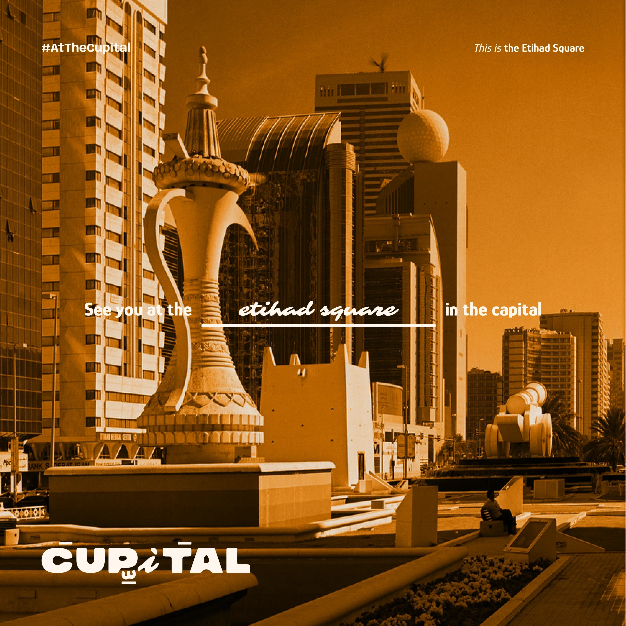
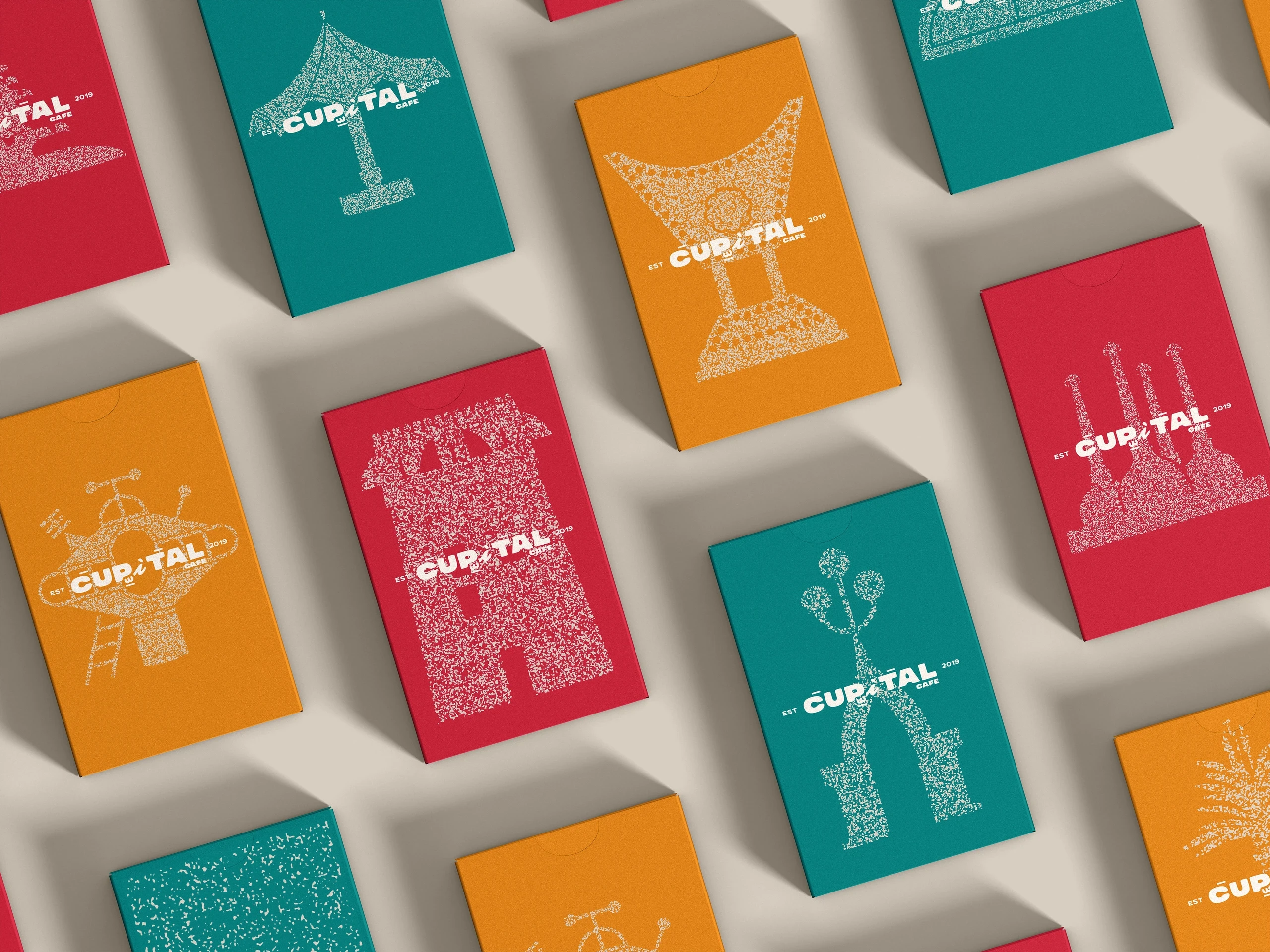
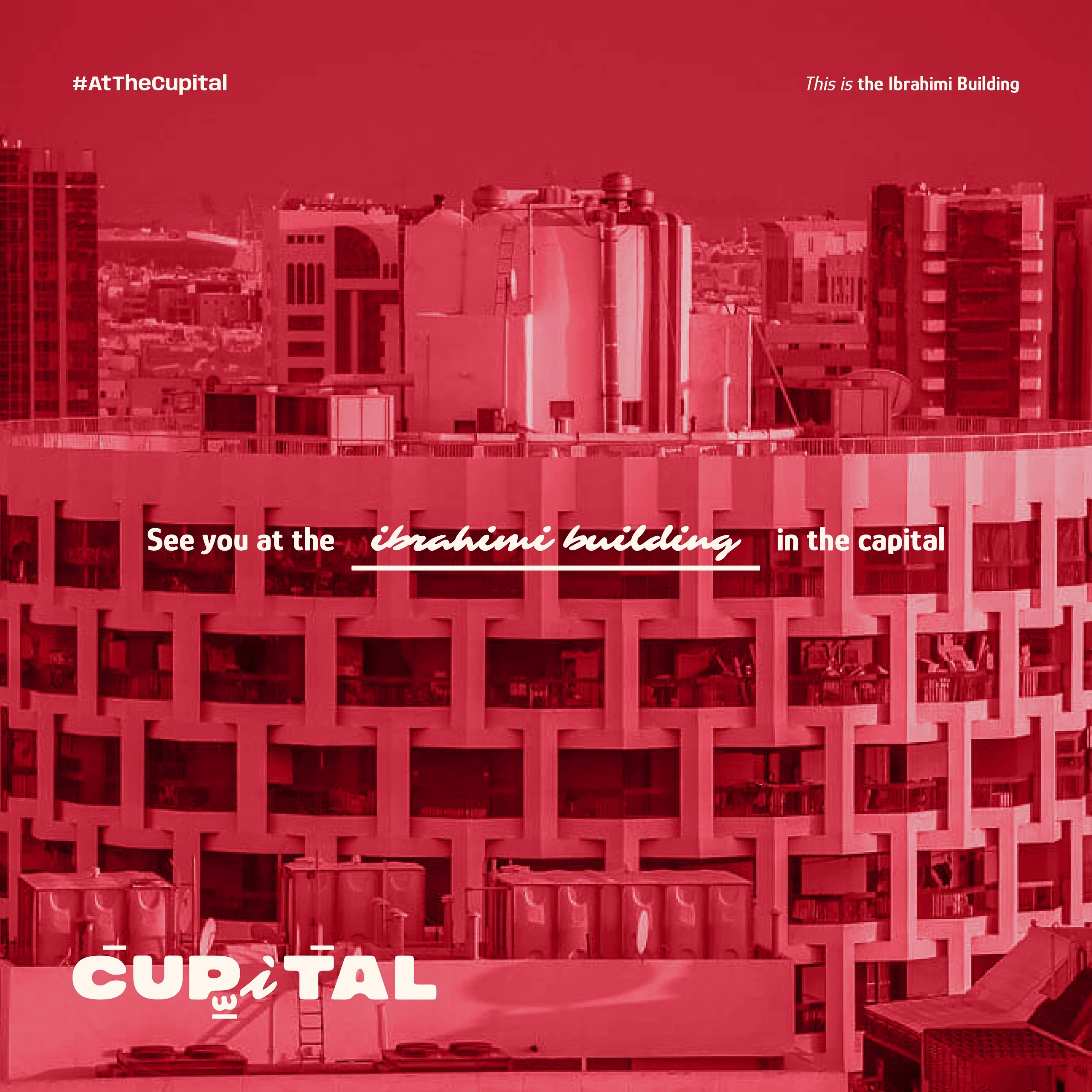
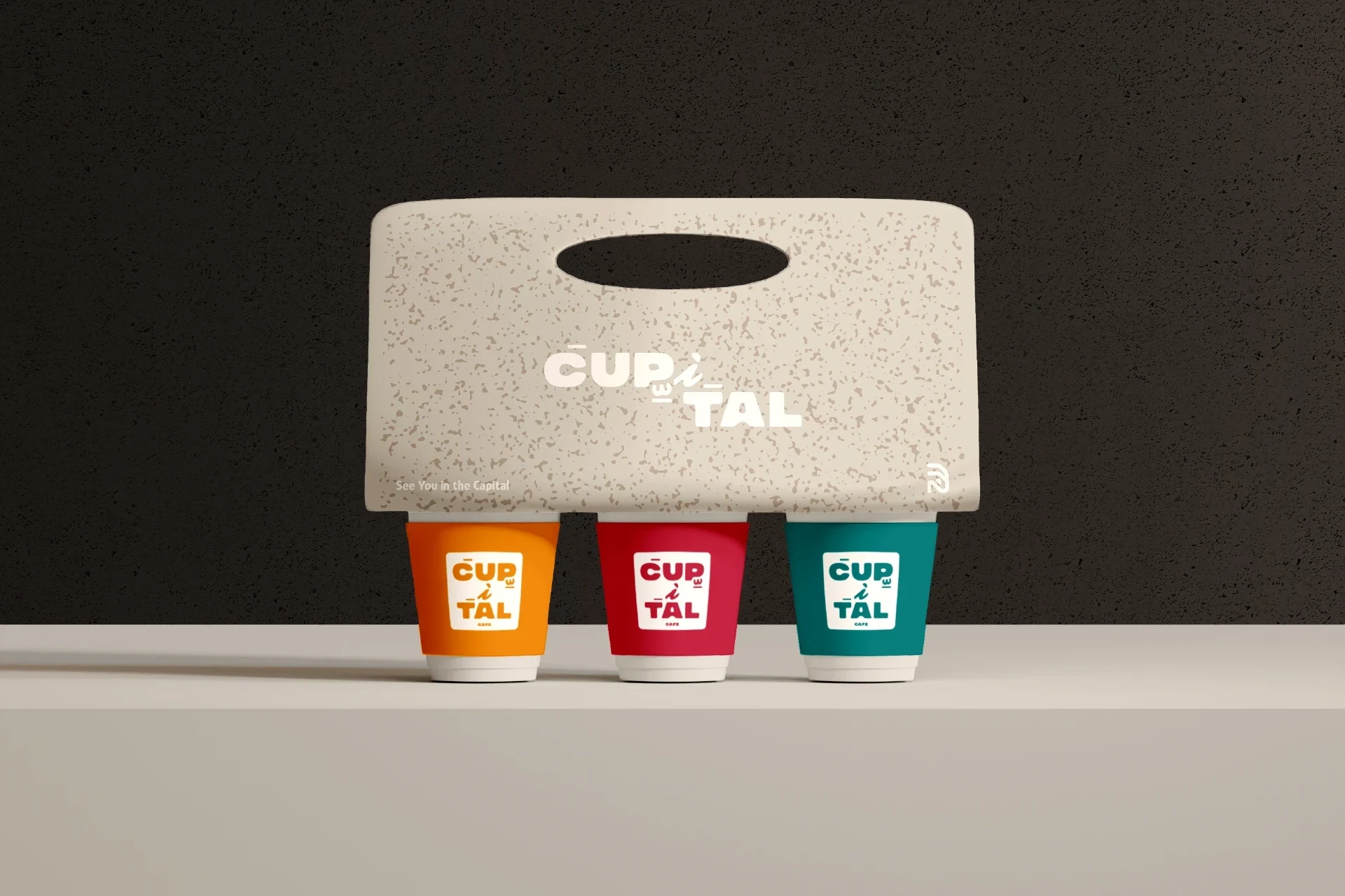
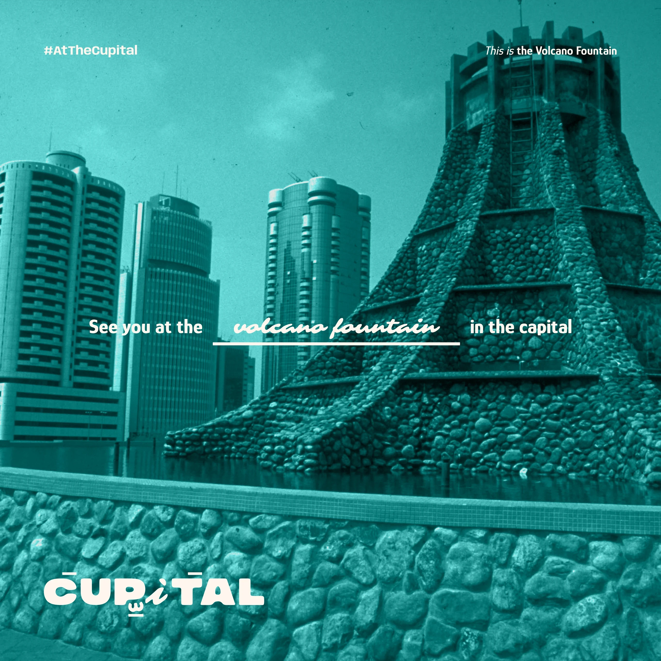
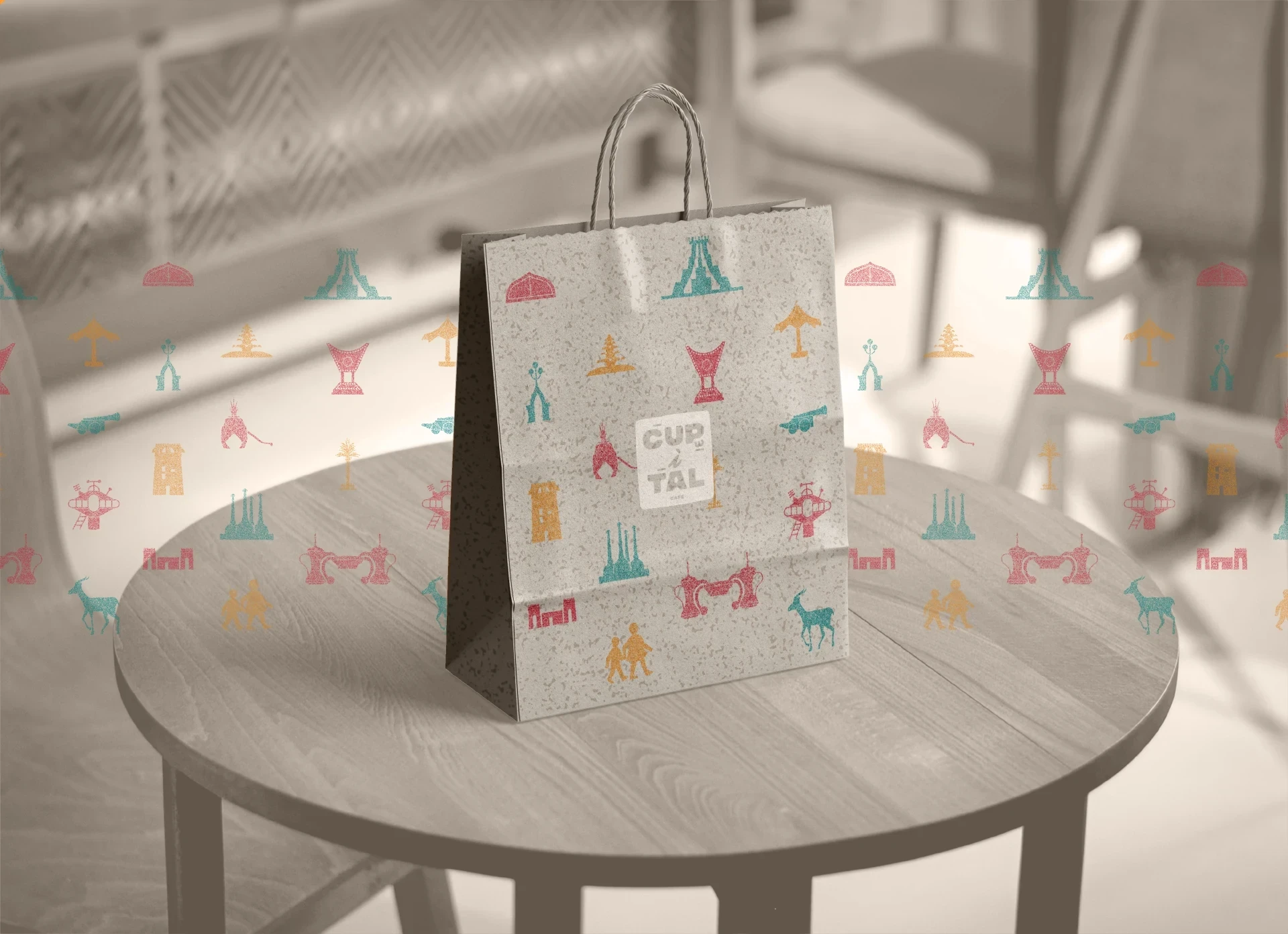
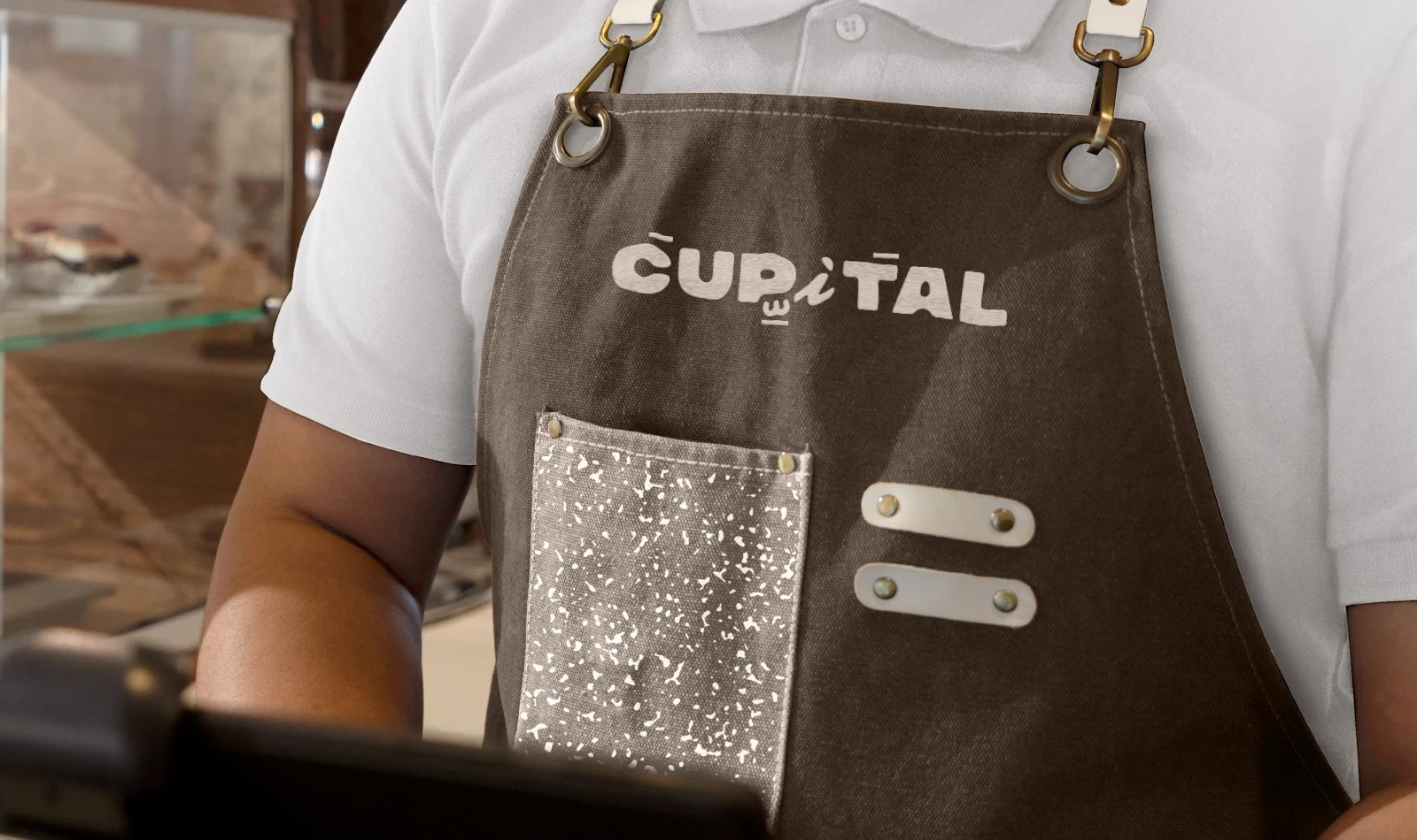
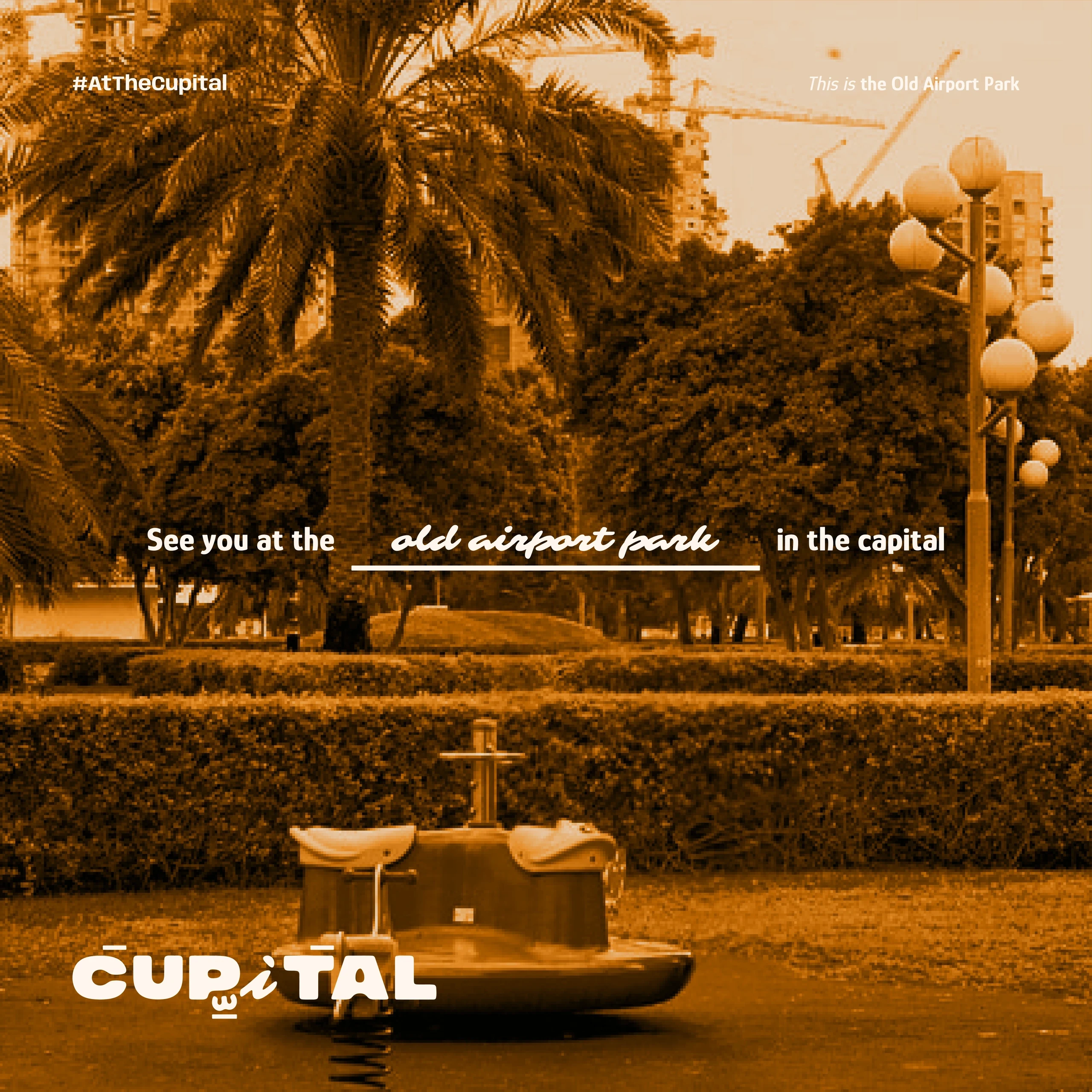
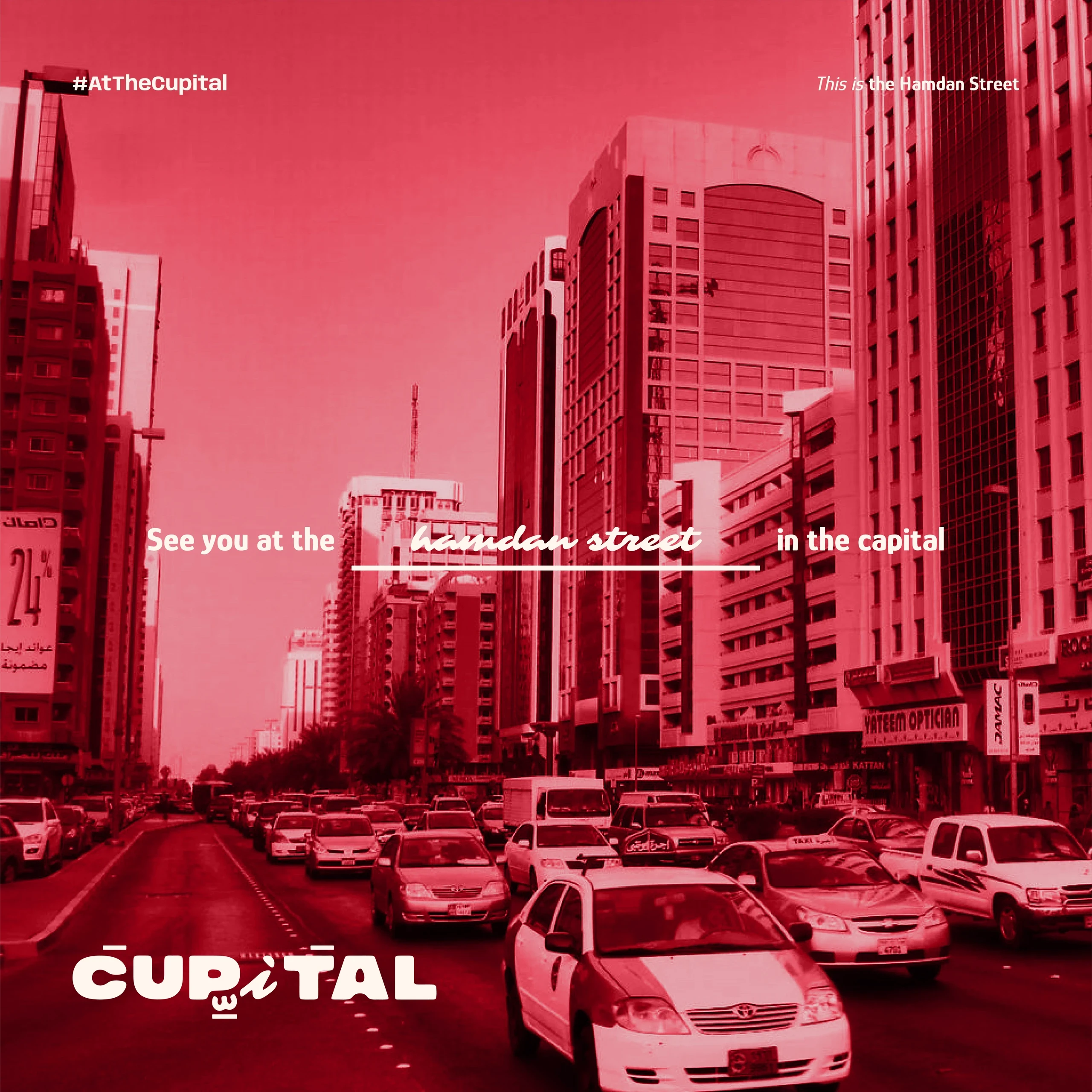
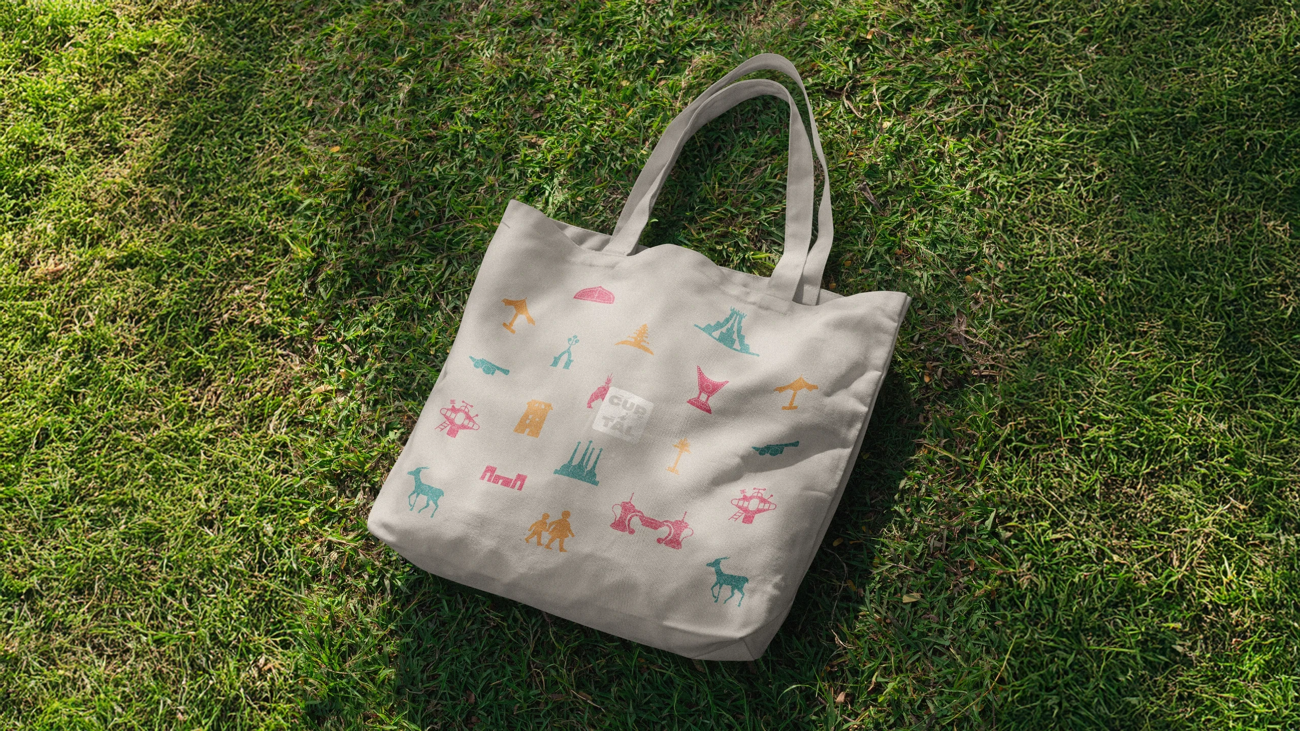
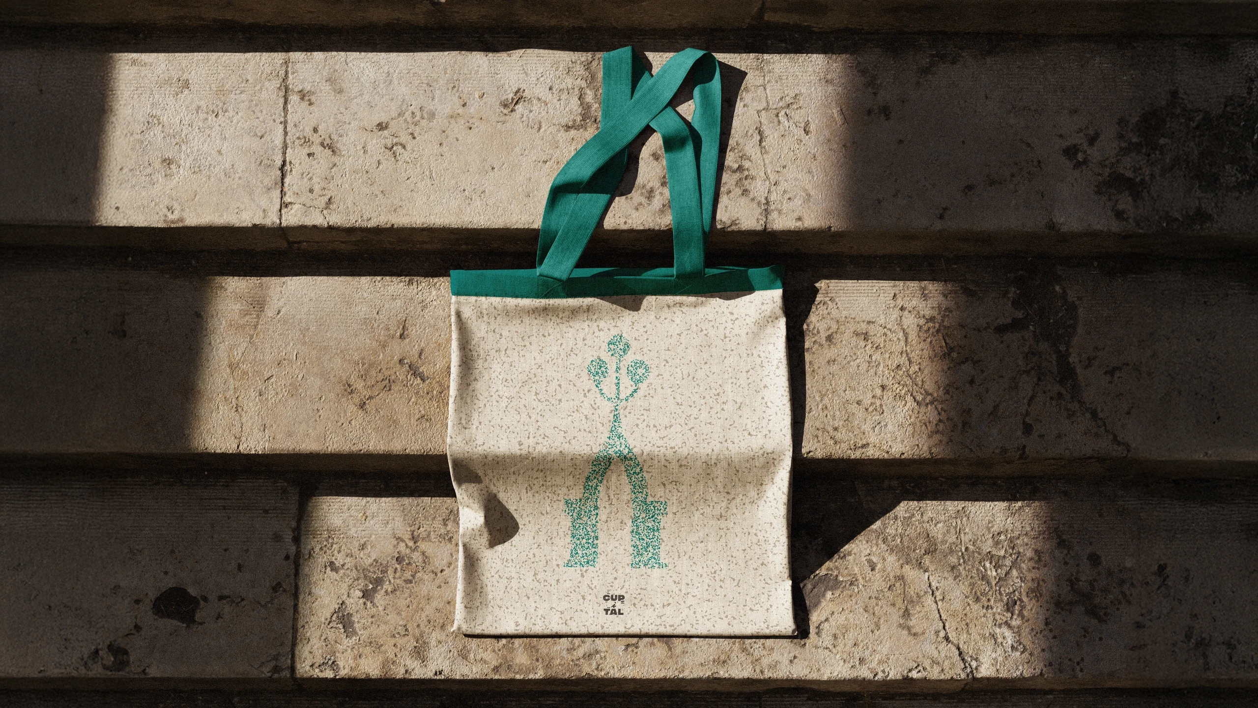
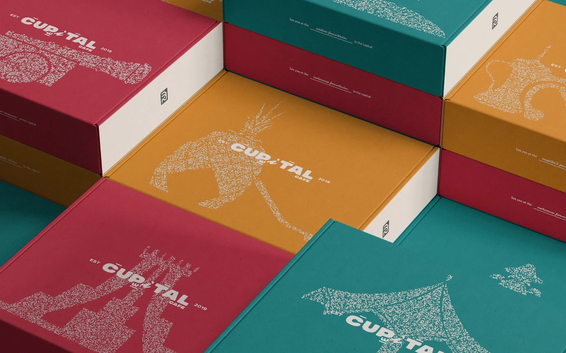
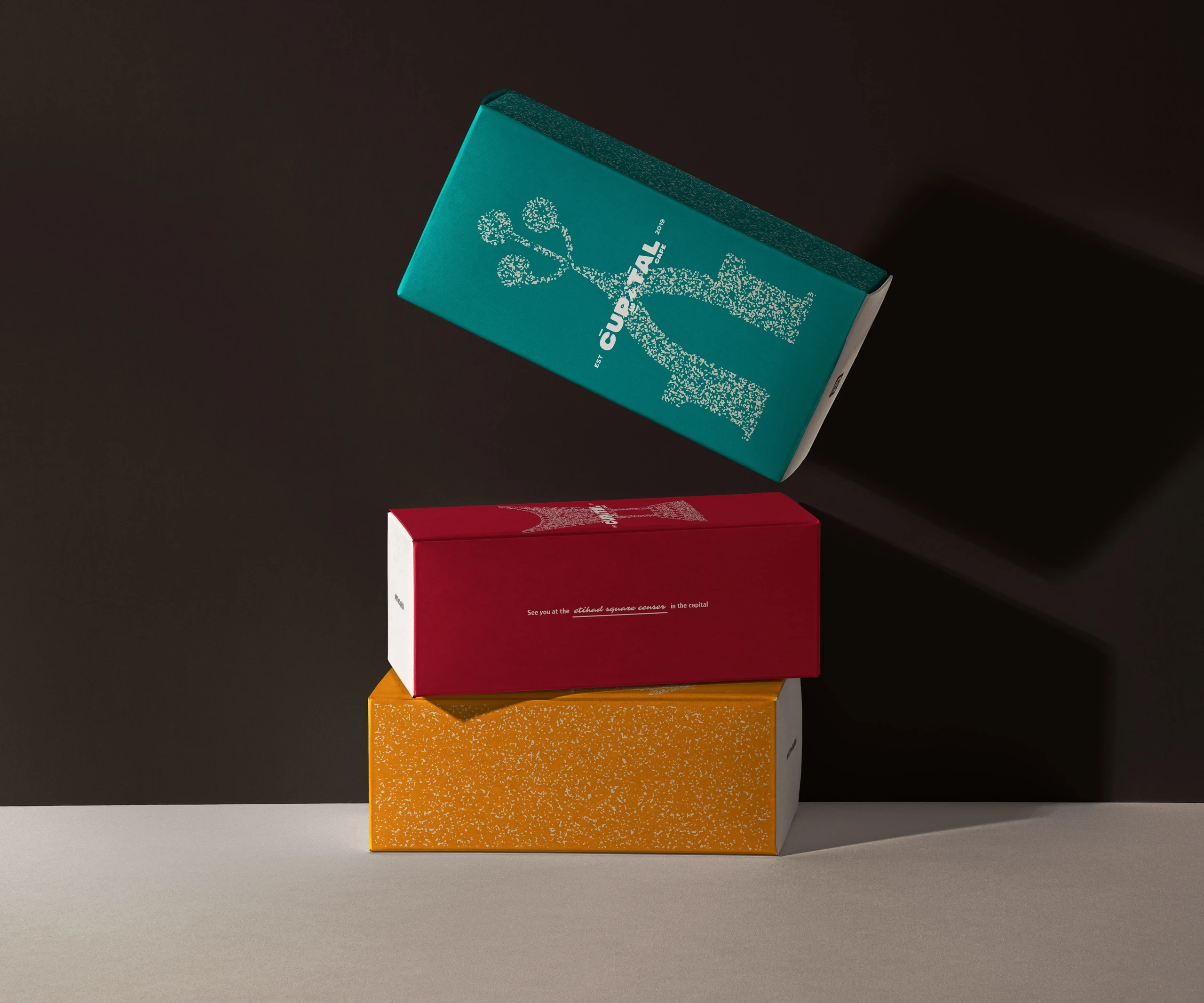
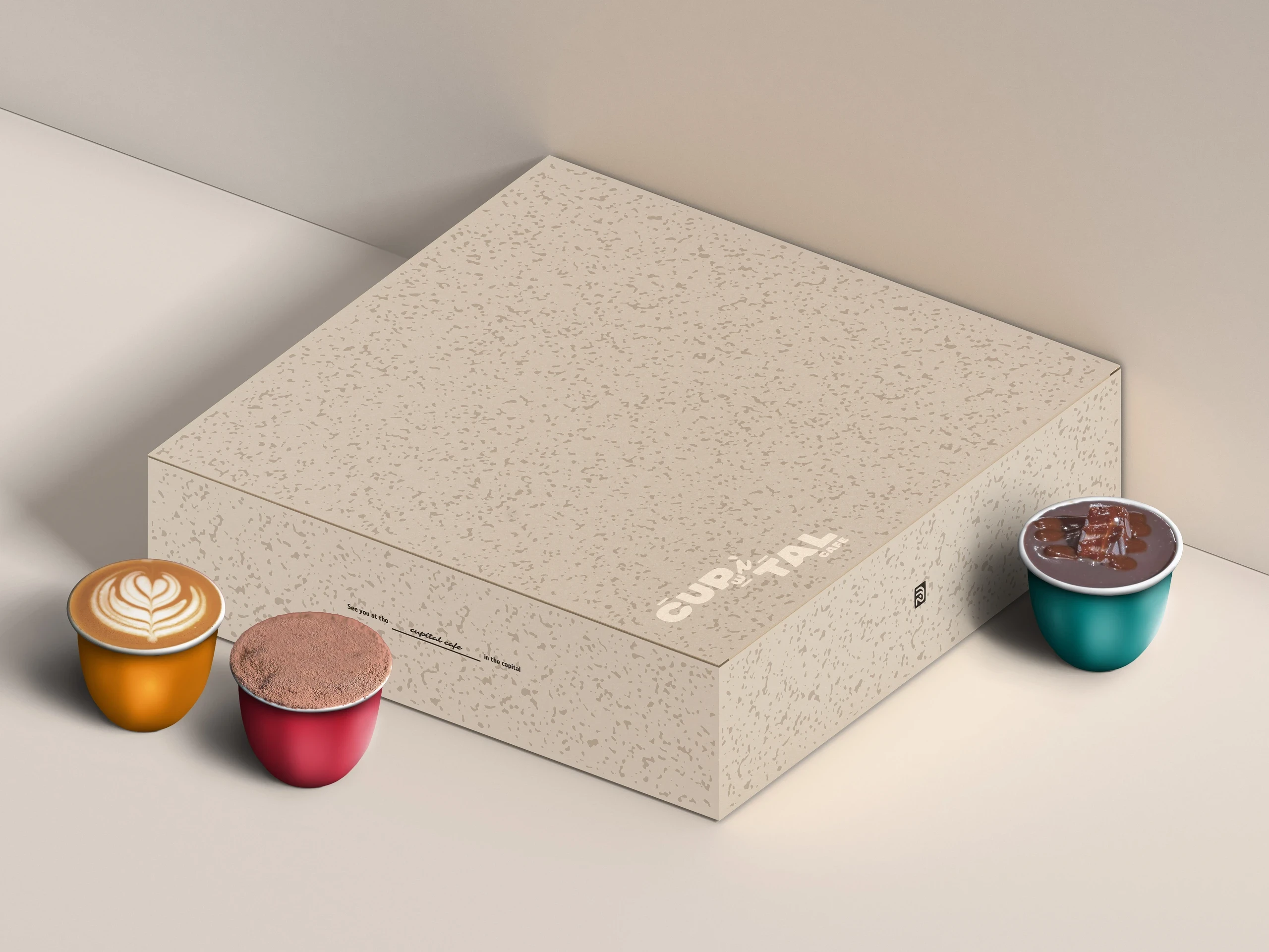
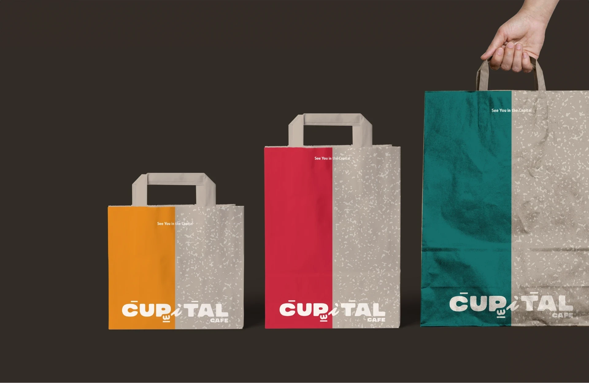
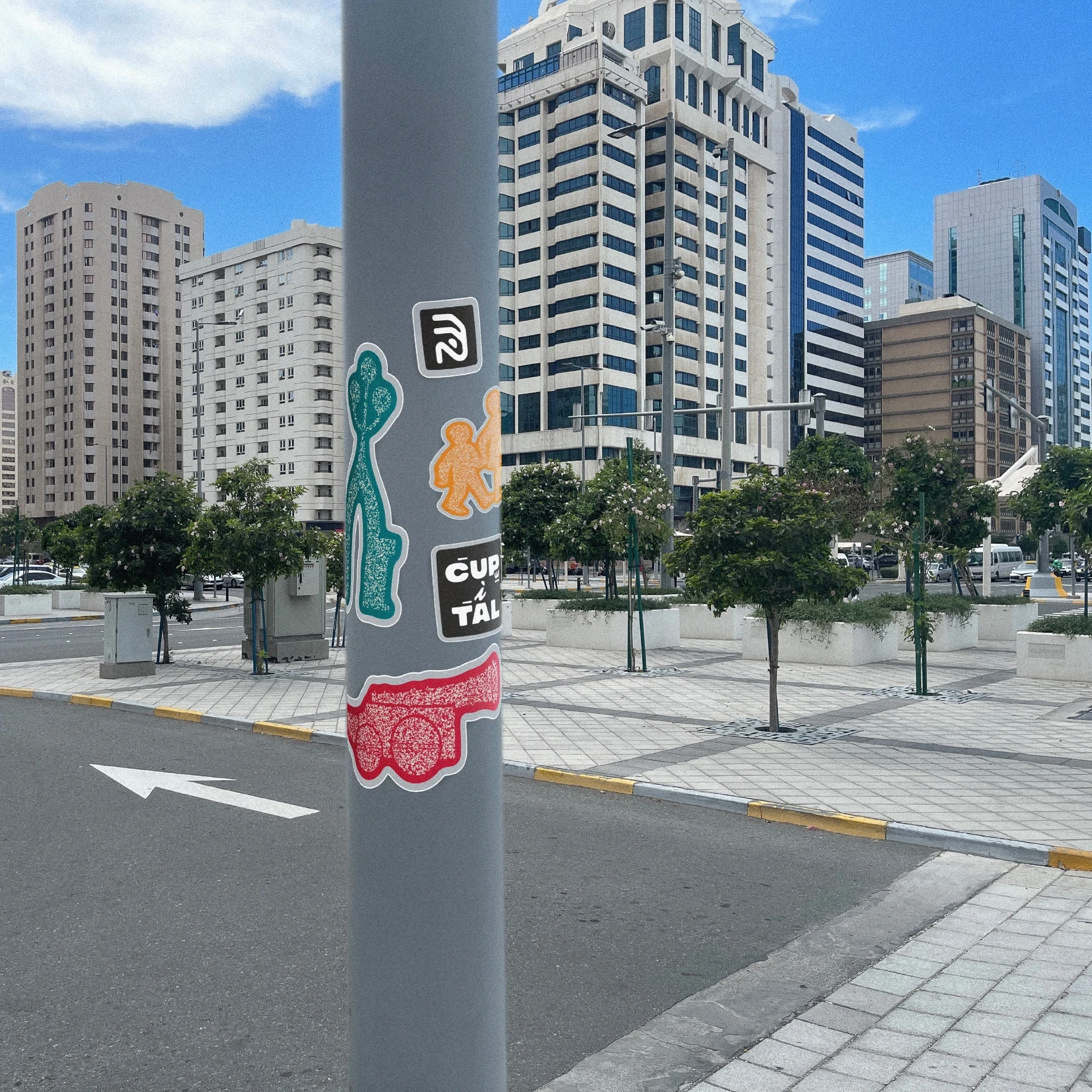
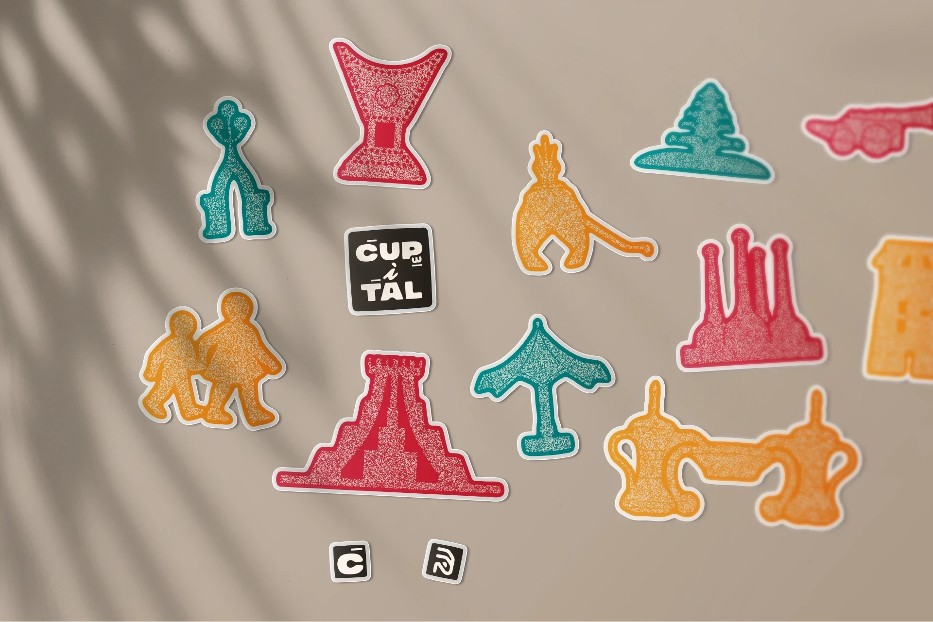
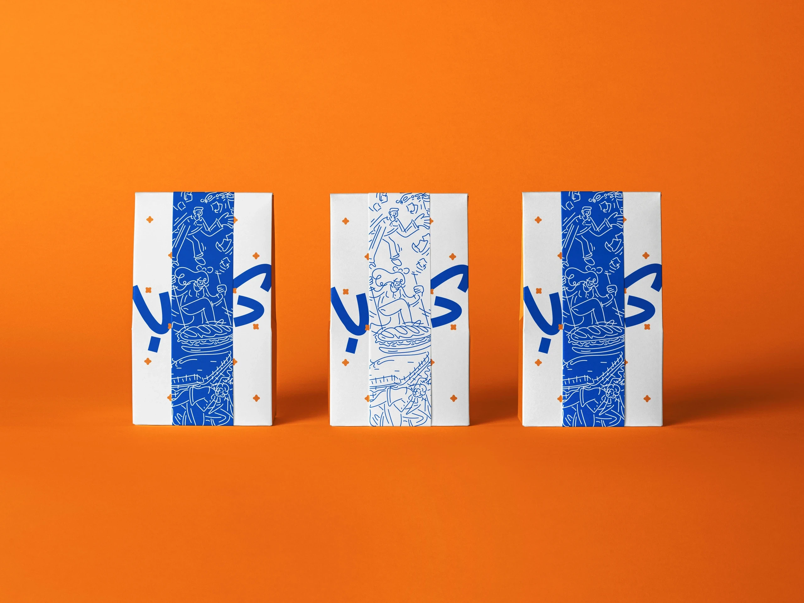
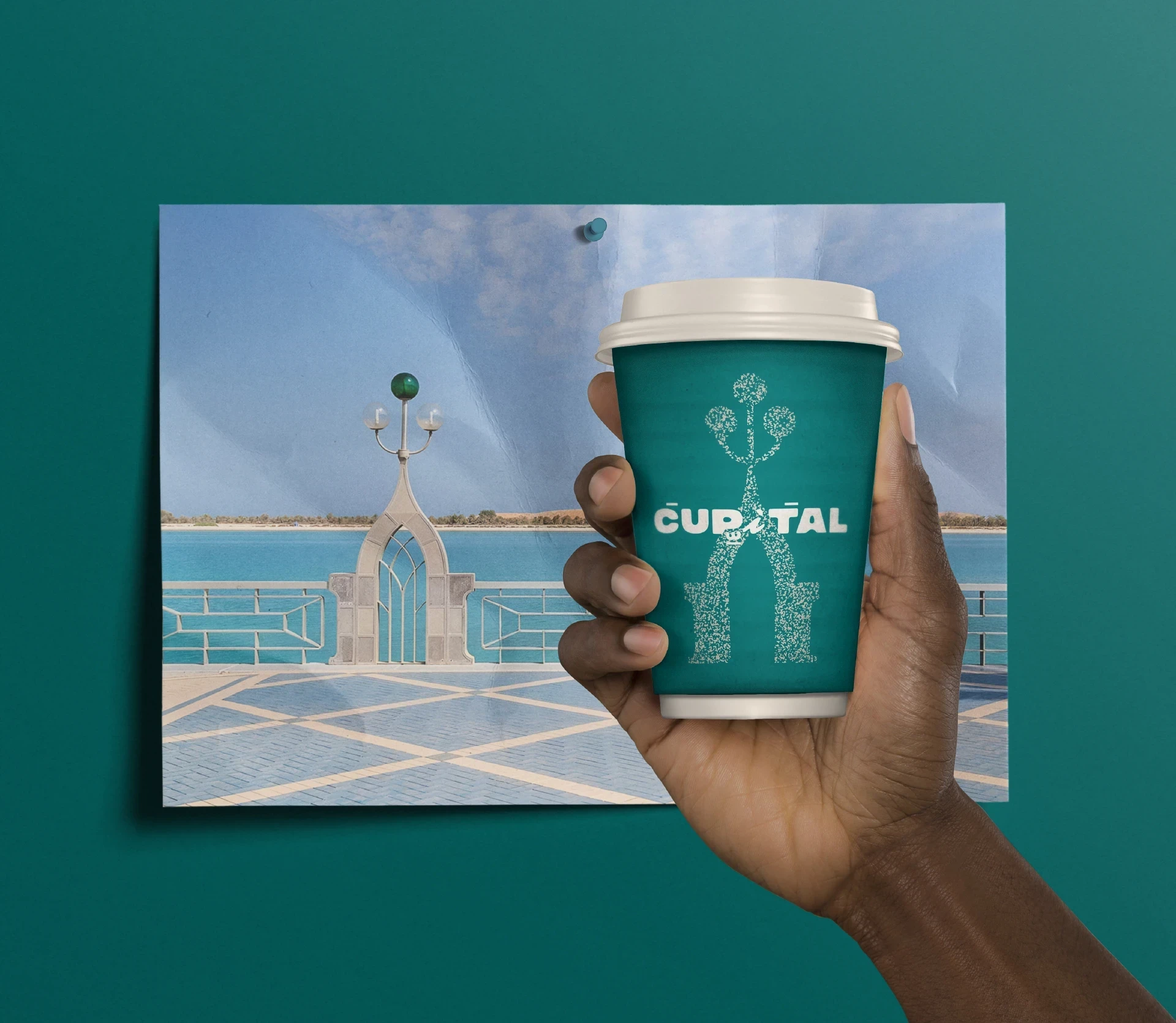
The identity centers on the relationship between Abu Dhabi's history and its modern urban character. A bilingual logo combines Arabic diacritics and English letterforms to express cultural fusion, while custom illustrations capture landmarks, streets, and everyday moments from the city. The visual system uses muted beige tones for core touchpoints, with brighter accents appearing in packaging and handheld applications to create moments of discovery. Messaging around "See you in the capital" extends the identity into a flexible campaign platform that can highlight different places and stories across the city. The result is a brand that treats coffee as a cultural and social experience rather than a product alone.
The identity centers on the relationship between Abu Dhabi's history and its modern urban character. A bilingual logo combines Arabic diacritics and English letterforms to express cultural fusion, while custom illustrations capture landmarks, streets, and everyday moments from the city. The visual system uses muted beige tones for core touchpoints, with brighter accents appearing in packaging and handheld applications to create moments of discovery. Messaging around "See you in the capital" extends the identity into a flexible campaign platform that can highlight different places and stories across the city. The result is a brand that treats coffee as a cultural and social experience rather than a product alone.
The identity centers on the relationship between Abu Dhabi's history and its modern urban character. A bilingual logo combines Arabic diacritics and English letterforms to express cultural fusion, while custom illustrations capture landmarks, streets, and everyday moments from the city. The visual system uses muted beige tones for core touchpoints, with brighter accents appearing in packaging and handheld applications to create moments of discovery. Messaging around "See you in the capital" extends the identity into a flexible campaign platform that can highlight different places and stories across the city. The result is a brand that treats coffee as a cultural and social experience rather than a product alone.