Khaisha
Khaisha
Khaisha
Info
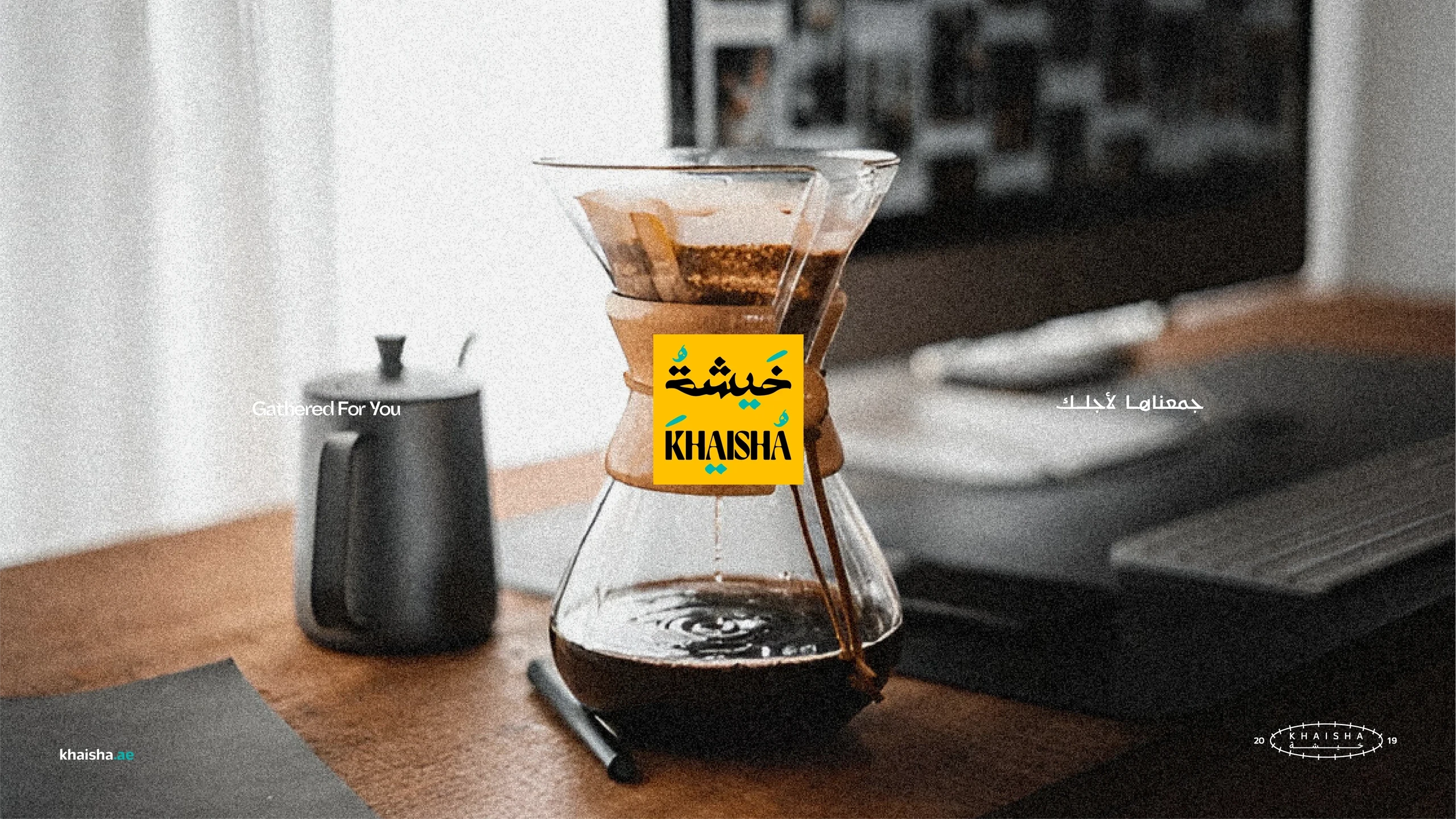
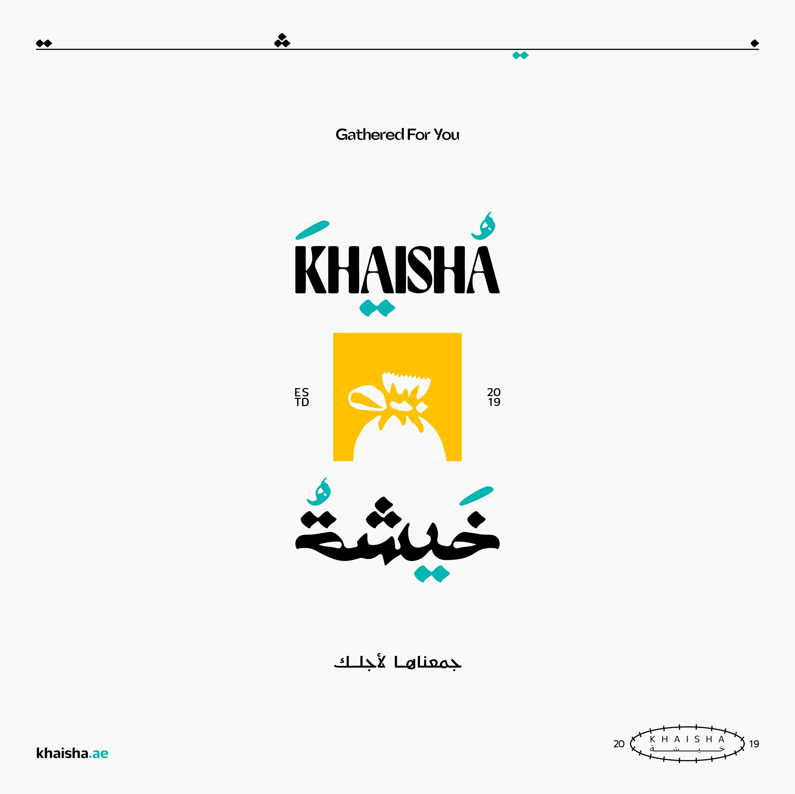
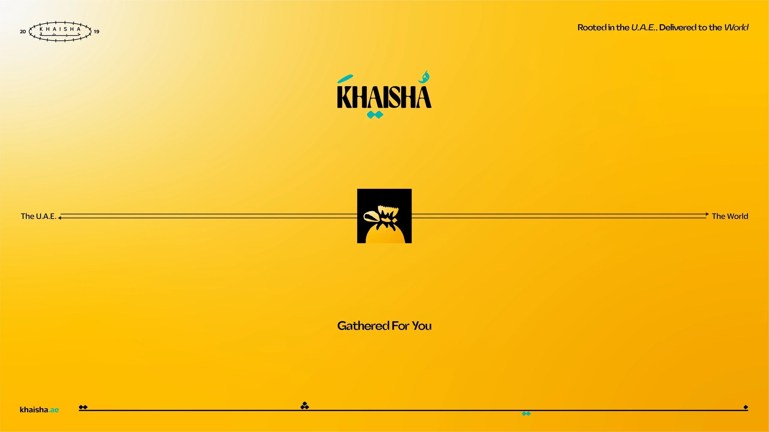
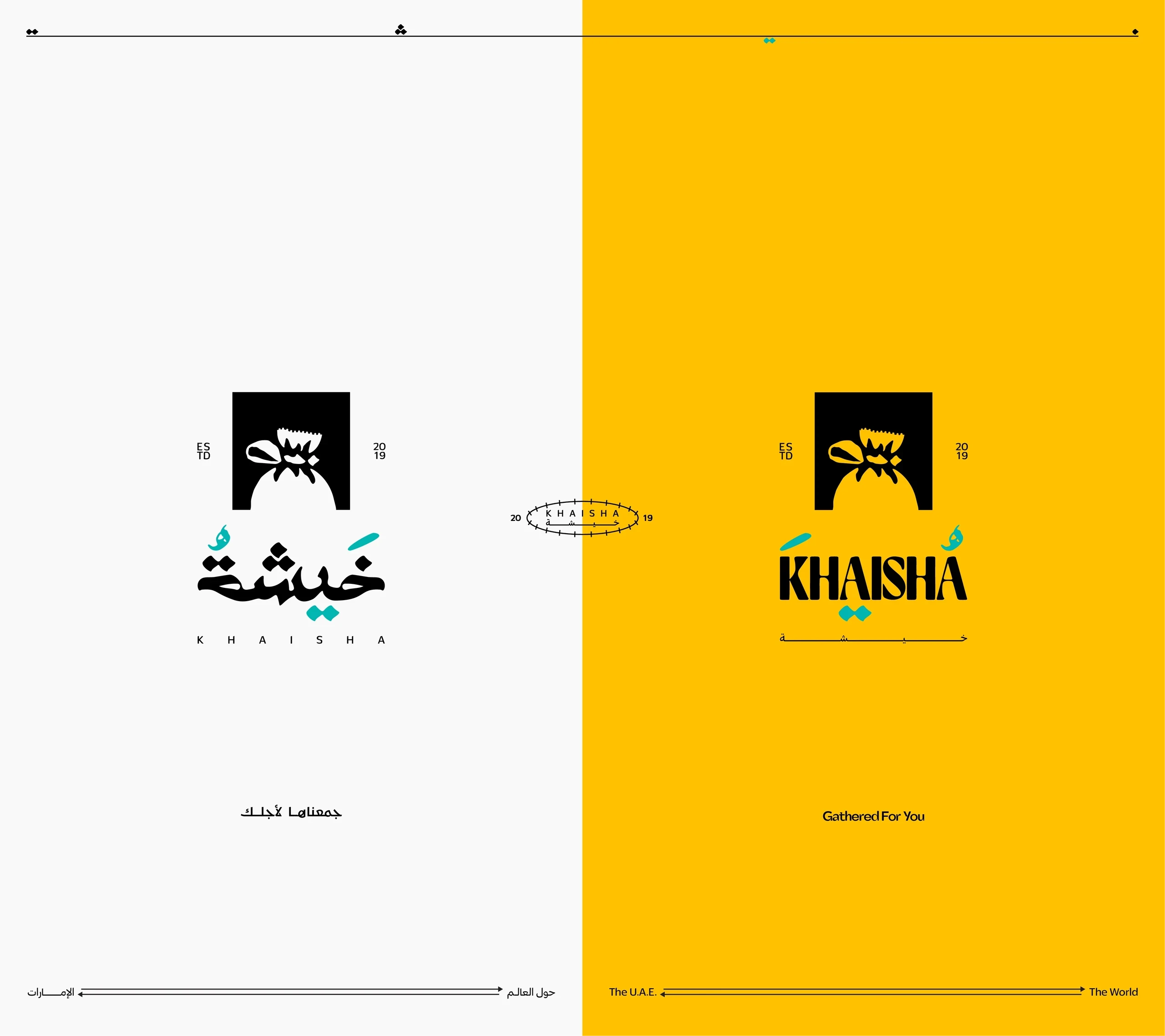
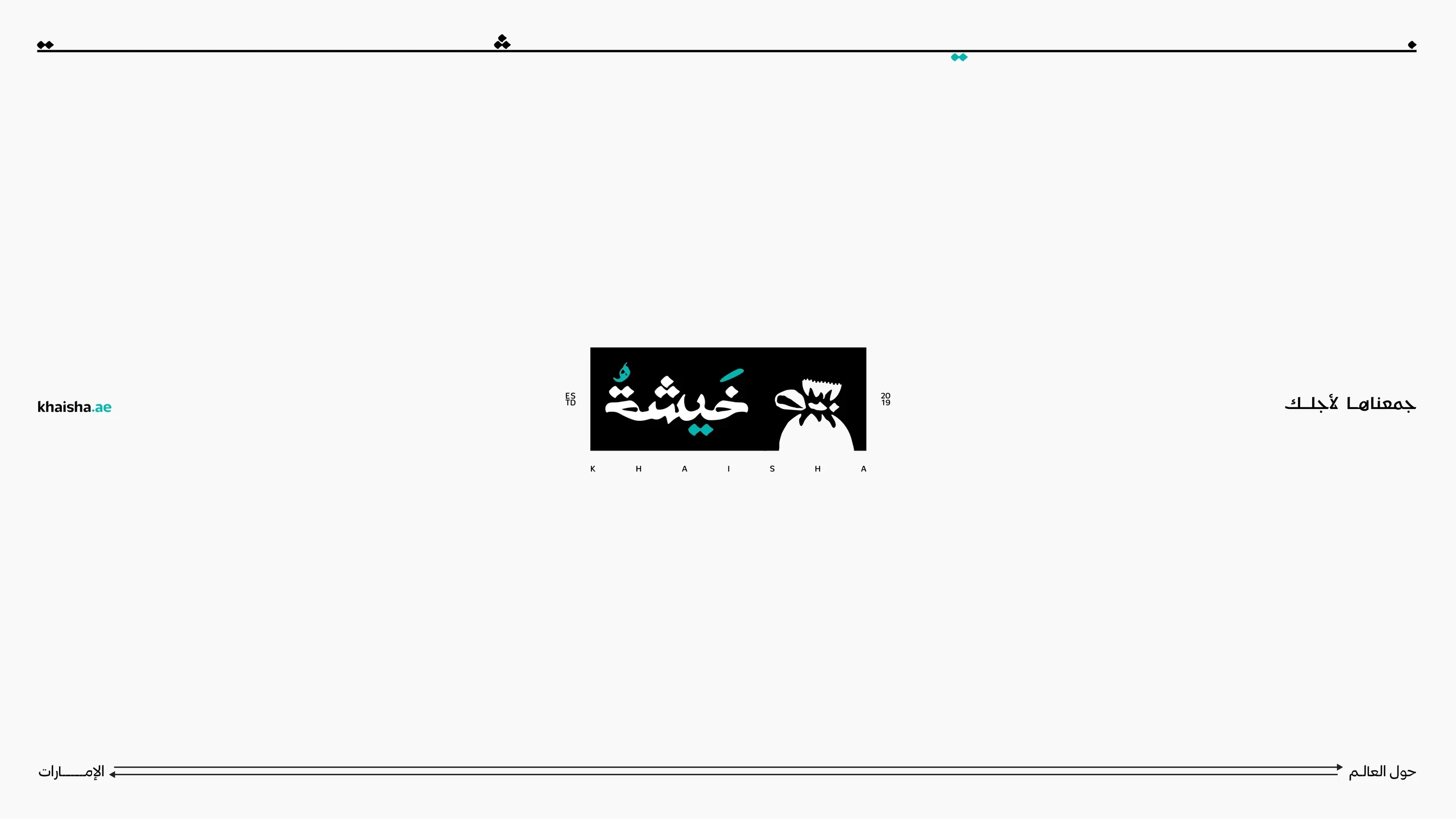
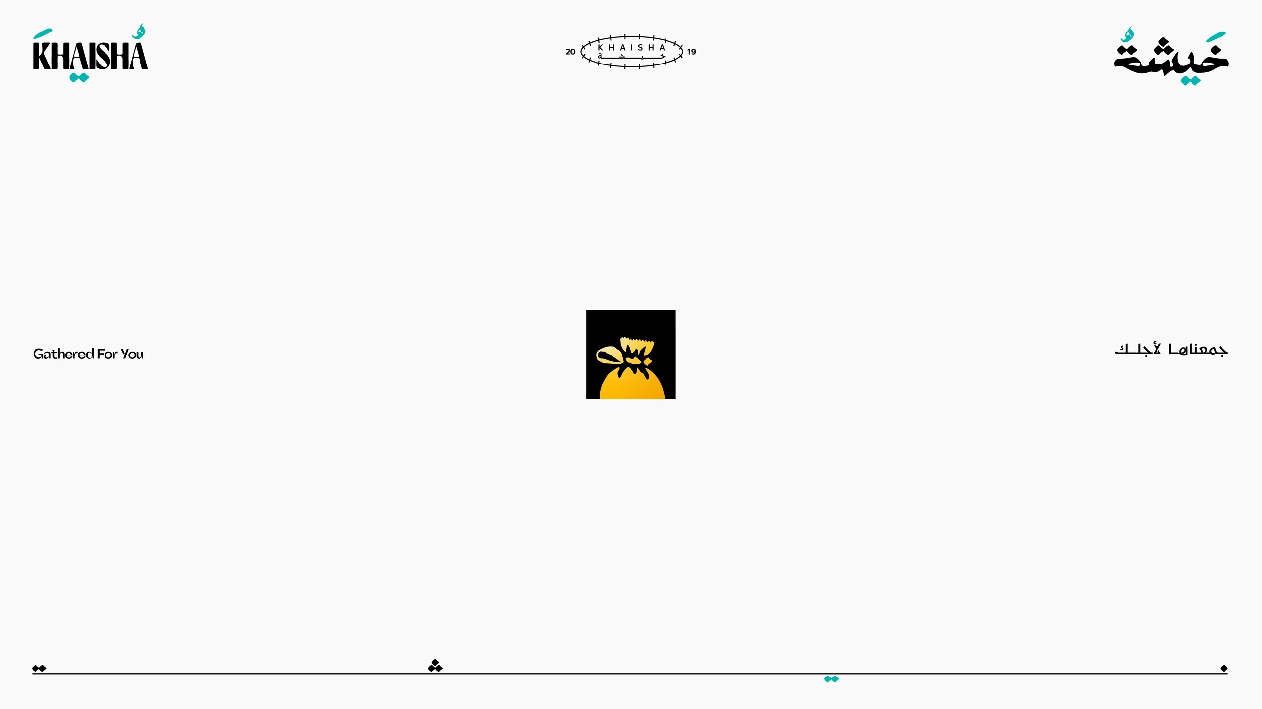
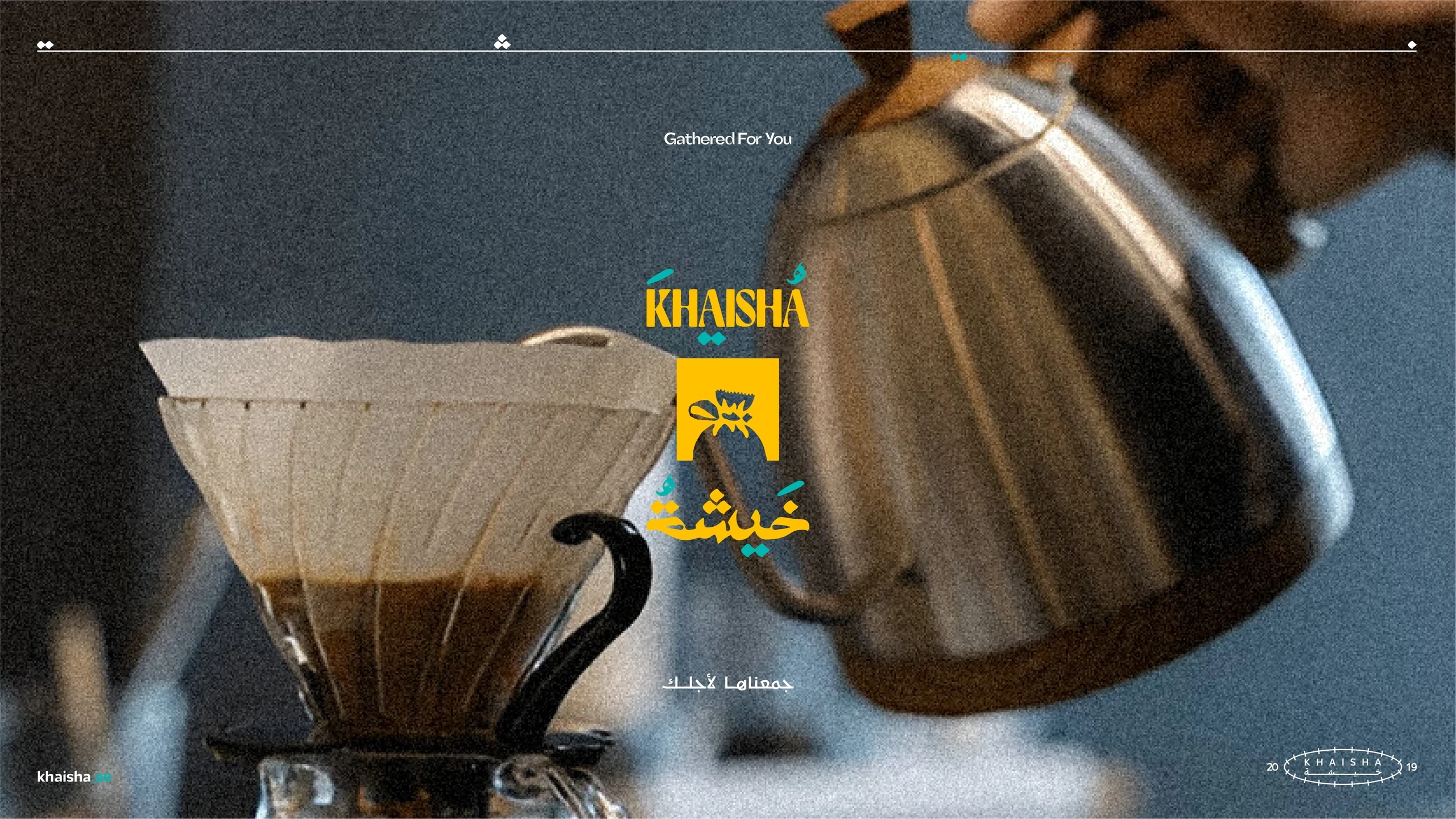
Khaisha is a brand identity inspired by traditional UAE craftsmanship. The visual language combines Arabic calligraphy, hand-crafted textures, and contemporary refinement to create a logo system that feels authentic, premium, and culturally rooted.
Year
2024
Client
Khaisha
Services
Rebrand Identity, Packaging Design, Product Design, Arabic Calligraphy, Illustration
The project explores how heritage can be translated into a modern brand system without losing its tactile character. The Arabic wordmark incorporates subtle symmetry, with mirrored letter relationships that create balance and visual rhythm. These forms were echoed in the English typography to maintain cohesion across both language systems. Material references such as burlap, woven fabric, and artisanal craft informed the overall aesthetic, while negative-space construction and simplified geometry ensured scalability across packaging and branding applications. The identity balances authenticity with clarity, creating a distinctive visual system that feels handcrafted yet contemporary.
The project explores how heritage can be translated into a modern brand system without losing its tactile character. The Arabic wordmark incorporates subtle symmetry, with mirrored letter relationships that create balance and visual rhythm. These forms were echoed in the English typography to maintain cohesion across both language systems. Material references such as burlap, woven fabric, and artisanal craft informed the overall aesthetic, while negative-space construction and simplified geometry ensured scalability across packaging and branding applications. The identity balances authenticity with clarity, creating a distinctive visual system that feels handcrafted yet contemporary.
The project explores how heritage can be translated into a modern brand system without losing its tactile character. The Arabic wordmark incorporates subtle symmetry, with mirrored letter relationships that create balance and visual rhythm. These forms were echoed in the English typography to maintain cohesion across both language systems. Material references such as burlap, woven fabric, and artisanal craft informed the overall aesthetic, while negative-space construction and simplified geometry ensured scalability across packaging and branding applications. The identity balances authenticity with clarity, creating a distinctive visual system that feels handcrafted yet contemporary.